In this tutorial, you’ll learn how to use ggplot in Python to create data visualizations using a grammar of graphics. A grammar of graphics is a high-level tool that allows you to create data plots in an efficient and consistent way. It abstracts most low-level details, letting you focus on creating meaningful and beautiful visualizations for your data.
There are several Python packages that provide a grammar of graphics. This tutorial focuses on plotnine since it’s one of the most mature ones. plotnine is based on ggplot2 from the R programming language, so if you have a background in R, then you can consider plotnine as the equivalent of ggplot2 in Python.
In this tutorial, you’ll learn how to:
- Install plotnine and Jupyter Notebook
- Combine the different elements of the grammar of graphics
- Use plotnine to create visualizations in an efficient and consistent way
- Export your data visualizations to files
Setting Up Your Environment
In this section, you’ll learn how to set up your environment. You’ll cover the following topics:
- Creating a virtual environment
- Installing plotnine
- Installing Juptyer Notebook
Virtual environments enable you to install packages in isolated environments. They’re very useful when you want to try some packages or projects without messing with your system-wide installation.
Run the following commands to create a directory named data-visualization and a virtual environment inside it:
$ mkdir data-visualization
$ cd data-visualization
$ python3 -m venv venv
After running the above commands, you’ll find your virtual environment inside the data-visualization directory. Run the following command to activate the virtual environment and start using it:
$ source ./venv/bin/activate
When you activate a virtual environment, any package that you install will be installed inside the environment without affecting your system-wide installation.
Next, you’ll install plotnine inside the virtual environment using the pip package installer.
Install plotnine by running this command:
$ pip install plotnine
Executing the above command makes the plotnine package available in your virtual environment.
Finally, you’ll install Jupyter Notebook. While this isn’t strictly necessary for using plotnine, you’ll find Jupyter Notebook really useful when working with data and building visualizations.
To install Jupyter Notebook, use the following command:
$ pip install jupyter
Congratulations, you now have a virtual environment with plotnine and Jupyter Notebook installed! With this setup, you’ll be able to run all the code samples presented through this tutorial.
Building Your First Plot With ggplot and Python
In this section, you’ll learn how to build your first data visualization using ggplot in Python. You’ll also learn how to inspect and use the example datasets included with plotnine.
The example datasets are really convenient when you’re getting familiar with plotnine’s features. Each dataset is provided as a pandas DataFrame, a two-dimensional tabular data structure designed to hold data.
You’ll work with the following datasets in this tutorial:
**economics**: A time series of US economic data**mpg**: Fuel economy data for a range of vehicles**huron**: The level of Lake Huron between the years 1875 and 1972
You can find the full list of example datasets in the plotnine reference.
You can use Jupyter Notebook to inspect any dataset. Launch Jupyter Notebook with the following commands:
$ source ./venv/bin/activate
$ jupyter-notebook
Then, once inside Jupyter Notebook, run the following code to see the raw data in the economics dataset:
from plotnine.data import economics

economics
The code imports the economics dataset from plotnine.data and shows it in a table:
      date      pce      pop   psavert uempmed  unemploy
0   1967-07-01  507.4   198712  12.5    4.5     2944
1   1967-08-01  510.5   198911  12.5    4.7     2945
... ...         ...     ...     ...     ...     ...
572 2015-03-01  12161.5 320707  5.2     12.2    8575
573 2015-04-01  12158.9 320887  5.6     11.7    8549
As you can see, the dataset includes economics information for each month between the years 1967 and 2015. Each row has the following fields:
**date**: The month when the data was collected**pce**: Personal consumption expenditures (in billions of dollars)**pop**: The total population (in thousands)**psavert**: The personal savings rate**uempmed**: The median duration of unemployment (in weeks)**unemploy**: The number of unemployed (in thousands)
Now, using plotnine, you can create a plot to show the evolution of the population through the years:
from plotnine.data import economics
from plotnine import ggplot, aes, geom_line

(
    ggplot(economics)  ## What data to use
    + aes(x="date", y="pop")  ## What variable to use
    + geom_line()  ## Geometric object to use for drawing
)
This short code example creates a plot from the economics dataset. Here’s a quick breakdown:
- Line 1: You import the
economicsdataset. - Line 2: You import the
ggplot()class as well as some useful functions fromplotnine,aes()andgeom_line(). - Line 5: You create a plot object using
ggplot(), passing theeconomicsDataFrame to the constructor. - Line 6: You add
aes()to set the variable to use for each axis, in this casedateandpop. - Line 7: You add
geom_line()to specify that the chart should be drawn as a line graph.
Running the above code yields the following output:
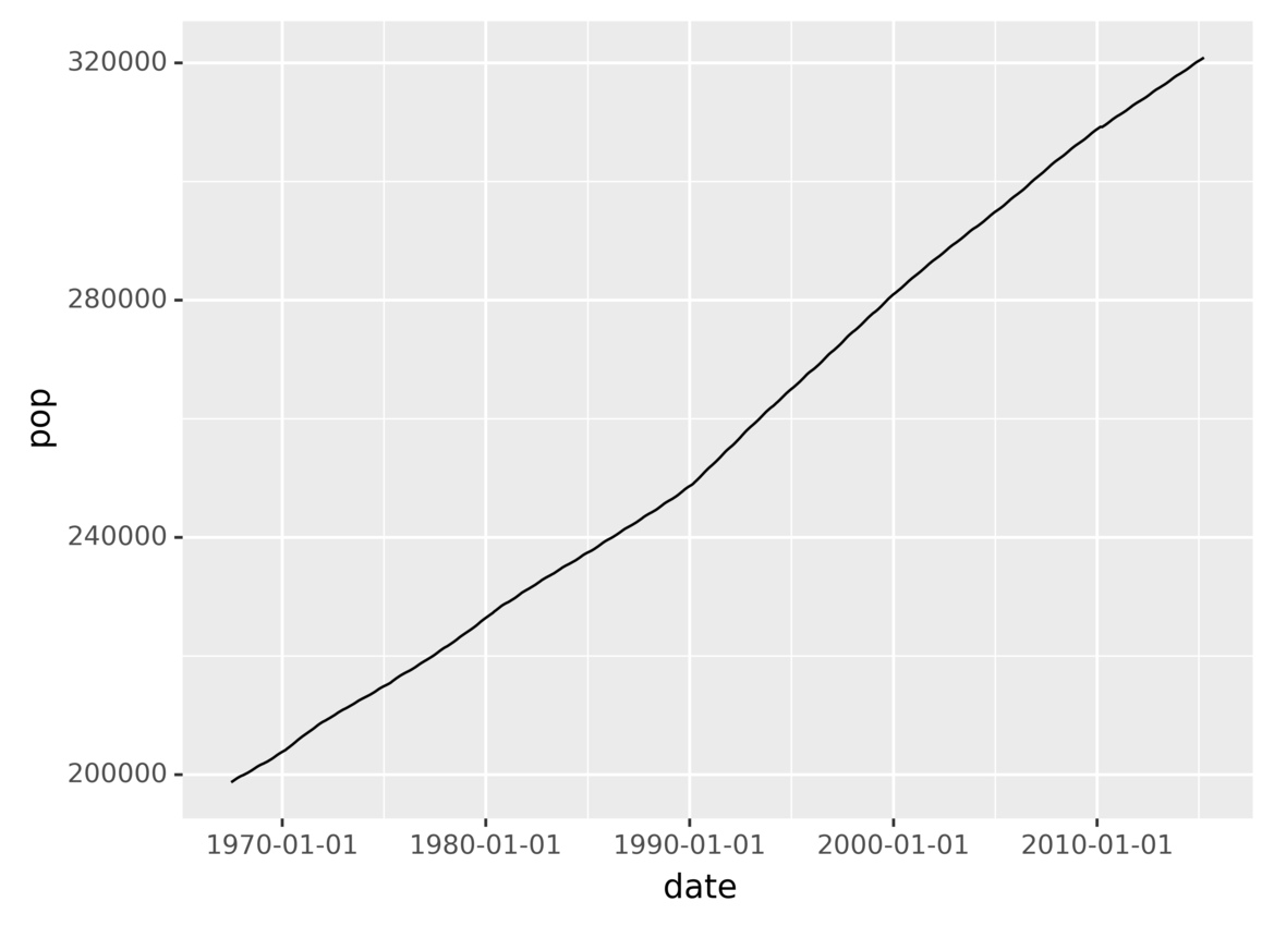
You’ve just created a plot showing the evolution of the population over time!
In this section, you saw the three required components that you need to specify when using the grammar of graphics:
- The data that you want to plot
- The variables to use on each axis
- The geometric object to use for drawing
You also saw that different components are combined using the **+** operator.
In the following sections, you’ll take a more in-depth look at grammars of graphics and how to create data visualizations using plotnine.
#python #r #data-science #programming #developer