How to JavaScript Animations with Anime.js
There are many JavaScript animation libraries out there, but Anime.js is one of the best. It’s easy to use, has a small and simple API, and offers everything you could want from a modern animation engine. The library has a small file size and supports all modern browsers, including IE/Edge 11+.
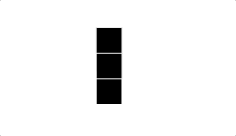
Anime.js is a very lightweight JavaScript animation engine, 14kb minified, and only 6kb gzipped. It supports all modern browsers and can practically animate anything from CSS properties to arbitrary JavaScript values. In this article, we’ll learn the basics of Anime.js and explore how to create the following animation:

This is the animation that we will be creating by the end of the article.
Anime Basics
Anime provides a very simple API for animating elements. You start by creating an Anime object, and passing it a plain JavaScript object describing your animation:
const animeObject = anime({
  /* describe animation */
 });
The following is the anatomy of an animation object:
{
  /* Animation Targets: div, .box, #sky, etc... *//* Animatable Properties: height, opacity, color, translateX, etc ... *//* Property Parameters: duration, delay, easing, etc... *//* Animation Properties: loop, direction, autoplay, etc... */}
- Animation Targets: div, .box, #sky, …
- Animatable Properties: height, opacity, scale, …
- Property Parameters: duration, delay, easing, …
- Animation Properties: loop, direction, autoplay
For example, the following piece of code is all you need to animate a div, with the id of box, 200 pixels across the screen:
anime({
  targets: '#box',
  translateX: 200,
 });
The snippet above results in the following animation:

Let’s use the snippet above to talk more about the anatomy of an animation object.
Targets
- We use targets to tell Anime how to find elements on the page.
- #box: find the element with the id of box
- .box: find all the elements with the class of box
- document.getElementById('box'): use the DOM Node with the box id
Property Values
- By specifying a single numeric value for a property, Anime is going to assume that you want to use the element’s unit (unitless). It will also use the element’s initial default value for the animation.
- You can specify the initial value of the property explicitly by setting the value to an array. For example, you can animate the x position from 50 to 200 by simply using an array: translateX: [50, 200].
- You can use different units by using a string like so: translateX: '1rem'
- You can also use a function for any property:
translateX: (elm, index, t) => index * 2
- Using a function enables you to programmatically set the animation properties of an element
- Also, using a function is pretty useful when you are animating multiple elements
Animation Properties:
The most common animation properties are duration and easing functions:
- You can set the duration of animation using the duration property. If no duration is specified, Anime will default to 1000ms.
- Using the easing function you can determine how values would change over time. The easing by default is set to easeOutElastic
Animating Multiple Elements
Let’s look at another example and use more attributes to create an animation with multiple elements:
const boxesAnimation = anime({
  targets: '.js-box',
  translateX: (elm, index, t) => index * 50,
  scale: 2,
  easing: 'easeInOutSine',
  delay: (elm, index, t) => index * 20,
  duration: 1200,
  loop: true,
  direction: 'alternate',
 });
In the snippet above:
- We are targeting all the elements on the page with the class js-box
- We are animating two css transform properties:
- translateX: we are using a function to move each element depending on their index.
- i = 0: move the first box 0 amount
- i = 1: move the second box, 1 * 50 amount
- i = 2: move the third box, 2 * 50 = 100 amount
- scale: we are scaling each element to 2 times their initial value (making each element twice as big)
- We are setting the easing function to one of the predefined easing functions easeInOutSine
- We are defining a delay for each element to perform all the property transitions:
- i = 0: delay the start of the animation for the first element by 0 * 20 = 0ms
- i = 1: delay the start of the animation for the second element by 1 * 20 = 20ms
- i = 2: delay the start of the animation for the third element by 2 * 20 = 40ms
- We are defining the duration to be 1200ms for each element's set of transitions
- We are also setting the animation to loop by setting loop: true
- And with the direction attribute, we are telling Anime to alternate the animation direction, from normal to reverse
- Setting the direction to alternate practically makes the animation play forwards and backwards alternatively
- The other possible values for direction are normal and reverse
Putting it All Together
Now let’s put what we have learned together and create the following animation:
First, we need to set the html markup for our page. The following snippet loads Anime.js, the essential CSS, and our JavaScript animation:
<!DOCTYPE html>
 <html lang="en">
 <head>
  <meta charset="UTF-8">
  <link rel="stylesheet" href="/squares.css">
  <script src="//cdnjs.cloudflare.com/ajax/libs/animejs/2.2.0/anime.js"></script>
  <title>Anime Animation</title>
 </head>
 <body>
  <div class="boxes">
    <div class="boxes__inner">
      <div class="box js-box"></div>
      <div class="box js-box"></div>
      <div class="box js-box"></div>
      <div class="box js-box"></div>
      <div class="box js-box"></div>
      <div class="box js-box"></div>
      <div class="box js-box"></div>
      <div class="box js-box"></div>
      <div class="box js-box"></div>
      <div class="box js-box"></div>
      <div class="box js-box"></div>
    </div>
  </div>
  <script src="/squares.js"></script>
 </body>
 </html>
Then, we need to define a bunch of CSS to prepare the set for our animation. The most important part of this CSS is the .boxes__inner selector. In this selector we are setting the height of the div to a fixed value, and also making the overflow hidden. Essentially this will make the boxes "appear" from the bottom of the outer div, resulting in a nice, smooth effect. The rest of the CSS is pretty self explanatory. We are basically setting a nice background color for the page and centering everything on the page.
CSS:
html, body {
  padding: 0;
  margin: 0;
  background-color: #25275a;
  width: 100%;
  height: 100%;
 }
 .box {
  width: 50px;
  height: 150px;
 }
 .boxes {
  display: flex;
  align-items: center;
  justify-content: center;
  height: 100%;
 }
 .boxes__inner {
  display: flex;
  overflow: hidden;
  height: 165px;
 }
JS
const boxesAnimation = window.anime({
  targets: '.js-box',
  translateY: [150, 50],
  backgroundColor: (el, i, t) => {
    const r = 58 + (i * 12);
    const g = 35 + (i * 12);
    const b = 220;
    const color = `rgb(${r}, ${g}, ${b})`;
    return color;
  },
  duration: 900,
  easing: 'easeOutElastic',
  elasticity: 500,
  delay: (el, i, t) => i * 20,
  loop: true,
  direction: 'alternate',
 });
Now, let’s look at the JavaScript in more detail. In the JavaScript snippet above:
- We are animating all the elements on the page with the class .js-box
- We are animating two properties for each box:
- translateY: we are simply animating each box’s vertical position from 150 to 50. This makes each box appear from the bottom of the outer div to the top
- backgroundColor: for the background color we are using a function and setting the color of each box differently:
- i = 0: for the first box, the color is set to rgb(58, 35, 220)
- i = 1: for the second box, the color is set to rgb(58 + 12, 35 + 12, 220)
- i = 10: for the eleventh box, the color is set to rbg(58 + 120, 35 + 120, 220)
- Essentially by using the function we are keeping blue component the same while gradually changing the red and the green components. This results in a nice gradient of color changing for each box over time
- We are setting the duration of all the transitions for each box to 900ms
- In addition, we are defining the easing function as one of the predefined easing functions, i.e.easeOutElastic
- We are also using the elasticity attribute to define how elastic we want transitions to be. The elasticity property is only valid for elastic easing functions
- The delay for each box’s animation is defined using a function:
- i = 0: the first box’s transitions will start after 0 * 20 = 0ms delay
- i = 1: the second box’s transitions will start after 1 * 20 = 20ms delay
- i = 10: the eleventh box’s transitions will start after 10 * 20 = 2000ms delay
- The delay function essentially makes the animation interesting, causing each box to appear one after another with 20ms delay.
- We are also looping the animation using the loop: true property
- And finally we are making the animation loop forward and backwards using the direction: 'alternate' property
Fine-tunning the Background Color Transition
While the animation above is pretty acceptable, it would be nice to control the duration and transition of the background color transition. In Anime, you can have fine grained control over each property transition by using an object:
anime({
  property: {
    value: ...,
    transition: ...,
    duration: ...,
    /* etc */
  }
 });
For example:
anime({
  scale: {
    value: 2,
    transition: 'linear',
    duration: 1000,
  },
  opacity: 1,
  height: [0, 100],
  transition: 'easeInOutSine',
  duration: 500,
 });
In the snippet above all the properties transition using the easeInOutSine function over 500ms, except the scale property. The scale property will animate linearly over 1000ms. We can apply the same thing to our background transition, and make it a bit more smooth:
const boxesAnimation = window.anime({
  targets: '.js-box',
  translateY: [150, 50],
  backgroundColor: {
    value: (el, i, t) => {
      const r = 58 + (i * 12);
      const g = 35 + (i * 12);
      const b = 220;
      const color = `rgb(${r}, ${g}, ${b})`;
      return color;
    },
    easing: 'linear',
    duration: 200,
  },
  duration: 900,
  easing: 'easeOutElastic',
  elasticity: 500,
  delay: (el, i, t) => i * 20,
  loop: true,
  direction: 'alternate',
 });
As you can see, we assigned an object to backgroundColor and moved the function to value instead. And we have also defined a linear easing and a duration of 200ms for each box background color transition. You can see the result below:

Final animation after fine-tuning the background color transition
Conclusion
We saw how easy it is to create smooth animations with couple of lines of JavaScript using Anime.js. There are so many other features packed into Anime.js such as timelines, keyframes and SVG animations. Be sure to check out Anime’s documentation for more details and examples.
Thanks for reading ❤
If you liked this post, please do share/like it with all of your programming buddies!
Follow us on Facebook | Twitter
Further reading about JavaScript
☞ The Complete JavaScript Course 2019: Build Real Projects!
☞ Vue JS 2 - The Complete Guide (incl. Vue Router & Vuex)
☞ JavaScript Bootcamp - Build Real World Applications
☞ JavaScript Programming Tutorial - Full JavaScript Course for Beginners
☞ New ES2019 Features Every JavaScript Developer Should Know
☞ Best JavaScript Frameworks, Libraries and Tools to Use in 2019
☞ React vs Angular vs Vue.js by Example
☞ Microfrontends — Connecting JavaScript frameworks together (React, Angular, Vue etc)
☞ Creating Web Animations with Anime.js
☞ Ember.js vs Vue.js - Which is JavaScript Framework Works Better for You
☞ Do we still need JavaScript frameworks?
#javascript #web-development