Flutter Tutorial for Beginners
Flutter Tutorial for Beginners: Exploring widgets
Introduction
Many people say that Flutter has a steep learning curve. If you have seen Flutter UI layout code like below (simplified from here), you may be inclined to agree with them.
Warning: Incomprehensible code block ahead. Scroll past and keep reading.
      Widget build(BuildContext context) {
        ThemeData themeData = Theme.of(context);
        return new Scaffold(
          body: new Padding(
            padding: const EdgeInsets.all(10.0),
            child:
            new Column(
              mainAxisAlignment: MainAxisAlignment.spaceBetween,
              children: <Widget>[
                new Expanded(
                  child: new Align(
                    alignment: FractionalOffset.center,
                    child: new AspectRatio(
                      aspectRatio: 1.0,
                      child: new Stack(
                        children: <Widget>[
                          new Positioned.fill(
                            child: new AnimatedBuilder(
                              animation: _controller,
                              builder: (BuildContext context, Widget child) {
                                return new CustomPaint(
                                  painter: new ProgressPainter(
                                    animation: _controller,
                                    color: themeData.indicatorColor,
                                    backgroundColor: Colors.white,
                                  ),
                                );
                              }
                            ),
                          ),
                        ],
                      ),
                    ),
                  ),
                ),
                new Container(
                  margin: new EdgeInsets.all(10.0),
                  child: new Row(
                    mainAxisAlignment: MainAxisAlignment.spaceEvenly,
                    children: <Widget>[
                      new FloatingActionButton(
                        child: new AnimatedBuilder(
                          animation: _controller,
                          builder: (BuildContext context, Widget child) {
                            return new Icon(
                              _controller.isAnimating
                                ? Icons.pause
                                : Icons.play_arrow
                            );
                          },
                        ),
                      ),
                    ],
                  ),
                ),
              ],
            ),
          ),
        );
      }
    }
Mountains are only steep if you climb straight up. And the Flutter learning curve is only hard if you try to do too much at once. Just as hiking trails with switchbacks makes a mountain climb more manageable, in this tutorial I will give you an opportunity to take some easy first steps to mastering Flutter. You are going to discover that it’s a lot easier than you thought.
One of the first concepts that you encounter in Flutter are widgets, so we will be looking at what they are and how to use them. Most importantly, there will be lots of examples that you will be able to experiment with yourself. I encourage you to actually run the examples and make changes to them as you go through the tutorial. This will greatly improve your rate of learning and help solidify your understanding of the topics.
I hear and I forget.
I see and I remember.
I do and I understand.
Prerequisites
I don’t expect you to know much. That’s the point of this tutorial. However, you should have already set up your development environment. Some people prefer Android Studio. Others like Visual Studio Code because it’s more lightweight. The fact is that both work fine. I’m writing the text of this tutorial using Visual Studio Code and running the code for the examples below in Android Studio with Flutter 1.0.
If you haven’t set up the Flutter development environment yet, then I highly recommend following the directions in the Flutter documentation. Unlike a lot of documentation, the Flutter docs are very thorough and easy to follow. You should have finished at least the first three steps below (but I highly recommend Step 4 as well).
Also feel free to check out the previous Pusher Blog tutorials Getting started with Flutter Part 1 and Part 2.
What are widgets?
Widgets are just pieces of your user interface. Text is a widget. Buttons are widgets. Check boxes are widgets. Images are widgets. And the list goes on. In fact, everything in the UI is a widget. Even the app itself is a widget!
If you are familiar with Android or iOS development (no problem if you aren’t), then you will make the immediate connection to views (for Android) and UIViews (for iOS). This is a good comparison to make and you will do fine to start your journey with this mindset. A more accurate way to think, though, is that a widget is a blueprint. Flutter uses these blueprints to build the view elements under the hood and render them to the screen.
When you understand that widgets are almost anything that affects how the UI looks and behaves, then it makes sense that there are a lot more widgets than just structural elements like buttons, text, and images. For example, padding is a widget. Layout columns are widgets. Styles are widgets. Even gesture detectors are widgets.
This is your first step on the way to mastering Flutter. But if you think of widgets as simple blueprints, then this first step shouldn’t be a hard one.
Widget trees
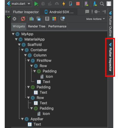
We are not going to go into how to make a layout in this lesson, but it’s helpful to know that widgets are arranged into a tree of parent and child widgets. The entire widget tree is what forms the layout that you see on the screen. For example, here is the widget tree for the default demo app when you start a new project. The visible widgets are marked with red lines. (The other widgets in this tree are used for layout and adding functionality.)
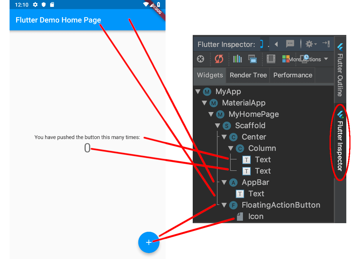
Note: You can view any project’s widget tree by using the Flutter Inspector tool. In Android Studio it’s a vertical tab on the far right near the top. In Visual Studio Code you can find it by running the command Flutter: Inspect Widget when running the app in debugging mode.
Types of widgets
Widgets are immutable. That is, they cannot be changed. Any properties that they contain are final and can only be set when when the widget is initialized. This keeps them lightweight so that it’s inexpensive to recreate them when the widget tree changes.
There are two types of widgets: stateless and stateful. Stateless widgets are widgets that don’t store any state. That is, they don’t store values that might change. For example, an Icon is stateless; you set the icon image when you create it and then it doesn’t change any more. A Text widget is also stateless. You might say, “But wait, you can change the text value.” True, but if you want to change the text value, you just create a whole new widget with new text. The Text widget doesn’t store a text property that can be changed.
The second type of widget is called a stateful widget. That means it can keep track of changes and update the UI based on those changes. Now you might say, “But you said that widgets are immutable! How can they keep track of changes?” Yes, the stateful widget itself is immutable, but it creates a State object that keeps track of the changes. When the values in the State object change, it creates a whole new widget with the updated values. So the lightweight widget (blueprint) gets recreated but the state persists across changes.
A stateful widget is useful for something like a checkbox. When a user clicks it, the check state is updated. Another example is an Image widget. The image asset may not be available when the widget is created (like if it is being downloaded), so a stateless widget isn’t an option. Once the image is available, it can be set by updating the state.
If this section was too much for you, then don’t worry about it. It isn’t necessary at all for today’s tutorial. But if you would like to learn more, then check out the Flutter widgets 101 YouTube videos from the Flutter team or read the core principles in the docs. If you want to do some deeper research then I recommend watching Flutter’s Rendering Pipeline and Flutter’s Layered Design.
Examples
Next we are going get our hands dirty with some easy examples of common widgets. Again, I highly recommend that you follow along and run the code in your editor.
Setup
-
Start a new Flutter application project. I called my project
flutter_widget_examples, but you can call yours whatever you want. -
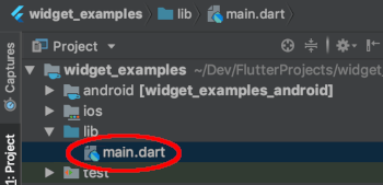
Open the
main.dartfile. It’s in thelibfolder in your project outline.
-
Delete all the text in this file and replace it with
void main() {}
If you hot reload your app now it should be a blank screen. The main() function is the starting point for every Flutter app. Right now ours does nothing, but in each of the examples below we will be testing a different Flutter widget here.
Container widget
The first widget we are going to play with is called a Container. As you might have guessed from the name, it’s a holder for other widgets. But we aren’t going to put anything else in it to start with. We will just play with its color property.
Replace all the code in main.dart with the following:
    // importing this package gives us the dart widgets
    // as well as the Material Theme widgets
    import 'package:flutter/material.dart';

    // the main() function is the starting point for every Flutter project
    void main() {

      // calling this method (you guessed it) runs our app
      runApp(

        // runApp() takes any widget as an argument.
        // This widget will be used as the layout.
        // We will give it a Container widget this time.
        Container(
          color: Colors.green, // <-- change this
        ),

      );
    }
Note: You may have noticed the commas (
,) at the ends of some lines in Dart (the programming language that we write Flutter apps in). These commas are used for formatting lines. You could remove them but then the text would be written on a single line when auto-formatted.
Restart the app and see what you get. Then replace Colors.green with other values. You will notice that if you try to do a hot reload nothing happens. We will fix that soon. For now just restart the app between every change.
Colors.redColors.blueAccentColors.deepPurple
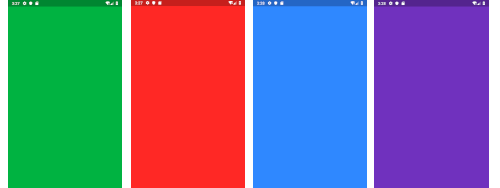
This step was pretty easy, wasn’t it? Now you know how to change property values in Flutter widgets.
Text widget
Probably every single app that you make will have text, so the Text widget is definitely one that we need to look at.
I added some boilerplate code with explanations. You don’t have to pay too much attention to it, though. I was going to leave it out, but using the MaterialApp widget makes the app look nicer and makes the rest of the code simpler. Also, having the build() method lets us use hot reload to update after changes.
Replace all the code in main.dart with the following code. Pay special attention to the myWidget() method at the bottom. We will use it to return the Text widget that we are playing with here. In following examples you will only need to replace this method.
    import 'package:flutter/material.dart';

    void main() {
      // runApp() is a builtin method that initializes the app layout
      // MyApp() (see below) is a widget that will be the root of our application.
      runApp(MyApp());
    }

    // the root widget of our application
    class MyApp extends StatelessWidget {

      // The build method rebuilds the widget tree if there are any changes
      // and allows hot reload to work.
      @override
      Widget build(BuildContext context) {

        // This time instead of using a Container we are using the MaterialApp
        // widget, which is setup to make our app have the Material theme.
        return MaterialApp(

          // The Scaffold widget lays out our home page for us
          home: Scaffold(

            // We will pass an AppBar widget to the appBar property of Scaffold
            appBar: AppBar(
              // The AppBar property takes a Text widget for its title property
              title: Text("Exploring Widgets"),
            ),

            // The body property of the Scaffold widget is the main content of
            // our screen. Instead of directly giving it a widget we are going
            // to break it out into another method so that things don't get
            // too messy here.
            body: myWidget(),

          ),
        );
      }
    }

    // This is where we will play with the Text widget
    Widget myWidget() {
      return Text(
        "Hello, World!",
      );
    }
You should see the following:

Change the text from “Hello, World!” to “Hello, Flutter!” and then do a hot reload.

If you want to increase the font size, you can add a TextStyle widget to the style property of Text. Replace the myWidget() method above with the following:
    Widget myWidget() {
      return Text(
        "Hello, Flutter!",
        style: TextStyle(
          fontSize: 30.0
        ),
      );
    }

There are lots of other changes you can make with the TextStyle widget, like color, font, shadows, and spacing to name a few.
If you want to add padding, you don’t change a property. Instead, you wrap the Text widget with a Padding widget. In Flutter lots of layout related tasks use widgets instead of setting properties. Remember, a widget is a blueprint that affects how the UI looks.
Replace the myWidget() method with the following:
    Widget myWidget() {
      return Padding(
        // Set the padding using the EdgeInsets widget.
        // The value 16.0 means 16 logical pixels. This is resolution
        // independent, so you don't need to worry about converting
        // to the density of the user's device.
        padding: EdgeInsets.all(16.0),
        // When wrapping one widget with another widget,
        // you use the child property.
        child: Text(
          "Hello, Flutter!",
        ),
      );
    }

Button widget
If you have been doing the code along with me, your confidence should be increasing. It really isn’t that hard to make widgets, is it? Buttons are another common need and Flutter has several types of button widgets. Although we are not doing anything in response to the button click in this tutorial, you can see in the code below where you could do something.
    Widget myWidget() {
      return RaisedButton(
        child: const Text('Button'),
        color: Colors.blue,
        elevation: 4.0,
        splashColor: Colors.yellow,
        onPressed: () {
          // do something
        },
      );
    }
We used a RaisedButton here. The elevation affects the shadow under the button. The splash color is what you see when the button is clicked.

You can use a FlatButton widget if you don’t want the elevation.
    Widget myWidget() {
      return FlatButton(
        child: const Text('Button'),
        splashColor: Colors.green,
        onPressed: () {
          // do something
        },
      );
    }

TextField widget
For accepting user text input you use a TextField widget. Now that you already have experience with the widgets above, this one is simple. You just click in the TextField and the system keyboard automatically pops up. (If it is not popping up on the iOS simulator press Command + Shift + K.)
    Widget myWidget() {
      return TextField(
        decoration: InputDecoration(
            border: InputBorder.none,
            hintText: 'Write something here'
        ),
      );
    }

Remove border: InputBorder.none, and run it again. Now there is a blue input border at the bottom of the TextField.

ListView widget
The most common way to display lots of data is with a ListView. Now, I have done lists before with Android RecyclerViews and iOS TableViews and I have to say that Flutter is way too easy. The stories that you have heard about Flutter having a steep learning curve may have been overrated.
    Widget myWidget() {
      return ListView.builder(
        padding: EdgeInsets.all(16.0),
        // spacing of the rows
        itemExtent: 30.0,
        // provides an infinite list
        itemBuilder: (BuildContext context, int index) {
          return Text('Row $index');
        },
      );
    }

What if you want the rows to respond to user taps? Then fill the rows with a ListTile widget instead of a plain Text widget. This also adds nice spacing, so we can take out the extra padding and item extent from the code above.
    Widget myWidget() {
      return ListView.builder(
        itemBuilder: (BuildContext context, int index) {
          return ListTile(
            title: Text('Row $index'),
            onTap: () {
              // do something
            },
          );
        },
      );
    }

If you have done native development on Android or iOS before, you can see how much easier this is. And if you haven’t, take my word for it. It’s easier. Pat yourself on the back for choosing Flutter. This is going to save you so much time.
Conclusion
Widgets are the basic building blocks of Flutter apps. You can think of them like blueprints for telling Flutter how you want the UI to look. In this lesson we looked at some of the most common structural widgets. You can see that making these widgets wasn’t that hard when you take small steps one at a time. Everything I did here you can continue to do using the documentation. Find the widget that you want to study in the widget catalog, cut and paste a minimal example, and then start playing around with it.
You probably don’t need it, but the code for this tutorial is available on GitHub.
Oh, and regarding that incomprehensible block of code at the beginning of the tutorial, the solution is to break complex layouts into smaller pieces by using variables, methods, or classes. I’ll talk about that more next time when we explore layouts. Before you know it programming in Flutter will be second nature to you! In the meantime check out the resources below.
Flutter Tutorial for Beginners: Building layouts
Introduction
If you have done any iOS programming, then you are used to creating layouts graphically in the Interface Builder. Just drag a UIView onto the storyboard and use your mouse to add the constraints. Or if you are an Android developer, then you are probably equally comfortable in the Layout Editor creating layouts graphically or with XML. But then you come to Flutter and learn that you have to make your layouts programmatically. You see frightening examples of code indentation that look more like the mountains and valleys of the Himalayas than a user interface. “What?!” you say. “How am I supposed to learn this?”
Do not fear. Creating widget layouts programmatically does take a change in thinking, but that change doesn’t need to be a difficult one. In this lesson we are going to explore the basic building blocks of Flutter layouts and how we can use them to create complex user interfaces. I would even argue that Flutter’s method is superior to XML layouts or graphical UI builders, but that’s a topic for another day.
Most importantly, be prepared to do. Don’t just read the examples, follow along and do them. This will maximize your learning. Even if you don’t understand something, the simple act of typing the code out will help you start to get a feeling for what it does. Make little changes and see how that affects the layout. Step by little step, you will become a proficient Flutter developer.
Prerequisites
You don’t need any programming experience to go through this tutorial. I’m assuming that you are new to Flutter. However, you will need to have the Flutter development environment set up. If you haven’t done that, then check out the Getting Started Flutter documentation. It’s quite clear.
I am using Android Studio with the Flutter 1.0 plugin to run the code in this tutorial. If you are using Visual Studio Code, though, you should be fine.
Setup
Create a new Flutter project and replace lib/main.dart with the following boilerplate code. Notice the myLayoutWidget() method at the end. This is what we will be replacing in the examples below.
    import 'package:flutter/material.dart';

    // entry point for the app,
    // the => operator is shorthand for {} when there is only one line of code
    void main() => runApp(MyApp());

    // the root widget of our application
    class MyApp extends StatelessWidget {
      @override
      Widget build(BuildContext context) {
        return MaterialApp(
          home: Scaffold(
            appBar: AppBar(
              title: Text("Building layouts"),
            ),
            body: myLayoutWidget(),
          ),
        );
      }
    }

    // replace this method with code in the examples below
    Widget myLayoutWidget() {
      return Text("Hello world!");
    }
Basic layout widgets (single child)
So you already know that everything in the Flutter UI is a widget. They’re not only structural elements like text and buttons. Layout elements like padding and rows are also widgets. First let’s take a look at some of the most common layout widgets, and later we will see how to combine them into more complex layouts.
Padding
Thinking of padding as a widget is strange when you first come to Flutter. At least in iOS and Android world, padding is a parameter. But in Flutter, if you want add some extra space around a widget, then you wrap it in a Padding widget.
If you run the boilerplate code from the Setup section above, you should see something like this:

Now to add padding, wrap the Text widget with a Padding widget. In Android Studio this can be accomplished by placing your cursor on the widget and pressing Option+Enter (or Alt+Enter in Windows/Linux).
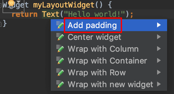
which gives you this:
    Widget myLayoutWidget() {
      return Padding(
        padding: EdgeInsets.all(8.0),
        child: Text("Hello world!"),
      );
    }
The EdgeInsets parameter is used to specify the amount of padding. Here all was used to indicate that every side (left, top, right, and bottom) should have equal padding. If you want them to have different values, then you can use only instead of all.
Hot reload the app and you should have this:

Notice that now the text has moved away from the edges. It has a padding of 8.0 logical pixels all around it.
Experiment yourself:
- Change the padding value
- Make the top padding be different than the right padding
Alignment
To center a widget, the concept is the same as it was for padding. This time you just wrap your widget with a Center widget. You can type it out or there is a shortcut menu option for it, too.
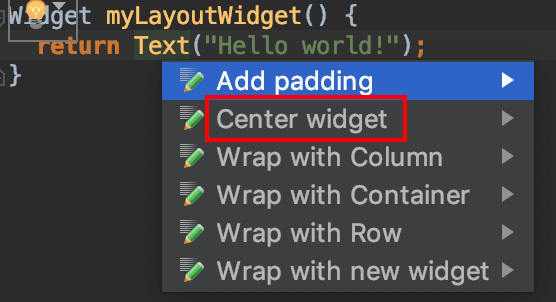
In addition to centering it, I added some styling to the Text widget so that the font size is more visible. If you are going the cut-and-paste route, then replace the myLayoutWidget() method with the following code:
    Widget myLayoutWidget() {
      return Center(
        child: Text(
          "Hello world!",
          style: TextStyle(fontSize: 30),
        ),
      );
    }
Hot reload your app and you should see the text centered in middle of the screen.

What about if you want to align a widget somewhere else? You can use the Align widget for that. You can either pass in relative x and y values or you can use the predefined ones. Here are the options. The items in the same row are equivalent.
Alignment.topLeft |
Alignment(-1.0, -1.0) |
|---|---|
Alignment.topCenter |
Alignment(0.0, -1.0) |
Alignment.topRight |
Alignment(1.0, -1.0) |
Alignment.centerLeft |
Alignment(-1.0, 0.0) |
**Alignment.center** |
**Alignment(0.0, 0.0)** |
Alignment.centerRight |
Alignment(1.0, 0.0) |
Alignment.bottomLeft |
Alignment(-1.0, 1.0) |
Alignment.bottomCenter |
Alignment(0.0, 1.0) |
Alignment.bottomRight |
Alignment(1.0, 1.0) |
You can see that another way to center something is to use Alignment.center or Alignment(0.0, 0.0). Actually, the Center widget is just a special case of the Align widget.
The following is an image I made for this Stack Overflow answer. (Check that answer out for even more details on alignment.)

Notice the (1,2) position in the bottom right. This shows that you can even align something outside of the parent. Remember that these numbers are relative to the width and height of the parent widget.
Your turn. Paste in the following code.
    Widget myLayoutWidget() {
      return Align(
        alignment: Alignment.topCenter,
        child: Text(
          "Hello",
          style: TextStyle(fontSize: 30),
        ),
      );
    }
Now adjust the Alignment to try to get the text to move everywhere you can see “Hello” in the following image (but just one location at a time).

Did you get the blue one, too? For that you use Alignment(0.5, 0.5).
Container
We already met the Container widget in the last lesson. It is a combination of several simpler widgets. In addition to having Padding and Align built in, it also has a DecoratedBox (for background color, border, and more) and a ConstrainedBox (for size constraints).
Plug this code in:
    Widget myLayoutWidget() {
      return Container(
        margin: EdgeInsets.all(30.0),
        padding: EdgeInsets.all(10.0),
        alignment: Alignment.topCenter,
        width: 200,
        height: 100,
        decoration: BoxDecoration(
          color: Colors.green,
          border: Border.all(),
        ),
        child: Text("Hello", style: TextStyle(fontSize: 30)),
      );
    }
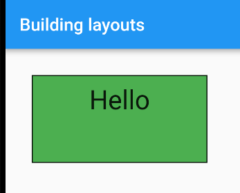
Play around with the parameters and see how adjusting them affects how the widgets look. Notice the margin parameter. Margin means the spacing outside of the border, while padding is the spacing inside of the border. Technically speaking, though, there is no such thing as margin in Flutter. Under the hood it is just another Padding widget that wraps the DecoratedBox.
Note: Flutter is open source and well documented. You can learn a lot about how widgets are built if you explore the source code. In Android Studio Command + click (or Ctrl + click in Windows/Linux) on the widget name to view its source code.
Basic layout widgets (multiple children)
The widgets above only took one child. When creating a layout, though, it is often necessary to arrange multiple widgets together. We will see how to do that using rows, columns, and stacks.
Rows and columns
Rows are easy. Just pass in a list of widgets to Row’s children parameter.
    Widget myLayoutWidget() {
      return Row(
        children: [
          Icon(Icons.home),
          Icon(Icons.home),
          Icon(Icons.home),
          Icon(Icons.home),
        ],
      );
    }
which gives

Now replace Row with Column and you get

What if you want to make the contents of the row or column be evenly spaced across the screen? Then wrap each child with an Expanded widget.
    Widget myLayoutWidget() {
      return Row(
        children: [
          Expanded(child: Icon(Icons.home)),
          Expanded(child: Icon(Icons.home)),
          Expanded(child: Icon(Icons.home)),
          Expanded(child: Icon(Icons.home)),
        ],
      );
    }

The Expanded widget can take a flex parameter. This is useful for giving size weights to the children. For example, here are two Containers in a row. The first one takes up 70% of the row and the second one takes up 30%.
    Widget myLayoutWidget() {
      return Row(
        children: [
          Expanded(
            flex: 7,
            child: Container(
              color: Colors.green,
            ),
          ),
          Expanded(
            flex: 3,
            child: Container(
              color: Colors.yellow,
            ),
          ),
        ],
      );
    }

Notes:
- If you wanted a single view to only take a fraction of its parent’s size, then you could use a FractionallySizedBox.
- Check out Flutter — Row/Column Cheat Sheet for much, much more.
Stacks
The Stack widget lays out its children like a stack of pancakes. You set it up like the Row and Column widgets. Whichever child comes first is the one on the bottom.
You could do something like this:
    Widget myLayoutWidget() {
      return Stack(
        children: [
          Icon(Icons.home),
          Icon(Icons.home),
          Icon(Icons.home),
          Icon(Icons.home),
        ],
      );
    }
but who needs four icons stacked on top of each other?

A more likely scenario is to use a stack to write text on an image. Let’s take this image

and put it in our project:
- Create an
imagesfolder in the root of your project and copy thesheep.jpgfile into it. - Register
imagesas an assets folder in yourpubspec.yamlfile.
    flutter:
      assets:
        - images/
(If that didn’t make sense, see this post for more details.)
Now we can get the image in code and use a Stack widget to display some text over it.
    Widget myLayoutWidget() {
      return Stack(

        // any unpositioned children (ie, our text) will be aligned at the bottom right
        alignment: Alignment.bottomRight,

        children: [

          // first child in the stack is on bottom
          Image.asset('images/sheep.jpg'), //            <--- image

          // second child in the stack
          Padding(
            padding: EdgeInsets.all(16.0),
            child: Text(
              'Baaaaaa', //                              <--- text
              style: TextStyle(fontSize: 30),
            ),
          ),

        ],
      );
    }
Do a full restart rather than a hot reload.

So the take away is that any time you need overlapping widgets, use a Stack to lay them out. (That’s not always the case, but you can take it as a general rule.)
Other layout widgets
We don’t have space to cover all of the layout widgets here, but you have seen the most important ones already. Here are a few others that deserve mentioning:
- ListView: This widget scrolls rows or columns of content that is too big to fit on the screen. We saw this in our last lesson on widgets.
- GridView: This widget scrolls content that is laid out in a grid of rows and columns.
- Scaffold: This is a widget provided by the Material package. It gives an easy way to add an AppBar, FloatingActionButton, Drawer, BottomNavigationBar, SnackBar, and more. Look at your
main.dartfile and you’ll see that we are using a Scaffold widget already.
Building complex layouts
Since you already know how to use the simple layout widgets that we talked about above, there really isn’t anything hard about building complex layouts. The trick is just to break the complex layout into smaller simple layouts. Rows and columns are your friends here.
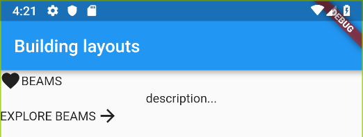
As an example, lets take this image from the Pusher website and duplicate its layout:

How can we convert this into simple rows and columns? First notice that it can be divided into a single column with three rows.

The first and the third rows both have two simple items: an image and a text string.
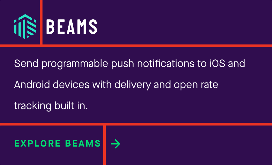
We now have enough information to build our complex layout widget. Before you look at the code below, try to build it yourself using what we have already learned. Instead of the Pusher Beams icon, you can use another placeholder icon or image. I’ll use a 💚.
Got it? Need a hint? Here is a rough outline that implements the structure that we saw in the image above:
    Widget myLayoutWidget() {
      return Column(
        children: [
          Row(
            children: [
              Icon(Icons.favorite),
              Text('BEAMS'),
            ],
          ),
          Text('description...'),
          Row(
            children: [
              Text('EXPLORE BEAMS'),
              Icon(Icons.arrow_forward),
            ],
          ),
        ],
      );
    }
It needs some work, but you can see that we have the correct structure. Now make it look good by adding padding, alignment, and color. Try to do it yourself before you look at my code below.
Really. Don’t look yet. Not until you try it yourself. I’m serious.
OK, ready?
    Widget myLayoutWidget() {

      // wrap everything in a purple container
      return Container(
        margin: EdgeInsets.all(16.0),
        padding: EdgeInsets.all(16.0),
        decoration: BoxDecoration(
          color: Colors.purple[900],
          border: Border.all(),
          borderRadius: BorderRadius.all(Radius.circular(3.0)),
        ),

        // column of three rows
        child: Column(

          // this makes the column height hug its content
          mainAxisSize: MainAxisSize.min,
          children: [

            // first row
            Row(
              children: [
                Padding(
                  padding: EdgeInsets.only(right: 8.0),
                  child: Icon(Icons.favorite,
                    color: Colors.green,
                  ),
                ),
                Text(
                    'BEAMS',
                  style: TextStyle(
                    color: Colors.white,
                  ),
                ),
              ],
            ),

            // second row (single item)
            Padding(
              padding: EdgeInsets.symmetric(
                vertical: 16.0,
                horizontal: 0,
              ),
              child: Text('Send programmable push notifications to iOS and Android devices with delivery and open rate tracking built in.',
                style: TextStyle(
                  color: Colors.white,
                ),
              ),
            ),

            // third row
            Row(
              children: [
                Text('EXPLORE BEAMS',
                  style: TextStyle(
                    color: Colors.green,
                  ),
                ),
                Padding(
                  padding: EdgeInsets.only(left: 8.0),
                  child: Icon(Icons.arrow_forward,
                    color: Colors.green,
                  ),
                ),
              ],
            ),

          ],
        ),
      );
    }
Ugh, look at that code! I’ve made the terrible mountain and valley indentations that I was complaining about last time. We’ll get back to that. Right now take a look at the result:

It’s not perfect, but it’s not bad, either. I’m happy with it.
Making complex layouts readable
All the indentation in the code above makes it hard to read. The solution to this is to break the large code block into smaller chunks. There are a few ways to do this.
Break sections out as variables
In the abbreviated code below the rows have been extracted from the bigger widget into variables.
    Widget myLayoutWidget() {

      Widget firstRow = Row(
        ...
      );
      Widget secondRow = ...
      Widget thirdRow = ...

      return Container(
        ...
        child: Column(
          children: [
            firstRow,
            secondRow,
            thirdRow,
          ],
        ),
      );
    }
Break sections out as functions
This is basically the same as above, except this time the Row is a function instead of a variable. This is how we set up the boilerplate code at the beginning of the lesson with the myLayoutWidget() function.
Here is what firstRow() would look like:
    Widget firstRow() {
      return Row(
        children: [
          Padding(
            padding: EdgeInsets.only(right: 8.0),
            child: Icon(Icons.favorite,
              color: Colors.green,
            ),
          ),
          Text(
            'BEAMS',
            style: TextStyle(
              color: Colors.white,
            ),
          ),
        ],
      );
    }
It is called like this:
        ...
        child: Column(
          children: [
            firstRow(),
            secondRow(),
            thirdRow(),
          ],
        ...
Break sections out as widgets
The MyApp widget in the boilerplate code at the beginning of this lesson is an example of creating a custom widget.
Here is the first row extracted as its own widget.
    class FirstRow extends StatelessWidget {
      // the build method is required when creating a StatelessWidget
      @override
      Widget build(BuildContext context) {
        return Row(
          children: [
            Padding(
              padding: EdgeInsets.only(right: 8.0),
              child: Icon(Icons.favorite,
                color: Colors.green,
              ),
            ),
            Text(
              'BEAMS',
              style: TextStyle(
                color: Colors.white,
              ),
            ),
          ],
        );
      }
    }
The widget is created like this:
        ...
        child: Column(
          children: [
            FirstRow(),
            SecondRow(),
            ThirdRow(),
          ],
        ...
Note: You may have seen the
newkeyword used in examples around the Internet. As of Dart 2, though,newis no longer required when creating an object.
Tools
Flutter has a few builtin tools for helping you debug layouts.
Flutter Inspector
In Android Studio you can find the Flutter Inspector tab on the far right. Here we see our layout as a widget tree.
Visual rendering
You can turn on visual rendering by setting debugPaintSizeEnabled to true in your main() function.
In your main.dart file replace this line
void main() => runApp(MyApp());
with this
    // add this line to your imports
    import 'package:flutter/rendering.dart';

    // update your main() function
    void main() {
      debugPaintSizeEnabled = true; //         <--- enable visual rendering
      runApp(MyApp());
    }
This outlines your widgets with blue in the emulator. You will need to do a full restart of your app rather than a hot reload to see it take effect.

Note: If you are using Visual Studio Code then you will need to run
[Flutter: Toggle Debug Painting](https://stackoverflow.com/a/49340887/3681880)from the Command Palette while the app is running in debug mode.
Conclusion
You’ve made a lot of progress! You not only have a working understanding of widgets, but you can also combine them together to make complex UI layouts.
In the next lesson we will explore what I consider to be the last of our First Steps with Flutter, that is, making the app respond to user input. After that you will have all the basic tools to start creating your own app. Of course, there will still be a lot to learn, but with a little Google magic and hacker determination, you’ll make steady progress.
The source code for this lesson is available on GitHub.
Flutter Tutorial for Beginners: Responding to user input
Introduction
In the two previous tutorials we saw that widgets are blueprints for everything that you can see (and many things that you can’t see) in the user interface. Simple widgets can be combined together to make complex layouts. The majority of these layouts can be built by dividing your design into rows (use the Row widget), columns (use the Column widget), and layers (use the Stack widget).
The thing about those layouts, though, is that they were static. You could touch and tap and swipe them all day and they wouldn’t do a thing. We are going to fix that in this lesson.
Today we’re going to explore how to actually do something when the user interacts with the widgets that we’ve added to our layout. The emphasis will be on simple, easy to reproduce examples. I strongly encourage you to work along as we go through each one. Make little changes to the code and see how that affects the behavior. This will greatly increase your overall learning.
Prerequisites
This tutorial is for beginning Flutter developers. However, I’m assuming that you have the Flutter development environment set up and that you know how to create basic layouts using widgets. If not, refer to the following links:
- Setup Flutter
- Learn about widgets
- Learn about layouts
In this tutorial we’ll start to do a little more programming with the Dart language. I’m assuming that you have a basic knowledge of object oriented programming, but I don’t assume that you know Dart.
This lesson was tested using Flutter 1.0 with Android Studio. If you are using Visual Studio Code, though, it shouldn’t be a problem. The commands and shortcuts are a little different, but they both fully support Flutter.
Review exercise
Before I give you the boilerplate code that we’ll use in the examples below, let’s see if you can create the following layout on your own.

How did you do? If you weren’t able to do it, you might want to check out the previous lesson on building layouts. You may have created something like this:
    void main() => runApp(MyApp());

    class MyApp extends StatelessWidget { //            <---  StatelessWidget
      @override
      Widget build(BuildContext context) {
        return MaterialApp(
          ...
            body: myLayoutWidget(),
          ...
    }

    Widget myLayoutWidget() {
      return Column(
        children: [
          Text(...),
          RaisedButton(...),
        ],
      );
    }
Widgets and state
That layout above was fine as far as layouts go, but if you try to change the text when the button is pressed, you’ll run into problems. That’s because widgets are immutable: they can’t be changed. They can only be recreated. But to recreate the Text widget we need to put the string into a variable. We call that variable the state. It’s similar in idea to the phrases “the state of affairs” or a “State of the Union Address,” which deal with the current conditions of some people or country. Similarly, when we talk about a widget, the state refers to the values (in other words, the current condition) of the variables associated with that widget.
You notice in the code above that it’s a StatelessWidget. StatelessWidgets don’t have any state. That is, they don’t have any mutable variables. So if we have a variable that we want to change, then we need a StatefulWidget.
StatefulWidgets work like this:
- There is a StatefulWidget class and a State class.
- The StatefulWidget class initializes the State class.
- The State class holds the variables and tells the StatefulWidget class when and how to build itself.
Note: Behind the scenes there is also an Element that is created from the widget. But as I said, it’s behind the scenes and we can happily ignore it at this point in our journey.
So practically speaking, whenever we need a StatefulWidget, we have to create two classes, a widget class and a State class. Here is the basic setup:
    // widget class
    class MyWidget extends StatefulWidget {
      @override
      _MyWidgetState createState() => _MyWidgetState();
    }

    // state class
    class _MyWidgetState extends State<MyWidget> {
      @override
      Widget build(BuildContext context) {
        return ...; // widget layout
      }
    }
Notice that
- the widget class has a
createState()method that returns the State. The State class has abuild()method that builds the widget. - the
_underscore at the beginning of the name_MyWidgetStatemakes it private. It can only be seen within this file. This is a characteristic of the Dart language.
Responsive widgets
Now that we’ve talked about state, we’re ready to use it to make our widgets respond to user input.
Buttons

Replace the code in your main.dart file with the following code:
    import 'package:flutter/material.dart';

    void main() => runApp(MyApp());

    // boilerplate code
    class MyApp extends StatelessWidget {
      @override
      Widget build(BuildContext context) {
        return MaterialApp(
          title: 'Flutter',
          home: Scaffold(
            appBar: AppBar(
              title: Text('Flutter'),
            ),
            body: MyWidget(),
          ),
        );
      }
    }

    // widget class
    class MyWidget extends StatefulWidget {
      @override
      _MyWidgetState createState() => _MyWidgetState();
    }

    // state class
    // We will replace this class in each of the examples below
    class _MyWidgetState extends State<MyWidget> {

      // state variable
      String _textString = 'Hello world';

      // The State class must include this method, which builds the widget
      @override
      Widget build(BuildContext context) {
        return Column(
          children: [
            Text(
              _textString,
              style: TextStyle(fontSize: 30),
            ),
            RaisedButton( //                         <--- Button
              child: Text('Button'),
              onPressed: () {
                _doSomething();
              },
            ),
          ],
        );
      }

      // this private method is run whenever the button is pressed
      void _doSomething() {
        // Using the callback State.setState() is the only way to get the build
        // method to rerun with the updated state value.
        setState(() {
          _textString = 'Hello Flutter';
        });
      }
    }
Run the code that you pasted in above. It should look the same as our original layout, but now the first time we press the button, the text gets updated.
Notes:
- The RaisedButton widget has an
onPressedparameter where you can add a function that will be called whenever the button is pressed. - You have to update variables inside the
setState()method if you want the changes to be reflected in the UI. - Do a hot restart (instead of a hot reload) to reset the state to the initial values.
TextFields
In this example whenever a TextField is changed, the Text widget above it gets updated.

Replace the _MyWidgetState() class with the following code:
    class _MyWidgetState extends State<MyWidget> {

      String _textString = 'Hello world';

      @override
      Widget build(BuildContext context) {
        return Column(
          children: [
            Text(
              _textString,
              style: TextStyle(fontSize: 30),
            ),
            TextField( //                       <--- TextField
              onChanged: (text) {
                _doSomething(text);
              },
            )
          ],
        );
      }

      void _doSomething(String text) {
        setState(() {
          _textString = text;
        });
      }
    }
Notes:
- TextField has an
onChangedparameter for a callback method. This method provides the current string after a change has been made. - If you want to get the text value without listening to
onChanged, you can set the TextField’scontrollerparameter. See this post.
Checkboxes
For a checkbox with a label you can use a CheckboxListTile.

Replace the _MyWidgetState() class with the following code:
    class _MyWidgetState extends State<MyWidget> {

      bool _checkedValue = false;

      @override
      Widget build(BuildContext context) {
        return CheckboxListTile( //                   <--- CheckboxListTile
          title: Text('this is my title'),
          value: _checkedValue,
          onChanged: (newValue) {
            _doSomething(newValue);
          },
          // setting the controlAffinity to leading makes the checkbox come
          // before the title instead of after it
          controlAffinity: ListTileControlAffinity.leading,
        );
      }

      void _doSomething(bool isChecked) {
        setState(() {
          _checkedValue = isChecked;
        });
      }
    }
Notes:
- If you want to create a custom checkbox then you can use the Checkbox widget. It doesn’t have a title included.
- Try commenting out the
controlAffinityline to see how that affects the layout. See this post also. - Here is an example of a list of checkboxes.
Dialogs
There are a few kinds of dialogs in Flutter, but let’s looks at a common one: the AlertDialog. It’s not difficult to set up.

Replace the _MyWidgetState() class with the following code:
    class _MyWidgetState extends State<MyWidget> {

      @override
      Widget build(BuildContext context) {
        return RaisedButton(
          child: Text('Button'),
          onPressed: () {
            _showAlertDialog();
          },
        );
      }

      void _showAlertDialog() {

        // set up the button
        Widget okButton = FlatButton(
          child: Text("OK"),
          onPressed: () {
            // This closes the dialog. `context` means the BuildContext, which is
            // available by default inside of a State object. If you are working
            // with an AlertDialog in a StatelessWidget, then you would need to
            // pass a reference to the BuildContext.
            Navigator.pop(context);
          },
        );

        // set up the AlertDialog
        AlertDialog alert = AlertDialog(
          title: Text("Dialog title"),
          content: Text("This is a Flutter AlertDialog."),
          actions: [
            okButton,
          ],
        );

        // show the dialog
        showDialog(
          context: context,
          builder: (BuildContext context) {
            return alert;
          },
        );

      }
    }
Notes:
- An AlertDialog needs the BuildContext. This is passed into the
build()method and is also a property of the State object. - The Navigator is used to close the dialog. We will look more at navigators shortly.
Try a little more:
- Can you make two buttons?
- Three buttons?
- See this post for the answer.
Gesture detectors
In the examples above we’ve seen how to respond to user input using some of the common widgets that are available. These widgets provide callback properties like onPressed and onChanged. Other widgets (like Text or Container) don’t have a built in way to interact with them. Flutter gives us an easy way to make them interactive, though. All you have to do is wrap any widget with a GestureDetector, which is itself a widget.
For example, here is a Text widget wrapped with a GestureDetector widget.
    GestureDetector(
      child: Text('Hello world'),
      onTap: () {
        // do something
      },
    );
When the text is tapped, the onTap callback will be run. Super easy, isn’t it?
You can try it. Every time you tap the text, the color changes.

Add import 'dart:math'; to your main.dart file and replace the _MyWidgetState() class with the following code:
    class _MyWidgetState extends State<MyWidget> {

      Color textColor = Colors.black;

      @override
      Widget build(BuildContext context) {
        return GestureDetector(  //                  <--- GestureDetector
          child: Text(
            'Hello world',
            style: TextStyle(
              fontSize: 30,
              color: textColor,
            ),
          ),
          onTap: () {  //                            <--- onTap
            _doSomething();
          },
        );
      }

      void _doSomething() {
        setState(() {
          // have to import 'dart:math' in order to use Random()
          int randomHexColor = Random().nextInt(0xFFFFFF);
          int opaqueColor = 0xFF000000 + randomHexColor;
          textColor = Color(opaqueColor);
        });
      }
    }
You are not limited to detecting a tap. There tons of other gestures that are just as easy to detect. Replace onTap in the code above with a few of them. See how the gestures are detected.
onDoubleTaponLongPressonLongPressUponPanDownonPanStartonPanUpdateonPanEndonPanCancelonScaleStartonScaleUpdateonScaleEndonTaponTapDownonTapUponTapCancelonHorizontalDragDownonHorizontalDragUpdateonHorizontalDragEndonHorizontalDragCancelonVerticalDragStartonVerticalDragDownonVerticalDragUpdateonVerticalDragEndonVerticalDragCancel
Navigation
A lesson about responding to user input wouldn’t be complete without talking about navigation. How do we go to a different screen in Flutter? And once there, how do we go back?
Well, as you might expect, a new screen in Flutter is just a new widget. The way to get to these widgets is called a route, and Flutter uses a class called a Navigator to manage the routes. To show a new screen, you use the Navigator to push a route onto a stack. To dismiss a screen and go back to the previous screen, you pop the route off the top of the stack.
Here is how you would navigate to a new widget called SecondScreen.
    Navigator.push(
        context,
        MaterialPageRoute(
          builder: (context) => SecondScreen(),
        ));
The context is the BuildContext of the current widget that is wanting to navigate to the new screen. The MaterialPageRoute is what creates the route to the new screen. And Navigator.push means that we are adding the route to the stack.
Here is how you would return from the SecondScreen back to the first one.
Navigator.pop(context);
Does that look familiar? Yes, we already used that same code to dismiss the AlertDialog that we made before.
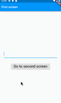
Try it out yourself. Here is what it will look like on the iOS simulator.

Replace all of the code in main.dart with the following code.
    import 'package:flutter/material.dart';

    void main() {
      runApp(MaterialApp(
        title: 'Flutter',
        home: FirstScreen(),
      ));
    }

    class FirstScreen extends StatelessWidget {
      @override
      Widget build(BuildContext context) {
        return Scaffold(
          appBar: AppBar(title: Text('First screen')),
          body: Center(
            child: RaisedButton(
              child: Text(
                'Go to second screen',
                style: TextStyle(fontSize: 24),
              ),
              onPressed: () {
                _navigateToSecondScreen(context);
              },
            )
          ),
        );
      }

      void _navigateToSecondScreen(BuildContext context) {
        Navigator.push(
            context,
            MaterialPageRoute(
              builder: (context) => SecondScreen(),
            ));
      }
    }

    class SecondScreen extends StatelessWidget {
      @override
      Widget build(BuildContext context) {
        return Scaffold(
          appBar: AppBar(title: Text('Second screen')),
          body: Center(
            child: RaisedButton(
              child: Text(
                'Go back to first screen',
                style: TextStyle(fontSize: 24),
              ),
              onPressed: () {
                _goBackToFirstScreen(context);
              },
            ),
          ),
        );
      }

      void _goBackToFirstScreen(BuildContext context) {
        Navigator.pop(context);
      }
    }
Passing data forward
Sometimes you need to send data to the new screen that you are displaying. This is easy to do by passing it in as a parameter in the SecondScreen widget’s constructor.
    class SecondScreen extends StatelessWidget {
      final String text;
      SecondScreen({Key key, @required this.text}) : super(key: key);
The Dart constructor syntax may look a little strange to you. Here is a brief explanation:
- The comma separated items between the
{ }braces are the named parameters. They’re optional, but users will be warned if they don’t provide an@requiredparameter. - In Flutter a Key is used to differentiate widgets in the widget tree. See this video for more.
- The
this.prefix is used for variables that are defined in the current class. - The part after the
:colon is a comma separated initialization list. The lines in this list are run before the super class’s constructor. In this case there is nothing here except a call to a specific constructor of the super class. - See the answers to this Stack Overflow question for more about constructors.
Now that the constructor is set up, you can pass in data when you call it from the FirstScreen.
    Navigator.push(
        context,
        MaterialPageRoute(
          builder: (context) => SecondScreen(text: 'Hello',),
        ));
- Note the text “Hello” being passed in as a parameter.
You can find the full code for the example here.
Passing data back
At other times you need to send data back to the previous screen. Flutter does this in an interesting way.
- The first screen starts the second screen and then waits for a result, which it can use after the second screen finishes. You will notice the
asyncandawaitkeywords below. Dart makes it easy to do things that you have to wait for (like web requests or long running tasks). Read this for more information. It’s way easier than Android AsyncTasks!
      void startSecondScreen(BuildContext context) async {

        // start the SecondScreen and wait for it to finish with a result
        final result = await Navigator.push(
            context,
            MaterialPageRoute(
              builder: (context) => SecondScreen(),
            ));

        // after the SecondScreen result comes back, update the Text widget with it
        setState(() {
          text = result;
        });

      }
- In the second screen you pass the data back by supplying it as a parameter in the
popmethod.
Navigator.pop(context, 'How are you?');

You can find the full code for the example here.
Conclusion
In this lesson we have gone from static layouts to dynamic ones with widgets that respond to user input. Making responsive widgets like this means that we need to deal with things that change, whether it’s text, color, size, or any number of other things that affect the UI. The value of these variables is known as the state, and widgets that have state are known as StatefulWidgets.
Properly managing state in Flutter is a big topic. You have already seen two ways to do it in this lesson. One was having a method variable in the State class. It was available to all of the widgets throughout the class. As the complexity increases, though, it is not practical to include the entire layout in a single build() method, nor is it good practice to allow global variables.
Another way we managed state in this lesson was passing data as a parameter into another widget. This works great when one widget is directly calling another, but it can get cumbersome when you need the state from another widget somewhere far away in the widget tree.
#flutter #mobile-apps #ios #dart