In this article, I’ll go through the basics of using Plotly and Python for drawing Sankey Diagrams.
They’re a convenient chart for visualizing any kind of measurable flow — Some examples are the flow of travelers, spellers, and money.

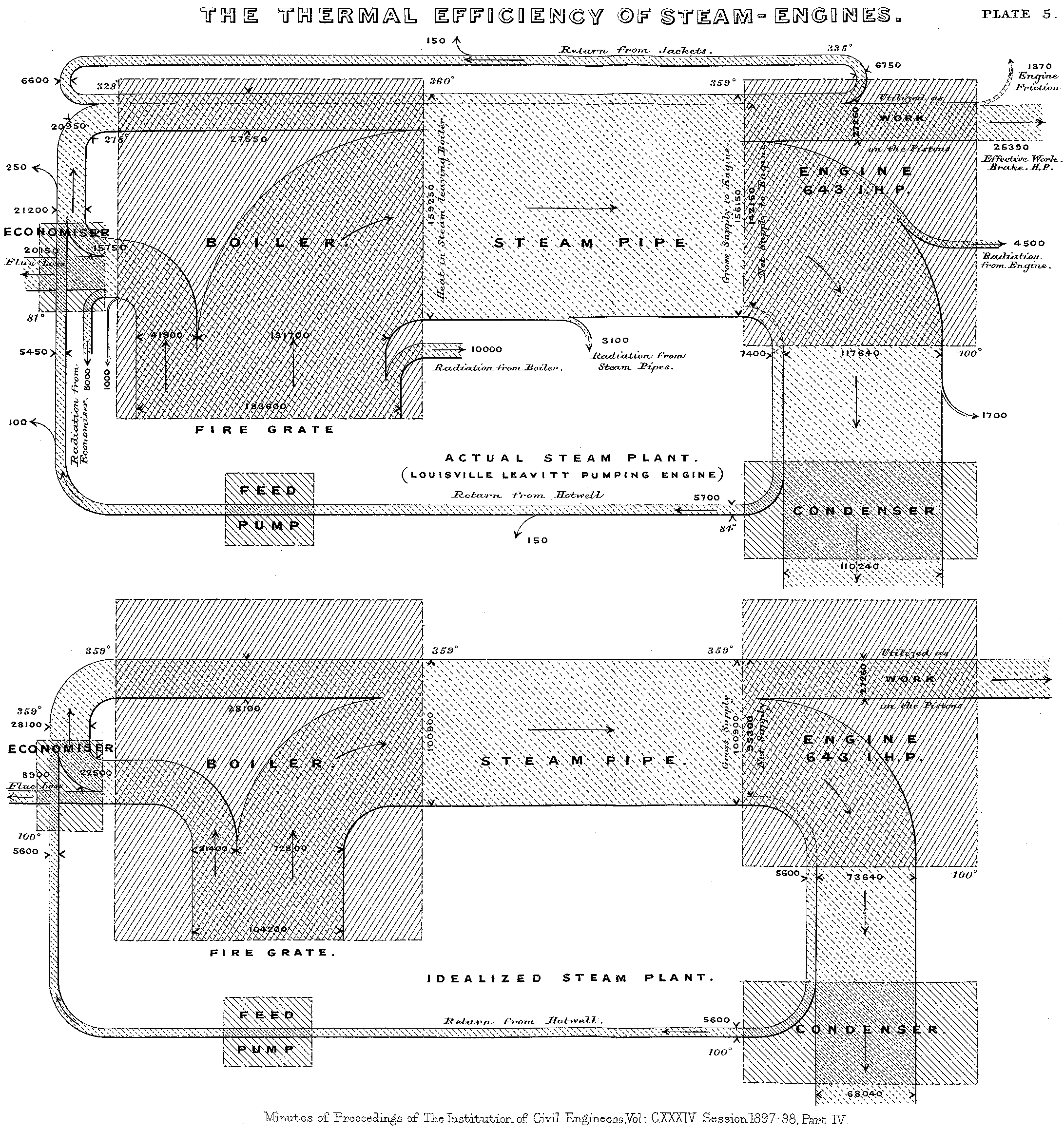
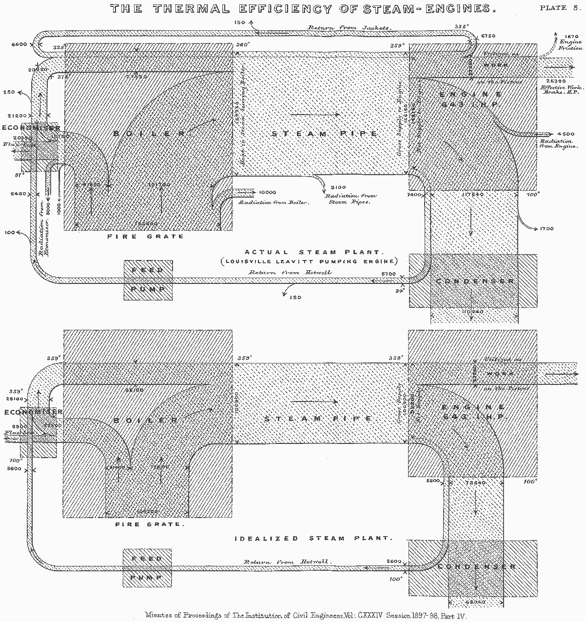
Sankey’s diagram showing the energy efficiency of a steam engine, 1898
The creation of this diagram is credited to the Irish Captain Matthew H. P. R. Sankey, who used it to visualize the energy efficiency of steam engines.
The idea of Sankey’s diagram is similar to a network chart, where links connect nodes.
The main difference being that in Sankey’s model, the links have different widths that encode a measurable variable they have in common.
Hands-on
For the following examples, I’ll use Plotly with Jupyter Lab to explore how to create a Sankey.
import plotly.graph_objects as go
There are different ways of building a chart with Plotly; I’ll use Graphical Objects, visualize the graphs with the Jupiter widgets, and export an HTML for the final visualization.
The Logic
Building a Sankey can be quite a struggle especially if you have too many nodes and connections, I’ll use lists for the examples to make it simpler, but you can adapt this logic with a JSON file or a Pandas Dataframe.
We will use go.Sankey to build the chart, which requires a link.
That link is a dictionary containing data about the connections we want to draw.
source = [0, 0, 1, 1, 0]
target = [2, 3, 4, 5, 4]
value = [8, 2, 2, 8, 4]
The source and target are lists of indexes for the nodes Plotly will connect, and the value is a list of numbers that will define the width of these connections.
link = dict(source = source, target = target, value = value)
data = go.Sankey(link = link)
print(data)

We saved the Sankey object to a variable called data, and now we can pass that data to a Figure;
fig = go.Figure(data)
And display the chart.
fig.show()

That’s the idea. Let’s try identifying those nodes so we can have a more unobstructed view of what is connecting what.
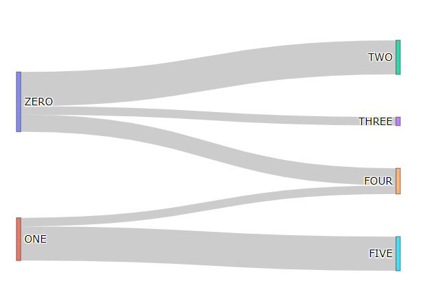
We’ll need a dictionary with the node’s data, which should contain a list with the labels. We can also add more parameters such as pad to customize the distance between the nodes, or thickness to define the size of their handles.
# data
label = ["ZERO", "ONE", "TWO", "THREE", "FOUR", "FIVE"]
source = [0, 0, 1, 1, 0]
target = [2, 3, 4, 5, 4]
value = [8, 2, 2, 8, 4]
# data to dict, dict to sankey
link = dict(source = source, target = target, value = value)
node = dict(label = label, pad=50, thickness=5)
data = go.Sankey(link = link, node=node)
# plot
fig = go.Figure(data)
fig.show()

That’s easier to understand. We can read the lists, and visualize how they connect.
#data-visualization #plotly #sankey-diagram #data-science #python
