Where to put the label in a web form? In the early days, we talked about left-aligned labels versus top-aligned labels. These days we talk about floating labels. Let’s explore why they aren’t a very good idea, and what to use instead.
I’ve been designing forms for over 20 years now, and I’ve tested many of them for large organizations like Boots, Just Eat and Gov.uk. One topic that comes up a lot with forms is: where to put the label. In the early days, we talked about left-aligned labels versus top-aligned labels.
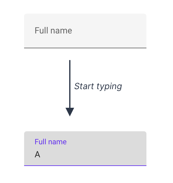
These days the focus is more about placeholders that replace labels and float labels. The latter start off inside the input. When the user starts typing, the label ‘floats’ up to make space for the answer:
Material Design text fields use the float label pattern. (Large preview)
Some people assume float labels are best because Google’s Material Design uses them. But in this case, Google is wrong.
Instead, I recommend using conventional text fields which have:
- The label outside the input (to tell the user what to type),
- A distinct border all the way around (to make it obvious where the answer goes).

A conventional text field
In this article, I’ll explain why I always recommend conventional text fields and why Google is wrong about using float labels for Material Design.
Float Labels Are Better Than A Common Alternative But They’re Still Problematic
Float labels were designed to address some problems with a commonly used alternative: placeholder labels. That’s where the label is placed inside the input but disappears when the user starts typing:

Placeholder label text field.
Having seen lots of people interacting with forms through my work first hand I know that placeholder labels are problematic.
This is because, for example, they:
- disappear as soon as the user types which can make it harder to remember what the input is for, especially for users with cognitive impairments;
- may be mistaken for an actual answer causing users to accidentally skip the field;
- are greyed out to indicate that it’s a label and not an answer — but this can make it harder to read.
Float labels don’t solve 2 of these problems: poor contrast and the chance of the label being mistaken for an actual answer. And while they attempt to address the problem of the label disappearing, in doing so, float labels introduce lots of other problems, too.
For example, the size of the label has to be tiny in order to fit inside the box, which can make it hard to read. And long labels cannot be used as they’ll get cropped by the input:

Long labels get cut off with Material Design text fields. (Large preview)
#web-development #web-design #developer
