Make your bar chart come to life
In my previous two articles on data analytics using the Covid-19 dataset, I first
- discussed how to perform data analytics using NumPy and Pandas (https://levelup.gitconnected.com/performing-data-analytics-on-the-covid-19-dataset-using-python-numpy-and-pandas-bdfc352c61e9), followed by,
- how to perform data visualization using matplotlib (https://levelup.gitconnected.com/performing-data-visualization-using-the-covid-19-dataset-47c441747c43).
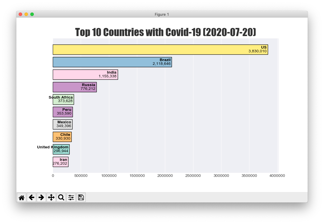
The Covid-19 dataset is a good candidate for exploring and understanding data analytics and visualisation. In this article, I will show you how to create a dynamic chart in matplotlib. In particular, I will create a racing bar chart to dynamically display the number of confirmed cases in each country as the days go by. At the end of this article, you will be able to see a chart like this:
Wrangling the Data
For a start, let’s use Jupyter Notebook to clean and filter all the data so that you have a clean dataset. Once the data is prepared, you will then be able to focus on creating the bar chart.
Importing the Packages
The first step is to import all the packages that you will be using for this project:
import pandas as pd
import numpy as np
import matplotlib.pyplot as plt
import datetime
#convid-19 #dataframes #pandas #matplotlib #racing-bar-chart