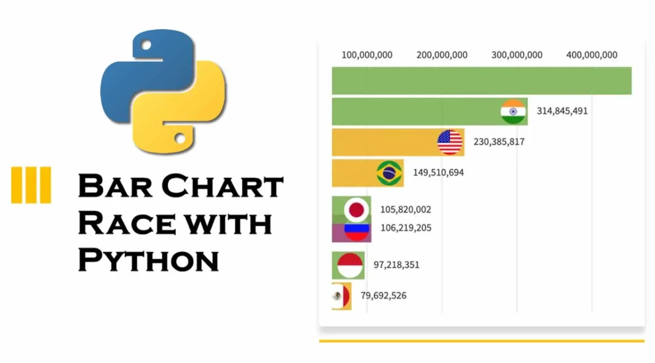
To visualize the features of different categories we use bar charts which are a very simple way of presenting the features. But when we are having a lot of features in one category only then a bar chart will not help. In this case, the Bar Chart Race will come into use. In this article, I will take you through creating an animated bar chart race with Python. A bar chart race helps in visualizing the change in features over time for each category.
Bar Chart Race with Python
For the task of creating an animated bar chart race, I will be using a GDP per capita forecast dataset provided by the OECD.
I’ll start by importing the necessary packages that we need for this task. I will be using Pandas for data management, Matplotlib for charts, Numpy for matrix operations:
import pandas as pd
import numpy as np
import matplotlib
import matplotlib.pyplot as plt
import matplotlib.ticker as ticker
import matplotlib.animation as animation
import matplotlib.colors as mc
import colorsys
from random import randint
import re
#python #data science #machine learning