Background
I work in Cyber Security. And if I’m being really honest, it’s not very interesting. There are plenty of tools, open-source or proprietary, that can automate many of the tedious tasks within a security role, but I always find myself more fascinated by how the tool works than by how much it’s helping me.
Cyber Security, Incident Response, Digital Forensics…They’re all very destructive by nature. But I’m a creative. How can a creative add value to an intrinsically destructive field? And how can I make my job more interesting by mixing it with my interests?
By creating tools.
This post is a walkthrough of a personal project I completed, which is a small step towards the creation of my own tool.
The Project
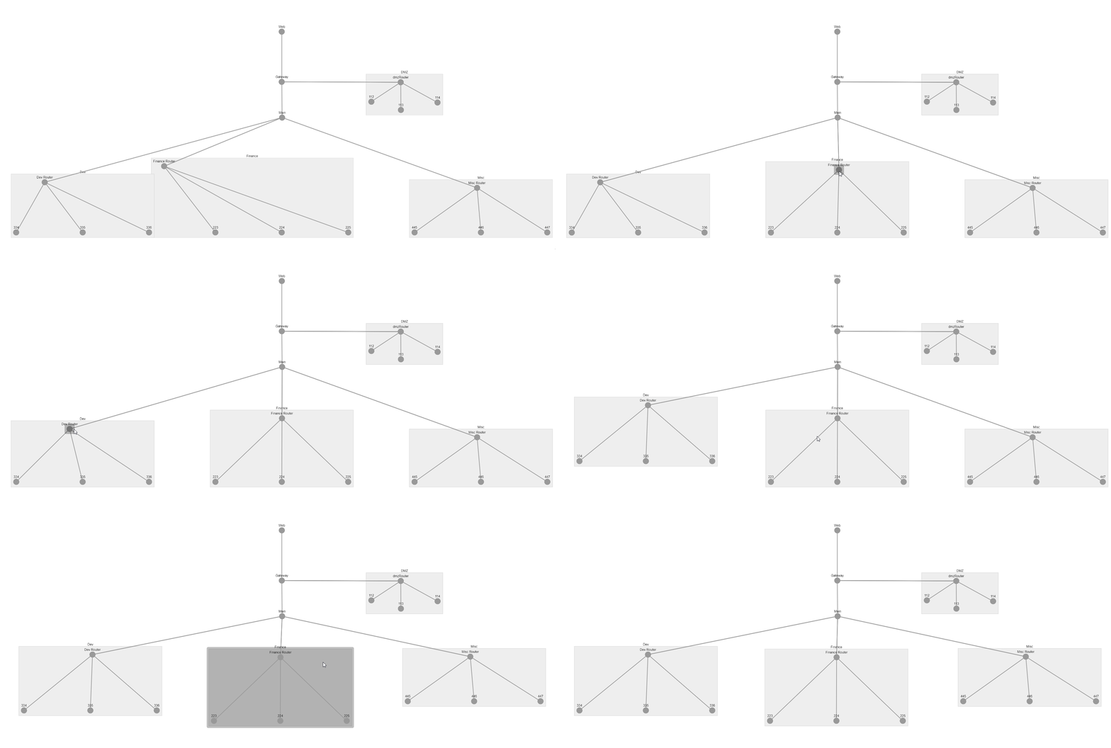
Turning thousands of lines of pcap data into interactive network visualisations.
Complete code available on my github repository.

Image by Author
Too often an Incident Responder asks for a map of the network, only to discover it’s more than 2 years old and not much more than a ghost of the current network topology.
So we try to create the ‘ground truth’ of what the network actually looks like. Various tools can be used for this, netflow, nmap, tracert. This example will focus on network packet captures, but a bit of Python applied in the right doses could adapt this project to any network mapping command line tool output.
Wireshark is a great tool, but as the size of the packet capture increases, the performance drops as it tries to parse the potential hundreds of thousands of lines of traffic data.
So I began by exporting my pcap data to a csv. Which python loves.
#data-science #dash #python #cybersecurity #data-visualization