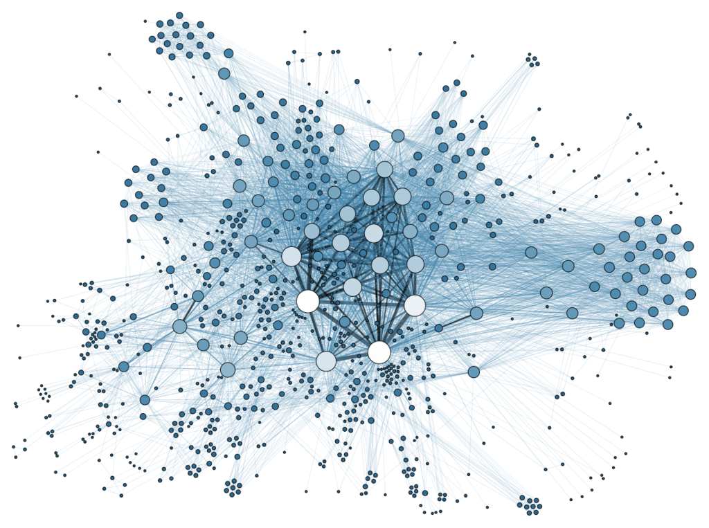
I just discovered — quite accidentally — how to export data from JIRA so naturally, I began to think of ways to visualize the information and potentially glean some insight from the dataset. I’ve stumbled upon the concept of network graphs and the idea quickly captured my imagination. I realized that I can use it to tell stories not only about the relationships between people but between words as well! But NLP is a big topic, so how about we walk first and run later?!
This is just a very gentle introduction so we won’t be using any fancy code here.
Network graphs “show interconnections between a set of entities” where entities arenodes and the connections between them are represented through links or edges. In the graph below, the dots are the nodes and the lines are called edges.

In this post, I’ll share the code that will let us quickly visualize a Pandas dataframe using a popular network graph package: networkx.
#pandas #machine-learning #data-analysis #data-science #matplotlib
