There are plenty of ways to visualize your data using Python and R, but the powerful business intelligence tool Tableau makes creating visualizations a simple drag-and-drop process.
Tableau is also more than just a tool you can use to create charts. You can write custom SQL, create complex calculated fields, and even generate high-quality forecasts!
Read on for a quick explanation of how Tableau automatically generates forecasts with just one click (gifs included).
A Brief Explanation of How Tableau Creates Forecasts
Tableau creates forecasts using the exponential smoothing method. You can do so on visualizations that plot a measure over time, although Tableau also supports you using an integer value instead of a date.
Forecasts are only as good as the data they are based on.
In general, you should include as much data as possible before trying to create a forecast. Tableau technically needs only five data points to create a time series forecast, and while it will even try to forecast for a view without sufficient data for an accurate model, forecasts are only as good as the data they are based on.
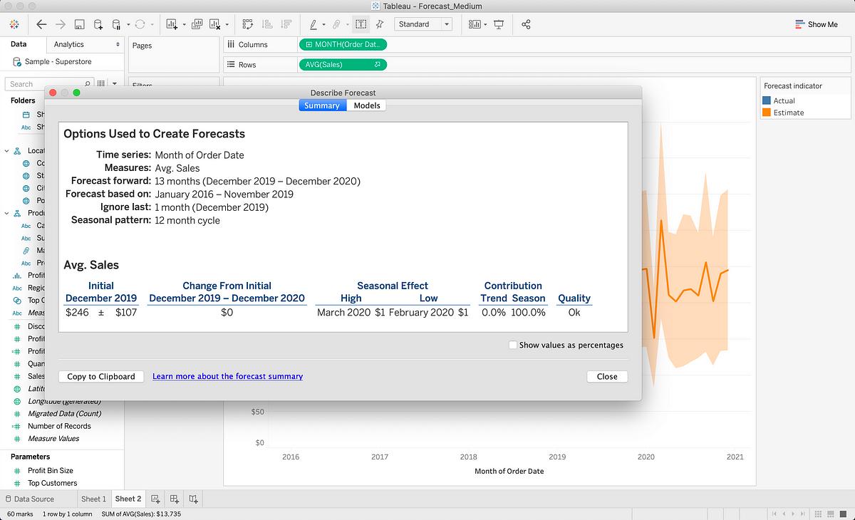
If you create a forecast based on too little data or data that is impacted too much by extraneous variables, your projections will most likely not fit the future. You should also take note of the Prediction Intervals that Tableau automatically generated with every forecast, to understand the range that forecast values are likely to fall under.
Tableau will select one of eight exponential smoothing models to create the best forecast (see the final section for more information). The exponential smoothing models may also take into account Trend (the overall increasing or decreasing direction of the model) and Seasonality (the patterns of fluctuation during specific periods).
Creating Forecasts in Tableau
For this walkthrough, we’ll be using the “Sample Superstore” data set that comes with Tableau. Open up a new workbook and connect to this data source if you want to follow along.
We start off with a simple graph that shows the average sales per month over time:
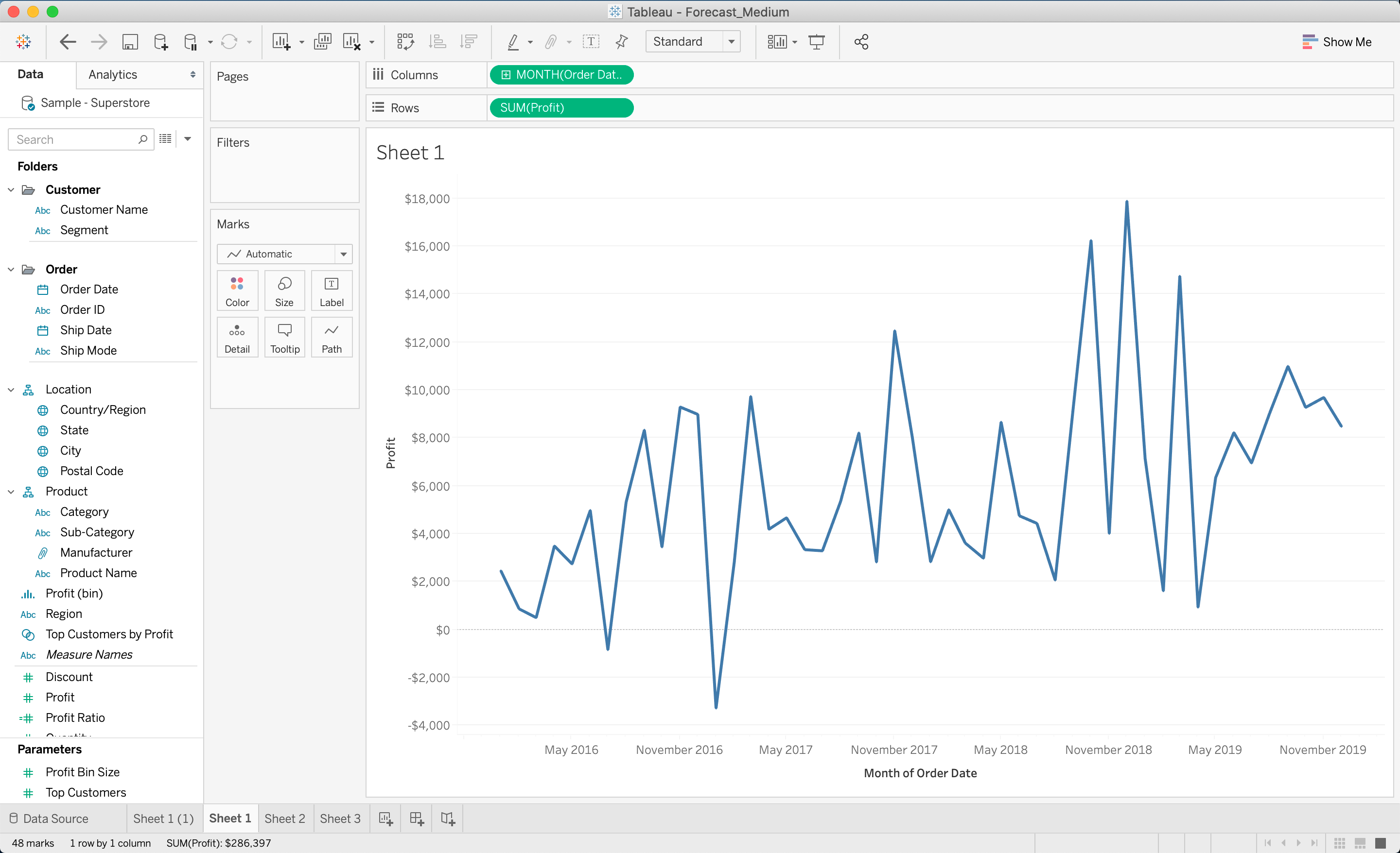
Basic graph showing average sales over time
Forecast and Trend/Seasonality Customization Options
To extend the graph with a forecast, right-click anywhere on the view (where the graph is) and click Show Forecast.
You can opt to customize how many periods ahead to forecast, but Tableau sets a default (in this case 13 months) that is usually appropriate.
#data-analysis #data-science #data-visualization #tableau #technology #data analysisa