With companies implementing Lean Six Sigma practices, it is imperative to keep track of how processes change over time. Control charts can help the business visualize process measurements over a span of time.
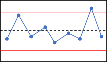
Control Chart (Image from r-bar.net)
First things first for those who don’t know what exactly is a control chart.
🚩 A control chart consists of 4 main features:
- X and Y-axis Values: The data value will be the Y-axis. This can be count of customers, count of tickets, revenue, cost, or whatever data value the business wants to measure. Time will be the X-axis.
- The Center Line (AKA Average): This is the mean/average of the data points. It is represented with a solid line drawn in the middle section of the graph.
- **Lower Control Limit **(LCL): This is found below the average and is referred to as -3 sigma line, which acts as a lower bound.
- **Upper Control Limit **(UCL): This is above the average and referred to as +3 sigma line, which acts as a upper bound.
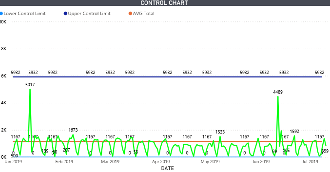
This is a control chart I created in Power BI (Image by Author)
🚩 Let’s get started by building that Control Chart in Power BI
In order to achieve the main features of a control chart, we start by creating some DAX measures:
For the Average calculation, you will simply be using the AVERAGE function. We included the ALLSELECTED function in order to make the calculation dynamic based on what the user selects in the date slicer.
AVERAGE CASES = CALCULATE(AVERAGEX(CONTROL_CHART_DATE,[TotalCases]), ALLSELECTED(CONTROL_CHART_DATE))
In order to derive the UCL and LCL, we first need to calculate the standard deviation. The syntax for standard deviation is as follows:
STDEV = CALCULATE(STDEVX.P(CONTROL_CHART_DATE,[TotalCases]),ALLSELECTED(CONTROL_CHART_DATE[DATE]))
Now that we have the standard deviation, we can input this piece inside the UCL and LCL syntax.
For UCL, we add the AVERAGE CASES measure with the STDDEV measure, then multiply by 3 (Hence, 3 sigmas).
Upper Control Limit (UCL) = AVERAGE CASES + [STDEV]*3
For LCL, we do the opposite of UCL. We subtract the AVERAGE CASES measure with the STDDEV measure, then multiply by 3.
Lower Control Limit (LCL) = AVERAGE CASES - [STDEV]*3
Create a line chart with the measures:
Once you created these measures, create a line chart. Drag LCL, UCL, and Average Cases into values. Select the Date for the axis.
#data-visualization #power-bi #data #power-bi-tutorials #statistics #data analysis