There is no modern interactive UI without buttons. They are an fundamental part of every digital solution. Learn how to improve the style of your buttons and delight users with perfect style.
This is the next tutorial from the series of quick tips that enhances your design. Read the first part.
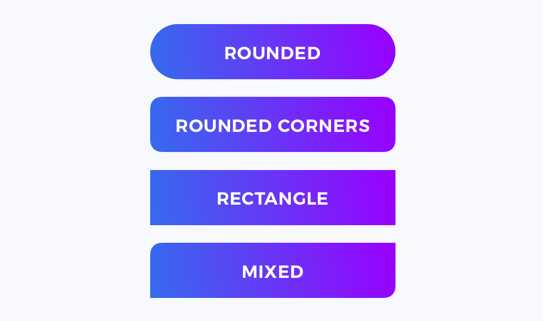
1. Choose a Shape
Buttons may be filled ones or just ghost buttons with stroke, but choosing the shape is the first step to create a better button. This may be a sharp rectangle or rounded one. It may be circular or mixed with some fancy unique shape.
It is important to establish one that will fit to the project style.
2. Pick a Color
Often main buttons get the Primary color of a brand. However, remember that buttons have to indicate their purpose, so choosing the color may depend on the context.
Always perform small research with users if you have any doubts on picking the right tone.

3. Apply Vivid Gradient
If the project brand allows that, consider applying a nice looking gradient. Thanks to this, the buttons look very modern. Gradients make buttons pop!

#ux-design #design-tutorial #sketch #ui-design #figma
