There are many attractive features to Svelte’s reactivity. In this article, I’d like to show you a tiny, simple, neat trick to optimize your website’s images for the appropriate device resolution. One of the reasons why so many websites take painfully long to load is due to being packed with high-resolution uncompressed images. Now, I won’t cover image compression in this article (you can compress images using many applications, even online free cloud-based such), but I would like to cover the issue of picking a resolution for your images.
Yes, what resolution should you upload your images in? You want your website to look beautiful for phones with small screens, but you also want it to look good for desktop visitors with high-res computer screens. The issue of having high-resolution images is that load times can get really long.
As SvelteJS is fully interactive, you can very easily display different images for different resolutions with very little code and without installing any external plugin or library.
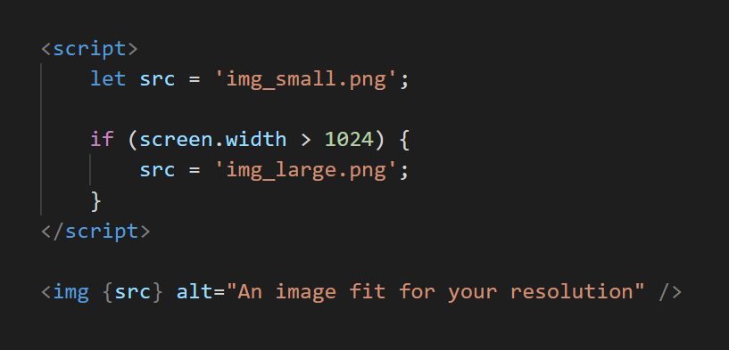
For example, if you want to display an image with a smaller resolution for smartphones and tablets and an image with a higher resolution for desktops, you could use this code snippet for your image module:
<script>
  let src = 'img_small.png';

  if (screen.width > 1024) {
      src = 'img_large.png';
  }
</script>
<img {src} alt="An image fit for your resolution" />
#technology #programming #javascript #svelte #web-development