A Beginner's Guide to CSS Variables
Learn about CSS Variables in this tutorial. We’ll explore what makes CSS variables special, why we should use them, some ways they can benefit us, and the best practices we should follow to create better themes.
CSS variables (also known as custom properties) allow us to define reusable values throughout a CSS or JavaScript file — previously only possible with preprocessors like Sass and Less. In this article, we’ll explore what makes CSS variables special, why we should use them, some ways they can benefit us, and the best practices we should follow to create better themes. It is worth noting that CSS variables are now supported by 96.19% of all browsers globally. Let’s get started.
Contents:
- What is theming?
- Why should you use CSS variables?
- What makes a CSS variable?
- How to use default values
- How to make your CSS dynamic with CSS custom properties
- CSS variables best practices
- Browser support for CSS variables
What is theming?
A great use case for CSS variables is theming. When we talk about theming, we mean styling various aspects of our website differently while maintaining the overall look and feel. This often involves changing the colors but sometimes includes fonts or icons.
One example is switching between a light and dark theme. A user can click or tap a button to reverse the site’s colors from dark text on a light background to light text on a dark one. There may be subtle changes, like switching to a different highlight color to maintain sufficient contrast with the background.
You can see that in action here:
You may also style most of your site’s pages with brand colors but with special event pages with a different color theme. Let’s look at how to use CSS variables to help us with cases like these.
Why should you use CSS variables?
Before we dive deep into other aspects of this article, let‘s look at some of the useful things you need to consider about CSS variables. First, CSS variables prevent repetition.
Generally, when building websites, we usually have some set of fonts, colors, padding, and other CSS values that will be reused throughout the website. However, hardcoding these reusable values is repetitive and can cause errors. They can also become a pain when a particular value needs to be changed.
CSS variables create a smoother theme-switching experience. As we will demonstrate in the subsequent sections, CSS variables allow us to easily switch themes without necessarily re-writing our styles. This fact ensures that we write lesser codes while maintaining the same set of styles for our components.
And lastly, CSS variables allow us to write cleaner codes. Not only does the CSS variable syntax look elegant, but it also allows us to set fallback values and reassign new values.
What makes a CSS variable?
CSS variables are dynamic variables. Once set, their value can be changed by a descendant element in CSS or with JavaScript. This means the same variable could have many different values within different selectors in your style sheet. To define a valid CSS variable, we should always include it in a selector similar to the way we define normal CSS properties, and it must be preceded by two hyphens, such as --text-color. Therefore, a valid CSS variable can look like this:
// CSS - style.css
:root {
--primary-color: red;
}
And, to use the CSS variable, we can use the var() CSS function like this:
// CSS - style.css
p {
color: var(--primary-color);
border: 1px solid var(--primary-color);
}
Suppose we have a different element we want to style while maintaining the same variable name. We can override the initial value of the variable name in the affected element’s selector like this:
// CSS - style.css

div {
--primary-color: blue;
color: var(--primary-color);
border: 1px solid var(--primary-color);
}
The above phenomenal is known as scoping CSS variables. The major advantage of this is that redefining the variable in the selector allows all the children to inherit the variable unless it is redefined further down the tree while preventing its value from leaking out to the global scope. A complete example of scoping CSS variables is in the sandbox below:

How to use default values
Scoping a variable to a selector can increase the likelihood of accidentally using a variable you haven’t yet defined. What happens in this case? Let’s look at the code below:
.my-component {
/* The `background-color` value here will be `transparent` */
background-color: var(--bgColor);
}
If a variable is undefined, then the property won’t take effect. Rather than falling back to a value previously defined in the cascade, it will take on the property’s _initial_ value — in the case of our background-color property here, that would be transparent. To avoid unintended consequences, it can be helpful to set a default value as the second argument:
.my-component {
background-color: var(--bgColor, hsl(20, 50%, 60%));
}
.my-component.special {
--bgColor: hsl(20, 100%, 30%);
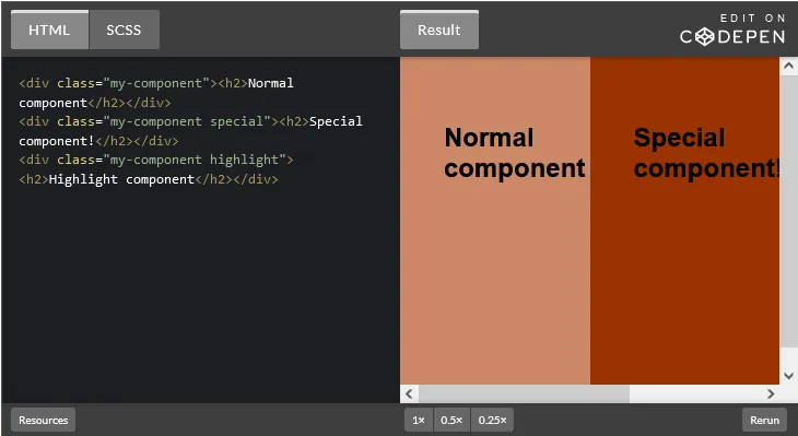
}Now, we don’t even have to define our variable until we want to update the value, and our code is even more concise. The first instance of our component will simply take on the default value. You can even set multiple default values:
.my-component {
/* Peach color background */
background-color: var( — bgColor, var( — highlight, hsl(20, 50%, 60%)));
}

.my-component.special {
/* Burgundy */
— bgColor: hsl(20, 100%, 30%);
}

.my-component.highlight {
/* Yellow */
— highlight: hsl(50, 100%, 60%);
}
With the above code, the first component’s background-color property value will fall back to the original peach color because variables have not been defined. The second component variant has the --bgColor variable defined, while the third variant only has the --highlight variable defined, so it will be bright yellow. Here’s what that will look like:
One drawback to this approach is it can be less readable. If you define your variables up front, it can be easier to scan over the code and see the value of that variable at a glance. Ultimately, it’s a matter of personal preference. There can also be performance implications if the browser has to parse multiple levels of variables, so that could be a consideration if you’re working with a large codebase.
How to make your CSS dynamic with CSS custom properties
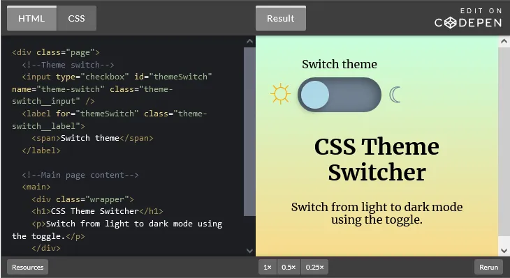
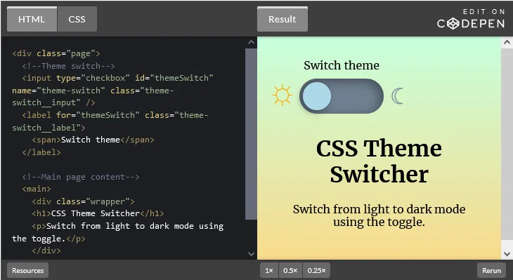
In this section, we will go through this example to better understand how to make our CSS more dynamic and invariable to create better themes. The first thing we will do is create our markup, as shown below:
HTML - index.html
<div class="page">
        <!--Theme switch-->
        <input type="checkbox" id="themeSwitch" name="theme-switch" class="theme-switch__input" />
        <label for="themeSwitch" class="theme-switch__label">
                <span>Switch theme</span>
        </label>

        <!--Main page content-->
        <main>
                <div class="wrapper">
                <h1>CSS Theme Switcher</h1>
                <p>Switch from light to dark mode using the toggle.</p>
                </div>
        </main>
</div>
Our markup is made up of a checkbox and the label. It also contains the main content of the page. In this example, we will style our checkbox to resemble a switch. Next, we will move over to our CSS to create the basic layout of our page:
CSS - style.css

@import url("https://fonts.googleapis.com/css?family=Merriweather:400,400i,700");
* {
  box-sizing: border-box;
}

body {
  font-family: Merriweather, serif;
}

.wrapper {
  max-width: 700px;
  margin: 0 auto;
}
In the code above, we set up a border-sizing to every element on our webpage, set a font for the whole page, and set a basic style for our wrapper while centering it. Next, we will have the code we need to understand how to use CSS variables to create better themes. Take a look at the code block below:
CSS - style.css

label,
main {
  color: var(--text, black);
}

.theme-switch__input:checked ~ main,
.theme-switch__input:checked ~ label {
  --text: white;
}

main {
  --gradDark: hsl(144, 100%, 89%);
  --gradLight: hsl(42, 94%, 76%);
  background: linear-gradient(to bottom, var(--gradDark), var(--gradLight));
  padding: 120px 40px 40px 40px;
  min-height: 100vh;
  text-align: center;
}

.theme-switch__input:checked ~ main {
  --gradDark: hsl(198, 44%, 11%);
  --gradLight: hsl(198, 39%, 29%);
}

.theme-switch__input:checked ~ .theme-switch__label {
  background-color: lightSlateGray;
}
Let’s break it down:
In the first selector for label and main, we set a color property using a var function while still setting a default value. Next, we set the value of the --text for the main and label when the checkbox is checked. This approach ensures that we handle the text color of our main and label for two themes (checked and unchecked states).
The next selector for main is where we set the other styles. Notice that instead of passing the colors to the background, we use variables. This ensures we can easily change the values of the background-color without re-writing the styles. The other styles in the markup are the padding, min-height, and text-align.
Now that we have defined the styles for main, we can easily change the values of --gradDark and --gradLight when the checkbox is checked. Does this look familiar? Well, it’s what we did in the .theme-switch__input:checked ~ main, which is a selector that selects every main element that is a subsequent sibling after the checked .theme-switch__input.
Similarly, the next selector sets the background color for the .theme-switch__label when the input is checked. The code above can be used in different contexts to create amazing themes. Essentially, it requires the clever use of CSS variables and the orderly arrangement of styles, as we have demonstrated. Once you have gotten to this level, your code result should look and function like the image below:

Next, we will have the rest of the CSS code for making the checkbox look like a switch. Nonetheless, we will be taking it one functionality at a time. The next piece of code will ensure that we hide the checkbox and also absolutely position the label. Check it out below:
CSS - style.css

.theme-switch__input,
.theme-switch__label {
  position: absolute;
  z-index: 1;
}

.theme-switch__input {
  opacity: 0;
}
The next code allows us to set background colors for the label on different states of our mouse, such as focus:
CSS - style.css

.theme-switch__input:hover + .theme-switch__label, .theme-switch__input:focus + .theme-switch__label {
  background-color: lightSlateGray;
}
.theme-switch__input:hover + .theme-switch__label span::after, .theme-switch__input:focus + .theme-switch__label span::after {
  background-color: #d4ebf2;
}
Next, we will add the styles to prepare our label visually:
CSS - style.css

.theme-switch__label {
  padding: 20px;
  margin: 60px;
  transition: background-color 200ms ease-in-out;
  width: 120px;
  height: 50px;
  border-radius: 50px;
  text-align: center;
  background-color: slateGray;
  box-shadow: -4px 4px 15px inset rgba(0, 0, 0, 0.4);
}
.theme-switch__label span {
  position: absolute;
  bottom: calc(100% + 10px);
  left: 0;
  width: 100%;
}
After that, we will add the right and left icons:
CSS - style.css

.theme-switch__label::before, .theme-switch__label::after {
  font-size: 2rem;
  position: absolute;
  transform: translate3d(0, -50%, 0);
  top: 50%;
}

.theme-switch__label::before {
  content: "☼";
  right: 100%;
  margin-right: 10px;
  color: orange;
}
.theme-switch__label::after {
  content: "☾";
  left: 100%;
  margin-left: 10px;
  color: lightSlateGray;
}
Then, we will add the style for the switch:
CSS - style.css

.theme-switch__label span::after {
  position: absolute;
  top: calc(100% + 15px);
  left: 5px;
  width: 40px;
  height: 40px;
  content: "";
  border-radius: 50%;
  background-color: lightBlue;
  transition: transform 200ms, background-color 200ms;
  box-shadow: -3px 3px 8px rgba(0, 0, 0, 0.4);
}

.theme-switch__input:checked ~ .theme-switch__label span::after {
  transform: translate3d(70px, 0, 0);
}
Finally, we will add the code that will allow us to change the color of the left and right icons:
CSS - style.css
.theme-switch__input:checked ~ .theme-switch__label::before {
  color: lightSlateGray;
}
.theme-switch__input:checked ~ .theme-switch__label::after {
  color: turquoise;
}
Our code combined should look similar to this:
CSS variables best practices
Although CSS variables are a great feature in CSS, when misused, they can cause a lot of difficulties for developers. To save you the headache, I have compiled some of the best practices to follow. First, for small projects, it is better to add all the variables in the :root element at the top.
For medium to large projects, it is better to move the :root element and the variables defined in it into a separate file. This way, you can reuse variables in different files. Here’s an example of that:
/* Top of the file... first code */
:root {
--text-color: black;
--background-color: white;
--accent-color: orange;
}
You should also always use a descriptive variable name, like so:
/* Do this */
:root{
--paragraph-text-color: #333333;
--paragraph-bg-color: white;
}

/* Don't do this */
:root{
-p-col: #333333;
-p-bg: white;
}
Don’t forget to provide a fallback value for var, as shown in the example below:
.paragraph{
color: var(--paragraph-text-color, black);
background-color: var(--paragraph-bg-color, white)
}
Additionally, do not use a CSS variable as media queries screen size:
CSS

/* NEVER DO THIS */
@media (max-width: var(--max-width-one)){

}
Also, keep in mind that var functions should only accept one fallback:
/* NEVER DO THIS */
.paragraph{
color: var(--paragraph-text-color, --paragraph-text-color-two, black);
background-color: var(--paragraph-bg-color, --pargraph-bg-color-two, white)
}

/* DO THIS */
.paragraph{
color: var(--paragraph-text-color, var(--paragraph-text-color-two, black));
background-color: var(--paragraph-bg-color, var(--paragraph-bg-color-two, white))
}
Lastly, remember always to use computed style to access and reset CSS variables in JavaScript, as shown below:
  const root = document.querySelector(':root');
  const rootStyle = getComputedStyle(root);
  root.style.setProperty('--paragraph-text-color', 'blue');
Browser support for CSS variables
The techniques used in this article have ample support in modern browsers. However, Internet Explorer v11 and below do not support CSS variables. If you need to support older browsers and your color themes are an important part of your website (for example, for accessibility or following strict brand guidelines), then using CSS variables may not be suitable .
At the very least, you should provide a user-friendly fallback. One way you can handle browser support is by using feature queries, as shown below:
.my-component {
background-color: #82f263;
}
@supports (--css: variables) {
.my-component {
--myVariable: #ef62e6;
background-color: var(--myVariable);
}
}
The value for the @supports declaration doesn’t matter too much as long as the syntax matches. You should always consider a progressive enhancement approach when using newer CSS properties.
Conclusion
Using CSS variables is a good way to structure and keep your styles (webpages) uniform. Therefore, I recommend using it in your projects. Thanks for reading! I hope you enjoyed this article, and be sure to leave a comment if you have any questions. Happy coding!
Source: https://blog.logrocket.com
#css