Since the COVID-19 outbreak, media all over the world have been hustling to produce the prettiest and most informative graphs about the outbreak. Graphs and charts are great at conveying complex statistics to a general audience. What graphs are also great at is misleading people into making wrong conclusions about the world. Some media mislead because of their incompetence in statistics, while others intentionally manipulate the data to paint a better picture of their country. In this article, we will look at how Argentinian, Russian, and Georgian media have been “fighting” the outbreak by manipulating graphs.
Argentina’s number of COVID-19 tests
If you need to show that your country is great at testing people, just ask Argentinian media for advice, they have done a great job with the following graph:
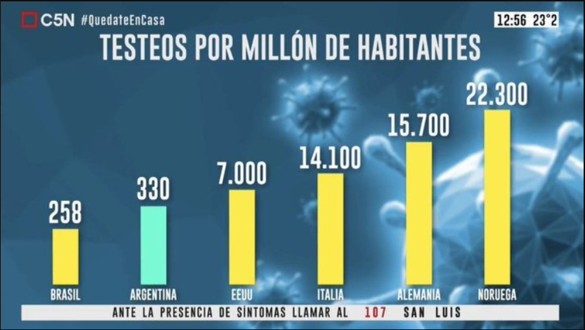
Argentinian TV channel C5N manipulating the y-axis to hide the terrible number of COVID-19 test. Source: Reddit. Original Source: C5N
The graph shows the number of COVID-19 tests per million people. For non-Spanish speakers, EEUU is the United States of America, Alemania is Germany, and Noruega is Norway. Now, look at those bars: Argentina tests almost as many people as the USA! At least that’s what it seems like until you look at the numbers. Argentina tests 330 people per million, while the USA tests 7000. That is 20 times more, but the USA’s bar is only 1.2 times higher. The graph makes Argentina look decent at testing people, while it’s clearly not the case. The TV channel arbitrarily manipulated the bars’ sizes with no regard for logic or rules of scaling. This is how the graph would look without manipulations:
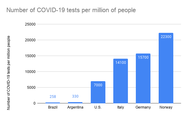
Argentinian COVID-19 Graph Done Right. Data Visualization by Author.
This visualization paints an entirely different picture and shows that Argentina is nowhere close to testing as much as the US and other countries. But who wants to see the bad news, right?
#media #covid19 #data #graph #data analysis