Angular Animations: How to Use Angular Animation
Angular animations offer a powerful way to add dynamic motion and visual effects to your applications. They allow you to smoothly transition between different states of your user interface, enhancing the user experience and making your app feel more engaging and responsive.
In this tutorial we will learn about Angular animation and how to use Angular animation, how to set it up, and how to create it to make an application look out of the box
Setting up Animations
Now after having a basic idea about Angular Animations and seeing reasons why it is considered to be the best option, let’s go through the steps that can help in setting up Animations.
Here are the steps that need to be followed to set up Angular Animation before you can start using it.
Step 1 : Install the @angular/animation package
ng new angular-animate
cd angular-animate
When the package @angular/animations are installed, the first step is to verify the list of dependencies which is a part of the package.json file. Ideally, the project created using CLI is installed by default in the package.
Step 2 :
After the verification of the dependencies, the next step is to import the BrowserAnimationsModule from the path @angular/platform-browser/animations. This then must be included in the root module file’s import array. The below code shows the exact steps that we discussed here.
import {CommonModule} from ‘@angular/common’;
import (NgModule) from ‘@angular/core’;
import {FormsModule} from ‘@angular/forms’;
import {BrowserAnimationsModule} from ‘@angular/platform-browser/animations’;
Step 3 :
The third step in setting up the Animations is to give certain Angular components to the animations if required or wished. And for this, the designers must import the animation functions that are required in the component’s file whenever these functions are imported from @angular/animations, they make the application’s workflow easier. See the below-given for the code snippet.
Step 4 :
The final step is to include an animation array in the metadata property animations in the component file. This property is – [] which can be added in its @Component() decorator. In this property, each of the array elements represents an animation trigger. To see how it happens, check the below code.
After setting up Angular Animations, it’s time to start creating Animation with the use of Angular and this is what we will see in the next part of this blog.
Creating a Simple Animation Using Angular
Here are some of the steps that need to be followed in order to create Animation using Angular:
- State and Style
The first step in creating a simple animation with the help of Angular is to define the state of the animation. And for this, the designers must use the Angular Animations state() function. The function stated here comes with two arguments, the first one is the name of the state. For this, Angular offers three different options that can be used by designers.
The second step is sterling and for this, the designers use the style() function that helps in the animation array determining a set of CSS styles to connect them with the state name.
Here in this blog, we will go through the demonstration of creating a simple arching ball animation with the use of Angular Animations.
2. Transition and Animate
The next phase in creating animation is to transition and animate. Here, after having an understanding of the states, the transition must be defined between the states. This helps the animation to occur perfectly. And for this, the designers need to use the transition() function, which will accept two arguments.
- The very first argument is an expression that enables the designers to define the direction between two states. For instance, ‘someState’ => ‘anotherState’ is the syntax of this expression. This example means that in animation the transition will happen when the bound element’s state will automatically change from ‘someState’ to ‘anotherState’. Here the symbol => is known as an operator which is a must between the states.
- The second argument is the animate() function. This function is something that will enable the app development team to execute it during the transition period. This means that the animate() function accepts style and timing arguments. Here, for the styles argument, the CSS animation library is used to fill it whenever any change in the style is required during the transition. And the timings argument can be defined in various different ways.
3. Triggering the Animation
3The third phase is triggering the animation. Here, after having states and transitions, it’s time to start the animation by triggering it, and for this, the web application designers must use the trigger() function that takes two arguments.
- In the first argument, specifying the name of the trigger is essential as it can be used to attach the triggering element in the HTML template file.
- The second argument is something where the collection of the states and transitions happen that are created above in an array. And for this, as soon as the below-given code, the trigger is named animateArc.
While triggering the animation, the last thing to carry out is to bind the trigger that is defined above with a variable that will be able to change the animation state. For this, it must be attached to the div of our element and this must be preceded by the @ symbol. Example:
<div [@animatearc]="arc" class="ball"></div>This will complete the setup and will create the animation.
4. Demo Example Code with Preview
The keyframes is a method that is imported from @angular/animations and instead of passing typical AnimationStyleMetadata, the keyframe passes into animate(..) argument. This means that in the keyframe(..) method, one argument of AnimationStyleMetadata is accepted as an array, and it is known as the style(..) method.
In this approach, every keyframe of the animation enters the array of keyframes(..) and its elements are style(..) which supports the properties like offset that demonstrates the animation duration’s point. And here the value of animation is between 0 to 1 where the animation starts at 0 and ends at 1.
In the below code, we will go through a practical example of this.
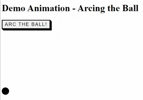
Update app.component.html file.
<h1>Demo Animation - Arcing the Ball</h1>
<button class="button-01" (click)="toggleBounce()">Arc the Ball!</button>
<div [@animatearc]="arc" class="ball"></div>
Update app.component.ts file.
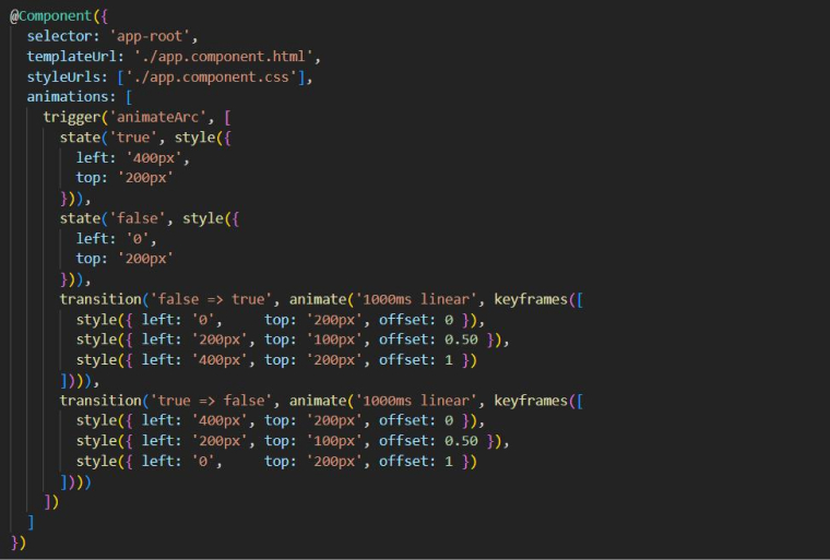
import { Component } from '@angular/core';
import { trigger, state, style, animate, transition, keyframes } from '@angular/animations';
@Component({
  selector: 'app-root',
  templateUrl: './app.component.html',
  styleUrls: ['./app.component.css'],
  animations: [
    trigger('animateArc', [
      state('true', style({
        left: '400px',
        top: '200px'
      })),
      state('false', style({
        left: '0',
        top: '200px'
      })),
      transition('false => true', animate('1000ms linear', keyframes([
        style({ left: '0',     top: '200px', offset: 0 }),
        style({ left: '200px', top: '100px', offset: 0.50 }),
        style({ left: '400px', top: '200px', offset: 1 })
      ]))),
      transition('true => false', animate('1000ms linear', keyframes([
        style({ left: '400px', top: '200px', offset: 0 }),
        style({ left: '200px', top: '100px', offset: 0.50 }),
        style({ left: '0',     top: '200px', offset: 1 })
      ])))
    ])
  ]
})


export class AppComponent {
  arc: string = 'false';


  toggleBounce(){
    this.arc = this.arc === 'false' ? 'true' : 'false';
  }
}
Update app.component.css file.
.ball {
    position: relative;
    background-color: black;
    border-radius: 50%;
    top: 200px;
    height: 25px;
    width: 25px;
  }


.button-01 {
    font-family: "Open Sans", sans-serif;
    font-size: 16px;
    letter-spacing: 2px;
    text-decoration: none;
    text-transform: uppercase;
    color: #000;
    cursor: pointer;
    border: 3px solid;
    padding: 0.25em 0.5em;
    box-shadow: 1px 1px 0px 0px, 2px 2px 0px 0px, 3px 3px 0px 0px, 4px 4px 0px 0px, 5px 5px 0px 0px;
    position: relative;
    user-select: none;
    -webkit-user-select: none;
    touch-action: manipulation;
}


.button-54:active {
    box-shadow: 0px 0px 0px 0px;
    top: 5px;
    left: 5px;
}
Thanks for reading !!!
#angular #animation #components #void state #wildcard state