
Imagine that it’s blinking…
… is probably an article I should have published on April 1st. Still, here it is. The Amiga had an iconic way to display fatal errors: The guru meditation alert. Let’s recreate this for Flutter.
Here is how I want to display the alert:
showAlert(context, 42);
Instead of complicated and talkative text messages, I will display succient hexadecimal error codes which need no translation or localization. I’m utterly convinced that this is the future.
import 'package:flutter/widgets.dart';
void showAlert(BuildContext context, int code) {
  final hex = code.toRadixString(16).toUpperCase().padLeft(8, '0');
  ...
}
Notice, how I not try to include a library for left-padding my string for improved stability and protection against rage-quitting developers.
To display anything above the normal UI, an OverlayEntry which is then added to the current Overlay can be used. The such an Overlay is automatically created as part of a WidgetsApp or MaterialApp widget. The overlay entry must be explicitly removed again. I’m using a GestureDetector so that the user has to tap the overlay to make it go away.
void showAlert(BuildContext context, int code) {
  final hex = code.toRadixString(16).toUpperCase().padLeft(8, '0');
  final black = Color(0xFF000000);
  final red = Color(0xFFFF0000);
  OverlayEntry overlay;
  overlay = OverlayEntry(builder: (context) {
    return Positioned(
      left: 0,
      right: 0,
      child: GestureDetector(
        onTap: () => overlay.remove(),
        child: Container(
          color: black,
          height: 128,
        ),
      ),
    );
  });
  Overlay.of(context).insert(overlay);
}
Because I don’t want to depend on material.dart I create my own Color objects. And because I need to refer to the overlay variable inside of the onTap handler of the builder function I cannot use the usual final variable definition that declares and initializes a variable in one step. Overlays are a bit special.
The Overlay widget is basically a Stack so I can use a Positioned widget to position my alert (currently just a black Container wrapped inside a GestureDetector) at the top edge of the screen.
At this point, I can display a black overlay which is removed if I tap it.

Because an OverlayEntry isn’t automatically wrapped with a DefaultTextStyle, Text widgets without style or with a TextStyle that does not explicitly prohibits inheritance are displayed with a very ugly default text style (large redish text that has yellow double-underlining). Therefore, it is important to add an inherit: false property like so:
Container(
alignment: Alignment.center,
color: black,
height: 128,
child: Text(
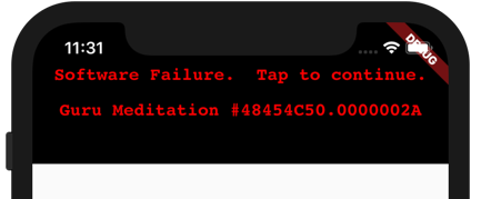
'Software Failure. Tap to continue.\n\n'
'Guru Meditation #48454C50.$hex',
textAlign: TextAlign.center,
style: TextStyle(
color: red,
fontFamily: 'Courier',
fontSize: 16,
fontWeight: FontWeight.bold,
inherit: false,
),
),
)
It starts to look like the real deal (please ignore the notch for now):
Let’s add the iconic red border next. There’s one problem, though. I don’t want the text to wrap (which would happen on smaller devices). Furthermore, if you compare the Courier font I used with the original Amiga font, it runs too wide. So let’s transform the Text widget by scaling it horizontally to 75%. To keep it at the same width, I have to enlarge the width by 133% at the same time. The text should now always fit the screen.
          Container(
            alignment: Alignment.center,
            decoration: BoxDecoration(
              color: black,
              border: Border.all(color: red, width: 8),
            ),
            padding: EdgeInsets.symmetric(
              horizontal: 8,
              vertical: 16,
            ),
            child: FractionallySizedBox(
              widthFactor: 4 / 3,
              child: Transform(
                alignment: Alignment.center,
                transform: Matrix4.identity().scaled(3 / 4, 1),
                child: Text(
                  ...
                ),
              ),
            ),
          ),
We’re almost there…

As you probably see on my screen shots, if the device has a notch, the alert doesn’t look right. I’d like to move the box below the notch but cover everything above in black. The Amiga also displays a small black border around the red border, so let’s add this, too. A SafeArea widget inside another Container can do both. I need to disable its bottom margin, though.
    return Positioned(
      left: 0,
      right: 0,
      child: Container(
        color: black,
        child: SafeArea(
          minimum: EdgeInsets.all(8),
          bottom: false,
          child: GestureDetector(
            ...
          ),
        ),
      ),
    );
And there, it is, perfectly aligned:

For the final and most important step, I will add blinking.
The following might be a bit hacky, I don’t know, but it works and I don’t have to create a custom StatefulWidget. I’m using a StatefulBuilder instead. Each time, that widget asks its builder function to recreate the UI, I setup a timer to toggle the border color from red to black and back again after 700ms. Then, I’m using an AnimatedContainer to implicitly animate this color change within 300ms. Some things are just too easy in Flutter.
          GestureDetector(
            onTap: () {
              blink = null;
              overlay.remove();
            },
            child: StatefulBuilder(
              builder: (context, setState) {
                Future.delayed(Duration(milliseconds: 700))
                .then((_) {
                  if (blink != null) setState(() => blink = !blink);
                });
                return AnimatedContainer(
                  duration: Duration(milliseconds: 300),
                  curve: Curves.easeInOut,
                  alignment: Alignment.center,
                  decoration: BoxDecoration(
                    color: black,
                    border: Border.all(
                      color: blink ? red : black, width: 8),
                  ),
                  ...
                );
              },
            ),
          ),
Here is the hacky part: Because Flutter throws an exception if I tap the alert and setState is then called on a disposed widget, I need to protect myself against this case by setting blink to null and explicitly checking for it. Perhaps, I should have used a Timer instead of a Future because that timer could be cancelled, I think. The future is inevitable.

Back to the future…
And there you have it, an alert box that looks much better than the usual modal dialog. And at least with old folk like myself, people will have a positive nostalgic feeling instead of cold-blooded anger because your app didn’t work for them as expected.
Here is the source code, by the way.
Thanks for reading ❤
If you liked this post, share it with all of your programming buddies!
Follow me on Facebook | Twitter
Learn More
☞ Learn Flutter & Dart to Build iOS & Android Apps
☞ Flutter & Dart - The Complete Flutter App Development Course
☞ Dart and Flutter: The Complete Developer’s Guide
☞ Flutter Tutorial - Flight List UI Example In Flutter
☞ A Design Pattern for Flutter
☞ An introduction to Dart and Flutter
☞ Introduction to Flutter: Building iOS and Android Apps from a Single Codebase
☞ Building DashCast, a podcast app in Flutter
#flutter #mobile-apps #ios #android