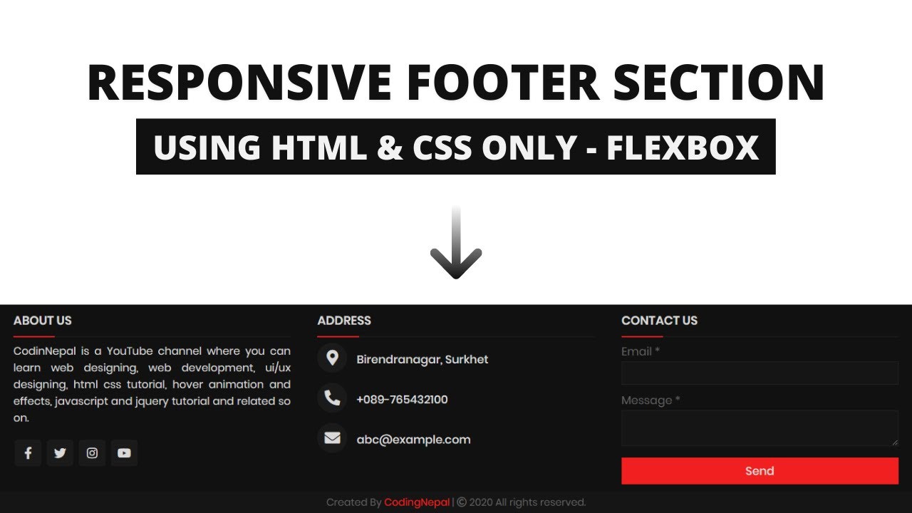
In this blog you’ll learn how to create a Responsive Footer Section using HTML and CSS only. Previously I have shared a Responsive Dropdown Menu Bar using HTML & CSS only, now it’s time to create a Responsive Dropdown Menu Bar.

A footer on any website is now compulsory. The HTML’s latest version HTML5 introduced the separate

tag for the footer. Until a few years ago, all most footers on mostly website with less height for giving copyright info. But, nowadays there is a trend, all websites have a big footer section with more information and social account links.

As you can see in the image, this a Responsive Footer Design using HTML & CSS. There are some icons, texts, and one contact form. This is a fully Responsive Footer Design with HTML and CSS. When you open this Footer in mobile devices, it’ll automatically adjust their height and width according to the device height and width.

#html #css

Fully Responsive Footer Section using HTML CSS
9.35 GEEK