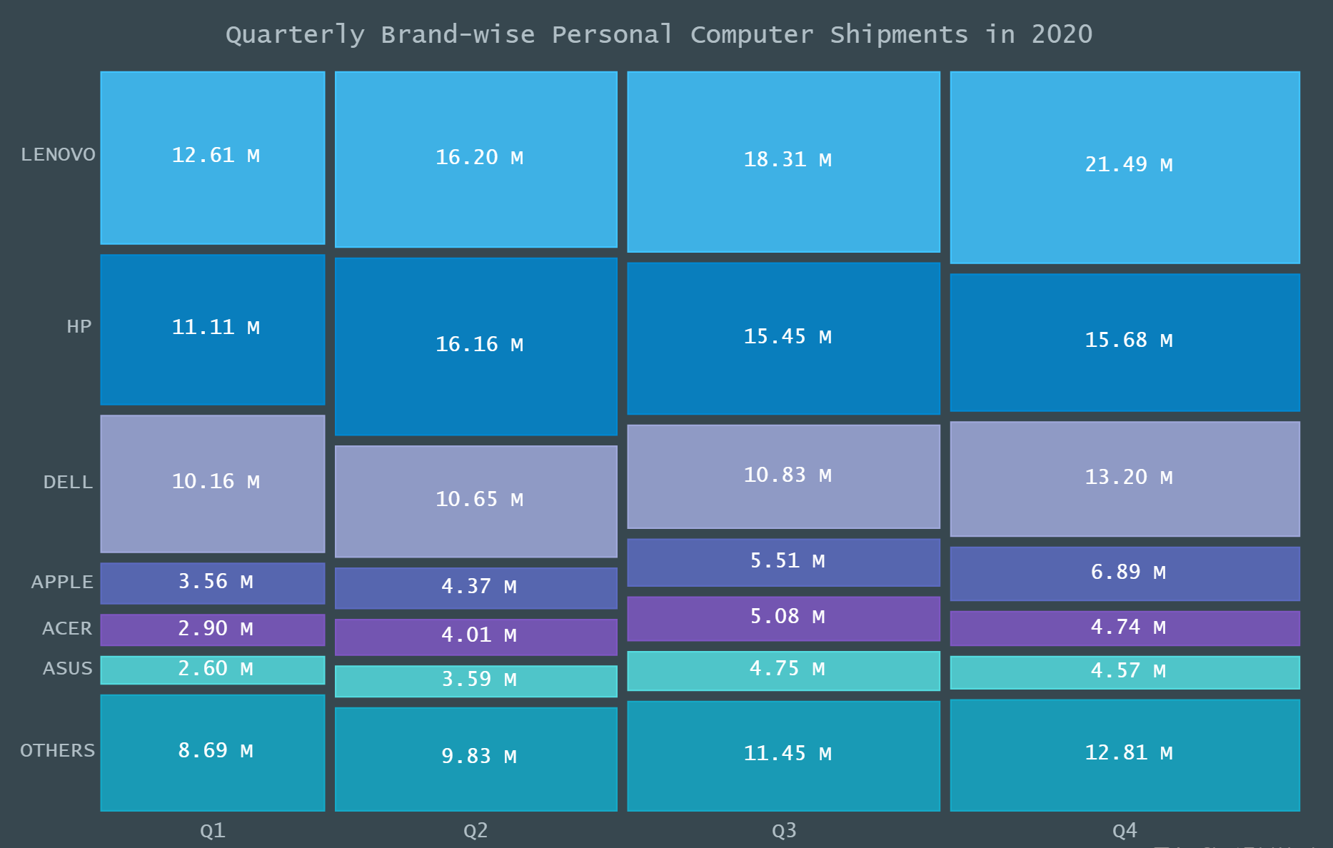
A step-by-step guide for building an interactive JS Mosaic Chart, illustrated by visualizing data on quarterly PC shipments by brand in 2020.
Data visualization is a valuable tool in today’s scenario, with data everywhere and various opportunities to tap into that data to find insights. Visual charts are imperative to communicate ideas, identify patterns, and make the most of the available data.
So then, would you like to quickly and easily learn how to create a really cool chart that showcases data interestingly?
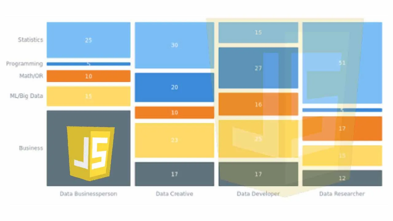
A mosaic chart is a multi-series chart that effectively represents data with over 2 parameters and is so-called because each data point has distinctive indents, making it visually similar to a piece of mosaic art. Not only is this chart beautiful to look at, but is also very helpful in representing multiple variables and recognizing the relationship between these different variables.
The year 2020 was not all bad, at least for the market of personal computers. The sales of PCs increased throughout each quarter of 2020, with more people working and studying from home. I explored how each brand fared in every quarter based on the number of global shipments.
Here is a look at the final chart to get you excited!
Follow along with this quick tutorial for front-end web developers and data viz enthusiasts to get the hang of creating a Mosaic Chart with JavaScript.
Building a JS Mosaic Chart in 4 Simple Steps
A mosaic chart may look exciting but difficult to create. However, it is pretty straightforward and easy to create this chart with a JavaScript charting library as one can remove a lot of the burden of coding and allow you to get a chart up quickly and with minimal technical details.
For this tutorial, I am using the AnyChart JS library. I’ve chosen AnyChart as it is flexible yet easy to start off. It is especially good for beginners because of the extensive documentation, along with many useful examples.
Having some background with technologies like HTML and JavaScript is an advantage when visualizing data. Nonetheless, it is quite uncomplicated to create interactive charts with a JS library, and the steps for creating mosaic charts with almost any JavaScript library that supports this chart type tend to be more or less the same.
The 4 fundamental steps to creating a JS Mosaic Chart are:
- Create an HTML page for the chart.
- Add the necessary JavaScript files.
- Connect the data.
- Write the required JS code for drawing the chart.
#javascript #data science #data #charts