Blog Structure
As can be seen in the title above, the purpose of this blog is to gain a basic but strong fundamental knowledge of ROC and AUC and how they relate to a binary classification model. The order of this blog is the following.
- Define what an ROC curve is and what it means
- Define the parameters of an ROC curve and gain an understanding of parameters
- Define what AUC means and how it relates to ROC
- Apply Lessons learned to a simple Kaggle Heart Disease Dataset to further understanding
So what are ROC and AUC anyway?
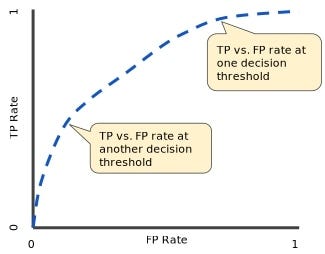
To put it simply, ROC(receiver operating characteristic curve) and AUC (area under the curve) are measures used to evaluate performance of classification models. ROC is a graph that shows the performance for a classification model at all unique thresholds. The graph uses the the following parameters on its axes:
- True Positive Rate
- False Positive Rate
ROC curve
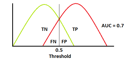
As you can see in the graphs above, the errors of our classification model are dependent on our threshold selection. Ideally, if we have a threshold and there is no overlap between the Red curve (positive class) and the Green curve (negative class), then our model would be able to perfectly distinguish between the two classes. Thus, we would eliminate _type one error _(false positive) and type two errors (false negative).
However, in real world examples, this is very unlikely. In real world examples, there is a tradeoff between type 1 and type II errors. As you can see in the first graph, we can increase our threshold to decrease our false positive count. Thus, decreasing our type 1 errors but at the same time we are increasing our count of false negative results. In other words, more type II error. The opposite would happen if we instead decreased our threshold.
#data-science #statistics