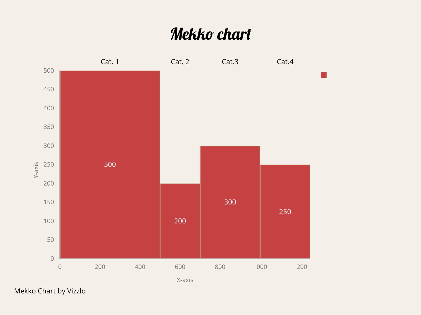
There are different types of variable width bar charts but two are the most popular: 1) Bar Mekko chart; 2) Marimekko chart.
They differ in the following: while the Bar Mekko chart (BMc) is like a “standard” bar chart, but its bars are of variable width, a Marimekko chart (Mc) is like a 100% stacked bar chart but its bars are of variable width.
WHY: they are used to show two numerical variables for each category present in the data set; the goal is to make a comparison between the categories, but not between the numerical variables. They are widely used in Dashboards or in Marketing and Sales Presentations, where the categories are usually products, regions, sectors, segments, etc. The numerical variables are typically sales, profits, costs, margins, growth rates, etc. They are not suitable for Distribution, Relationships, or Trends over Time analysis.
HOW: is a two-dimensional graph similar to a standard bar chart, with rectangular bars usually arranged in a vertical orientation. The vertical axis has a numerical scale (100% on a Marimekko Chart) and represents one of the quantitative variables. The horizontal axis can be either numerical or categorical. If it is numerical, each rectangle has a width proportional to the value of the second quantitative variable, a different color, and a legend that identifies it. If it is categorical, the width of each bar also indicates the value of the second quantitative variable.
The width of the rectangles is generally different for each category. It is always convenient to indicate with numbers or percentages the value of the numerical variable represented on the horizontal axis. These values are usually indicated on the upper baseline.
Unlike the standard bar chart, no space is left between the bars (Be careful not to confuse Mekko charts with Histograms [https://towardsdatascience.com/histograms-why-how-431a5cfbfcd5]). In both, BMc and Mc, the entire width of the horizontal axis is occupied.
The Mekko Bar chart is an alternative to classic bar charts allowing you to reduce the number of charts in a business presentation. To achieve this, the chart encodes one of the numerical variables by the height of the bars and the other quantitative variable by the width of the bars. The following graph shows a schematic representation of a Mekko Bar chart: a numerical vertical axis; a horizontal axis with variable width bars, each representing a different category. Product lines, sectors, or regions are examples of categories indicated on the horizontal axis. Sales, costs, or profits could be numerical variables represented by the width of the rectangles.

#data-visualization #data-analysis #storytelling #data-science #charts #data analytic
