How to Make a COVID-19 Rose Chart?
What is the Rose Chart?
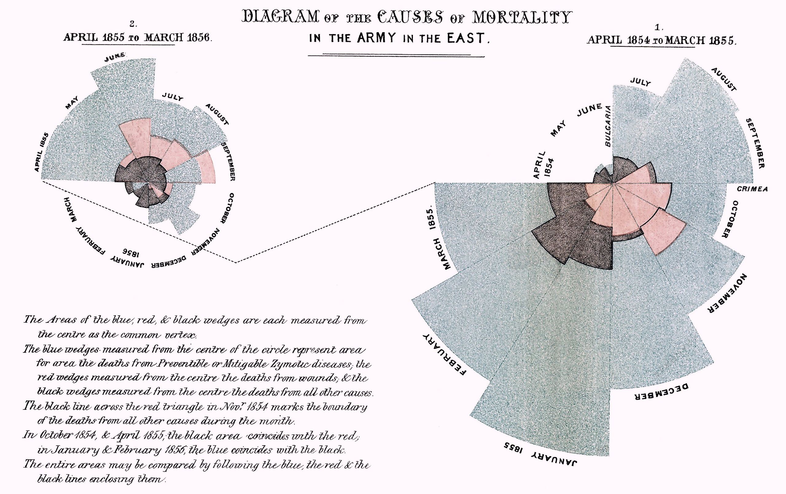
Have you ever seen this type of chart? Its name is Nightingale Rose Chart, also known as a Coxcomb Chart, Polar Area Diagram.
From Wikipedia
In the history, it is a chart invented by Nightingale when he submitted a report on soldiers’ injuries during the Crimean War.
The Nightingale Rose Chart is a histogram drawn in polar coordinates. The length of the arc is used to indicate the size (number) of the data.
- Because the relationship between radius and area is a square relationship, it can exaggerate the proportion of the data, which is especially suitable for comparing values with similar sizes.
- Due to the nature of the circle, it is also suitable for representing the concept of time within a cycle, such as a week and a month.
Application Scenarios for the Rose Chart
Suitable application scenarios:
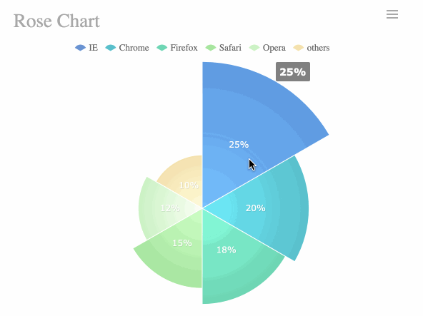
– Compare the sizes of different categories
The following figure is a comparison of the usage of each browser. The following chart can clearly see the difference in the proportion of the use of Internet Explorer, Google Chrome and other browsers. The advantage of using a rose chart is that even if the data is similar, the difference can still be clearly seen.
Unsuitable application scenarios:
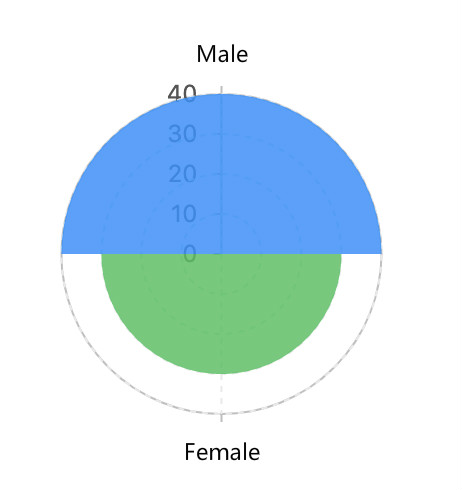
– Too few categories
The figure below shows the number of male and female students in a class. A pie chart is recommended for this scenario.
Rose Chart Extension
Example 1: Fan rose chart
The fan-shaped Nightingale rose chart can be realized by setting the starting angle of polar coordinates, as shown below:
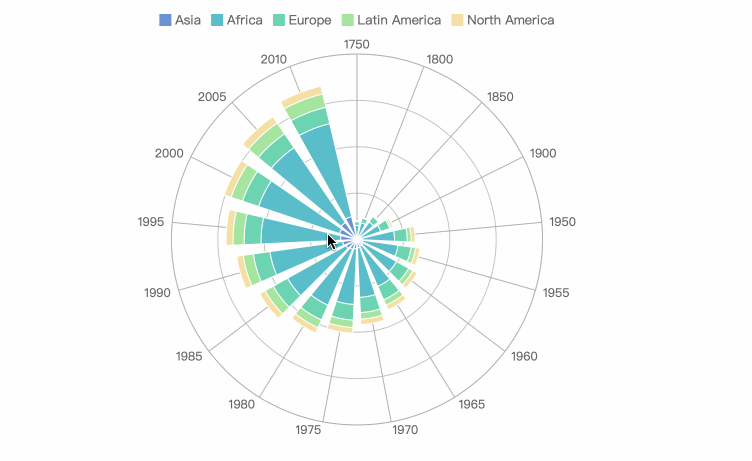
Example 2: Stacked rose chart
The principle of Nightingale’s rose chart is to draw the histogram in polar coordinates. If the histogram is extended to a stacked histogram, a stacked rose chart can also be realized.
The following rose chart shows the cumulative data for each year in Asia, Africa, America, and Europe. The final data and the proportion of each region can be displayed at the same time.
Comparison of the Rose Chart with Other Charts
With Histogram
Rose Chart is essentially a display of the histogram in polar coordinates.
The histogram uses the height of the rectangle to represent the size of the value.
Rose chart uses the radius of the fan to represent the magnitude of the value.
With Pie Chart
Rose Chart uses the radius of the fan to represent the size of the value, while the pie chart uses the radian of the fan to represent.
Rose chart can represent more classifications than the pie chart at the same time.
How to make a rose chart.
How to Make a COVID-19 Rose Chart?
Here I use FineReport as the data visualization tool, also you still have many other choices.
Prepare the Data
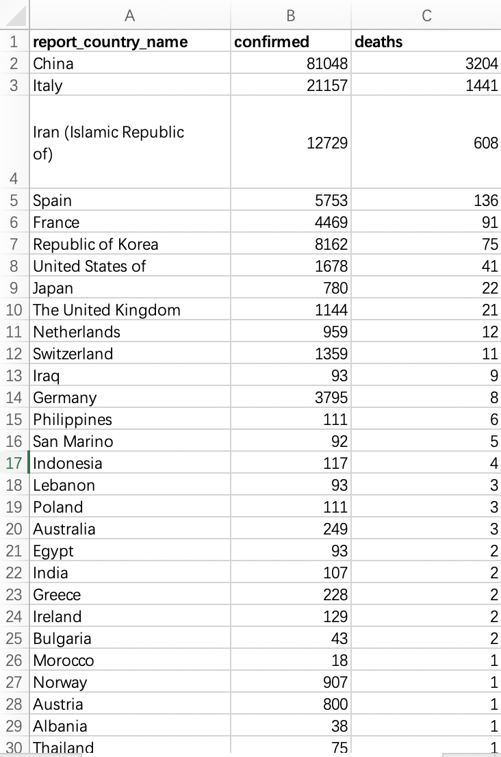
First, we need to get the latest COVID-19 data, WHO every day will update the situation report, you can find the data you want from the report.
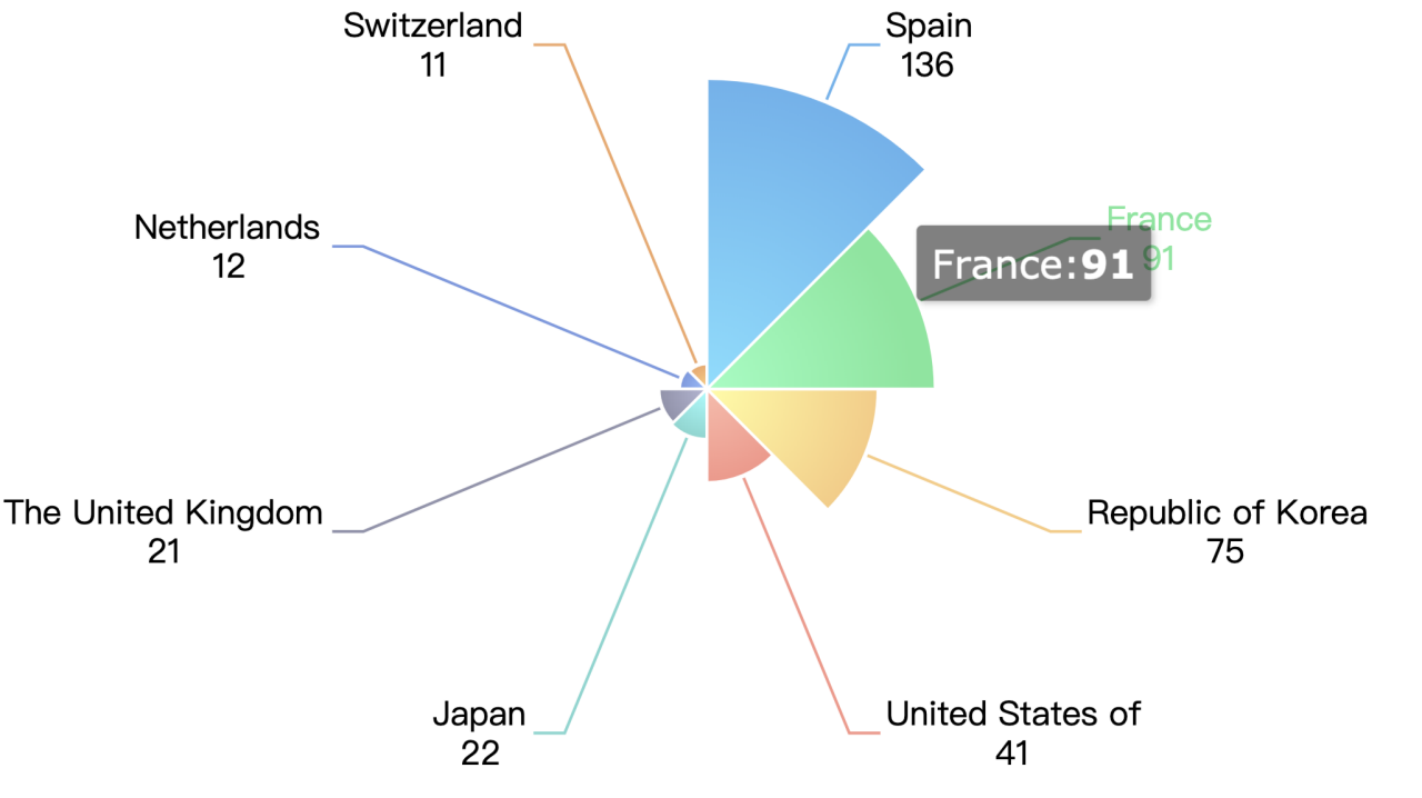
This time we made a chart of the number of death cases, so we put the relevant data in the report into an excel file.
Just like this
Import the Data
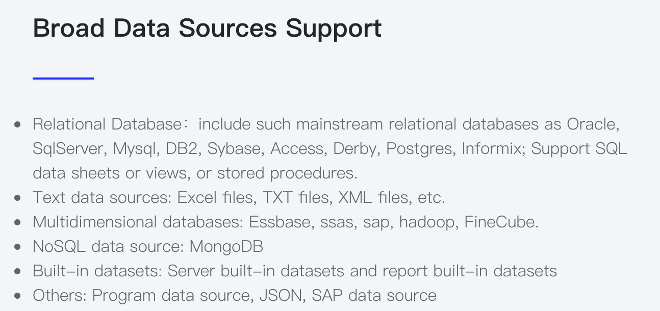
FineReport supports many kinds of databases, including relational databases, text databases… It’s very convenient for us to make the chart cause it can connect the Excel file as a data source.
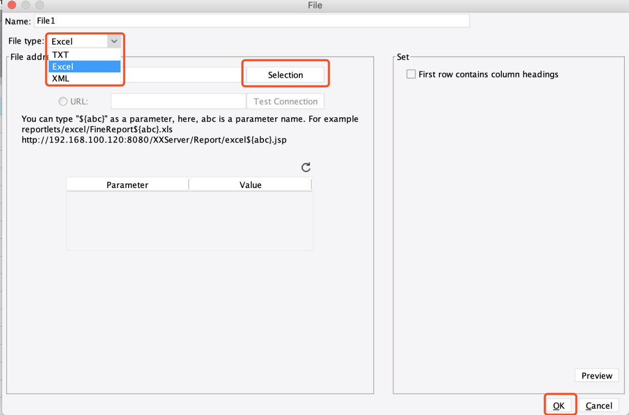
Then we open the FineReport designer, click the “+” button, choose the file as the data source.
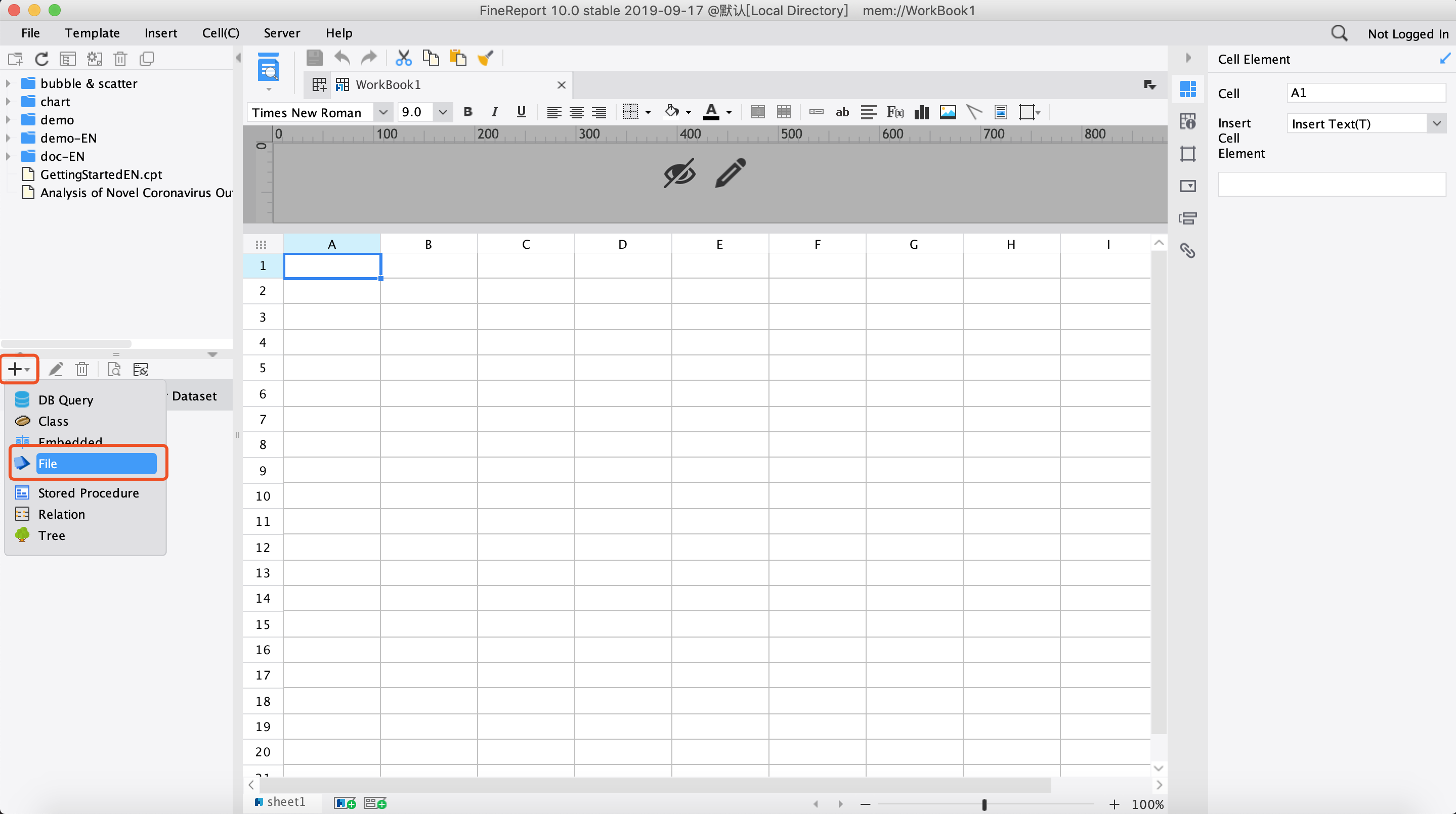
Remember to put the Excel file in the “reportlets” folder, and you can find the Excel file in the “Selection”.
And also remember to click the “First row contains column headings”.
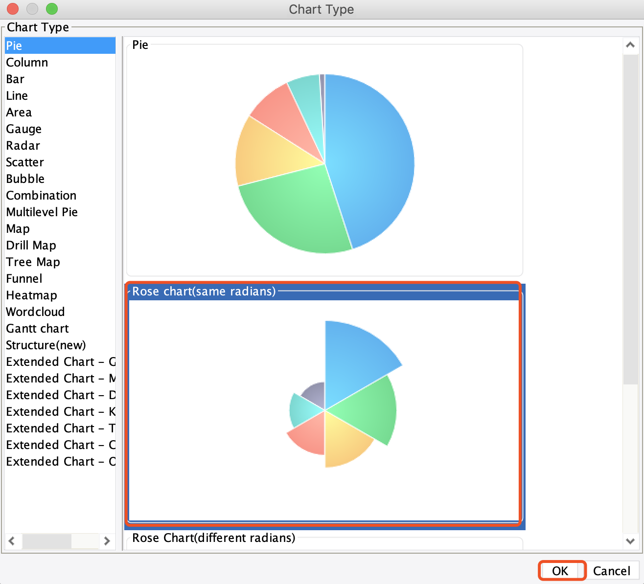
Design the Rose Chart
Click the insert from the menu bar, and choose float element->insert chart, and you can choose the chart you wanna make, here I choose the same radians chart.
Then we drag the data we just import to the cell, in this way, we can directly call the data. Remember to set the cell row height to 0 so that the data table is not displayed.
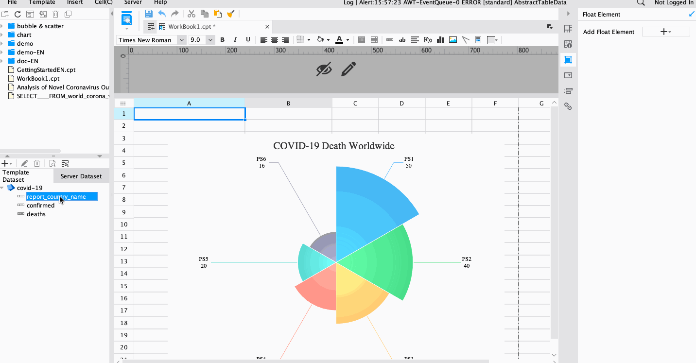
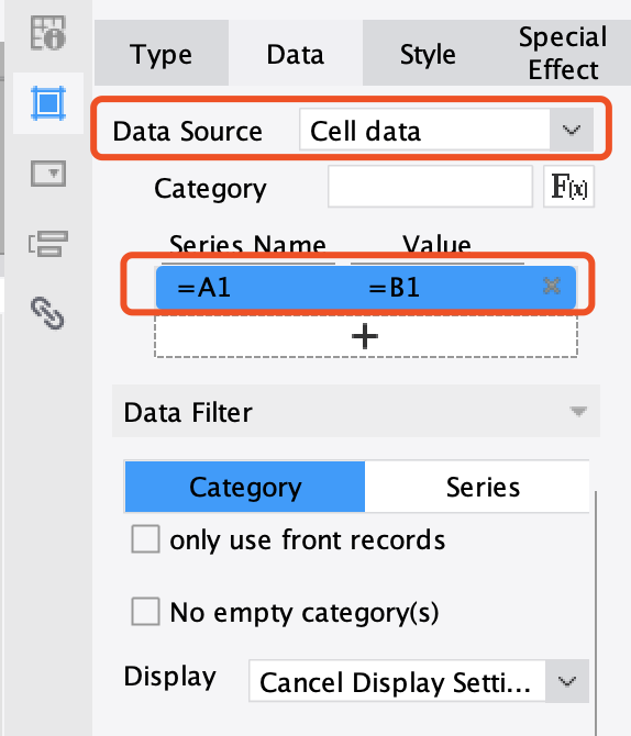
Associate Rose Chart with Data
Click data->, Associate data in A1 with data in B1, then all is finished! Click the preview, wow, you can’t believe that you have made it.
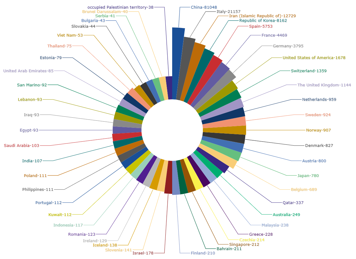
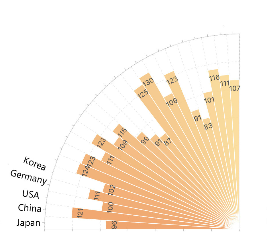
In order to make the data clearer, I chose relatively similar data. If you want to display data from all over the world, remember to scale the data to the logarithm, otherwise, too small data can hardly be displayed.
The following figure is a log of the world COVID-19 chart displayed after adjustment.

Summary
Through these various data visualization methods, we can more intuitively understand the changes of data in various places, and find some important points, such as the growth rate in Italy has exceeded China, so we need to be vigilant!
Finally, wish people can beat COVID-19 before July and restore peace to the world!
Originally published at https://www.finereport.com
#data-analysis #data-science #machine-learning #excel #web-development