Overview
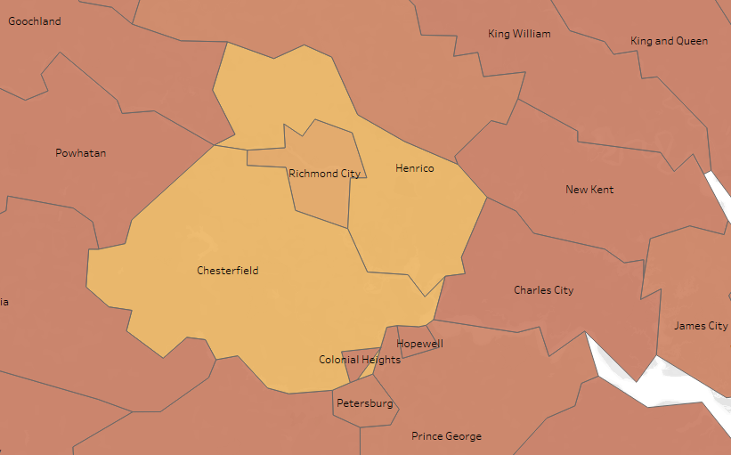
The geography of counties and county-level equivalents are often oddly-shaped and meandering. A smaller county may be nearly-if-not-completely surrounded by a larger, separate jurisdiction. Using a centralized pair of longitude and latitude coordinates to describe the location of the larger county might, instead, locate a point in the middle of the smaller county. Fortunately, there are ways to get around this problem.
In this article, we will explore the following:
- Identifying states and counties with Federal Information Processing Standards (FIPS) codes
- Mapping a dataset without geographic coordinates
- Animating geodata maps in Tableau Public
Motivation
If you are only looking for instructions on accessible ways to visualize worldwide or country-level geodata, you are in luck. There is no shortage of relevant software and library documentation and tutorials. Information can be a bit more sparse if you are looking into ways to visualize data on a county level.
In this example, we are working with data — for counties and independent cities in Virginia — that does not include longitude and latitude coordinates. In notebooks at the related Github repository, we explore how cases of Coronavirus, consequent hospitalizations, and related deaths in Virginia’s Hampton Roads region compare to those reported in other areas of the state and particularly in the state’s capital city of Richmond. We relied on interactive plotting in Python with Plotly Express, to visualize data for multiple localities (including population data) on a single figure with the option to hover or drill — down for greater detail.
Animated plots used in our previous notebooks enable us to quickly make visual comparisons across multiple localities, over time. Bar-plots and scatter-plots we include clearly show the Fairfax (county) area as having been more severely impacted than other localities. However, the plots do not easily reference some factors likely influencing the spread of the virus. They do not show us that Fairfax borders Washington, D.C., or that Virginia Beach (in Hampton Roads) is a regional tourist destination. This type of information might be better communicated, at a glance, by incorporating relevant map images into our visualizations. That is what we will do in this current exploration.
#geospatial #data-analysis #tableau #visualization #data-science