Build Powerful and Flexible Forms with Informed
Learn how to use Informed to build forms for your React apps. Informed is a powerful form builder that makes it easy to create beautiful and user-friendly forms.
Forms are a staple of web development. If you must collect user input on the web and process these on your server, you need a form.
While there are many libraries for working with forms in React, in this article, I’ll show you how to build powerful forms using the Informed library. Informed is a lightweight framework and utility for building powerful forms in React applications.
What sets the Informed library apart from its competitors is it has all the tools you’d expect of a framework: opinionated form UI components and state management, combined with baked-in utilities for formatting, masking, debugging and much more.
Let’s get started.
Contents:
- Setting up Informed
- Simple form validation (with messages)
- Simple required inputs
- Changing the required input validation message
- Going beyond basic, required validation
- Schema validation with Yup
- Exploring other input types
- The
Debugcomponent - Controlling when validation occurs
- Conditionally render form fields by accessing the form state
- Easy, conditionally-rendered form fields
- Easier data organization with scopes
- Adding input formatters and masks to Informed
- Why use Informed?
Setting up Informed
To get started, install the informed library in your react project via npm:
npm install informedA form, at its core, is mostly made of a parent form component and several children input fields. The input fields can take several forms, e.g., a basic text field, text area, radio input, checkbox input, select input, number input, etc. This is true regardless of the react form library.
Consider the following basic form:
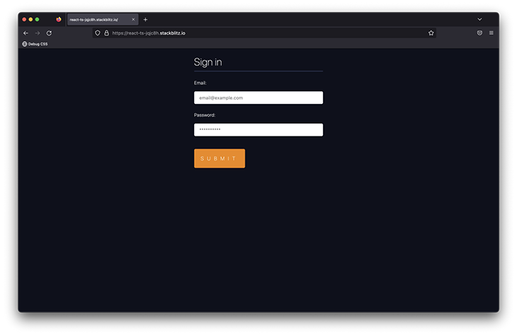
At its core, this is a form with three input elements: two text fields and a Submit button.
To represent this form via informed, we can use its inbuilt components, as shown below:
import * as React from 'react';
import { Form, Input, Debug } from 'informed'; {/**  look here **/}

export default function App() {
  return (
    <Form
      onSubmit={(formState) => {
        console.log(formState.values);
      }}
    >
      <h1>Sign in </h1>
      <Input name="email" label="Email:" placeholder="email@example.com" />
      <Input name="password" type="password" label="Password:" placeholder="**********" />
      <button type="submit"> Submit </button>
    </Form>
  );
}
Note how the props passed to the Input field are similar to standard HTML input attributes, i.e., name and placeholder.
This Form is relatively simple. When submitted, the form values are logged in the console. An empty object will be logged if you attempt to submit without any input entries:
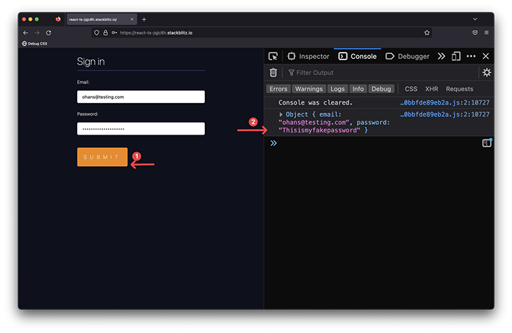
{/** ... **/}
onSubmit={(formState) => {
  console.log(formState.values);
}}
{/** ... **/}
Simple form validation (with messages)
The reason there are so many form libraries isn’t that it’s difficult to write HTML input fields — the hardship lies in managing form state and input validation. In the basic example above, a user could submit empty inputs. This is far from production ready.
Let’s fix this.
Simple required inputs
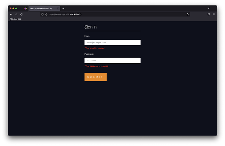
The first layer of validation is to simply make the fields required. Do this by passing the required prop to the informed inputs:
{/** ... **/}
<Input
  required {/**  look here **/}
  name="email"
  label="Email:"
  placeholder="email@example.com"
/>
<Input
  required {/**  look here **/}
  name="password"
  label="Password:"
  placeholder="**********"
/>
{/** ... **/}
Now, when you attempt to submit the form, you’ll see the default This field is required error message displayed below the required input fields.

Changing the required input validation message
In production applications, you’ll want full control over the message shown to your users. The default message, This field is required, may not suffice. You may also want to pass a localized message based on the language of the user.
To accomplish this, pass an errorMessage prop to the required inputs, as shown below:
{/** ... **/}
<Input
  required
  name="email"
  label="Email:"
  placeholder="email@example.com"
  errorMessage="Your email is required" {/**  look here **/}
/>
<Input
  required
  name="password"
  type="password"
  label="Password:"
  placeholder="**********"
  errorMessage="Your password is required" {/**  look here **/}
/>
{/** ... **/}
The above code produces the following:
Going beyond basic, required validation
Adding the required prop is a great first step. However, in real-world projects, you’ll want to go further than that.
Our sign-in form could use a bit more validation. For example, how about validating the actual email input for erroneously-entered emails? And what about validating the length of the password input?
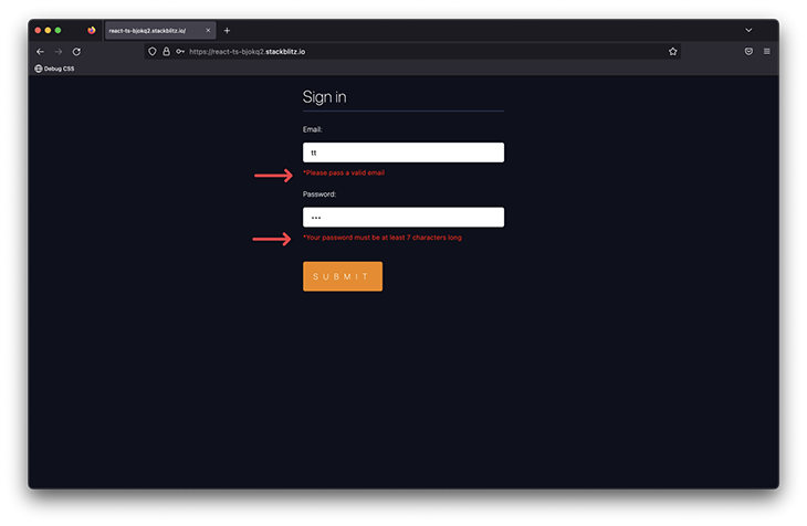
For greater validation flexibility, you can pass a validate function prop to the relevant inputs, as shown below:
import * as React from 'react';
import { Form, Input, Debug } from 'informed';

const validateEmail = (v: string) => {
  if (!v.includes('@')) {
    return 'Please pass a valid email';
  }
};

const validatePassword = (v: string) => {
  if (v.length < 6) {
    return 'Your password must be at least 7 characters long';
  }
};

export default function App() {
  return (
    <Form
      onSubmit={(formState) => {
        console.log(formState.values);
      }}
    >
      <h1>Sign in </h1>
      <Input
        required
        name="email"
        label="Email:"
        validate={validateEmail} {/**  look here **/}
        placeholder="email@example.com"
        errorMessage="Your email is required"
      />
      <Input
        required
        name="password"
                type="password"
        label="Password:"
        placeholder="**********"
        validate={validatePassword} {/**  look here **/}
        errorMessage="Your password is required"
      />
      <button type="submit"> Submit </button>
    </Form>
  );
}
Now, the default errorMessage prop will always be shown when the basic required validation kicks in. However, once the inputs are filled and submitted, the validate function kicks in and the returned string is shown as the input error message:
Schema validation with Yup
In practice, most people use robust schema validation libraries like Yup. Informed lets you use Yup as well.
Let’s rewrite our existing validation to use Yup, as shown below:
import * as Yup from 'yup';
import * as React from 'react';
import { Form, Input } from 'informed';

{/**  look here **/}
const validationSchema = Yup.object().shape({
  email: Yup.string()
    .email('Please pass a valid email')
    .required('Your email is required'),
  password: Yup.string()
    .required('Your password is required')
    .min(7, 'Your password must be at least 7 characters long'),
});

export default function App() {
  return (
    <Form
      yupSchema={validationSchema} {/**  look here **/}
      onSubmit={(formState) => {
        console.log(formState.values);
      }}
    >
      <h1>Sign in </h1>
      <Input name="email" label="Email:" placeholder="email@example.com" />
      <Input
        type="password"
        name="password"
        label="Password:"
        placeholder="**********"
      />
      <button type="submit"> Submit </button>
    </Form>
  );
}
What’s important about the above is that we pass the yupSchema prop to the Form component, and then define your validation schema as you normally would.
Exploring other input types
How does Informed deal with other form input types such as text areas, radio inputs, and select inputs? The usage is quite similar to regular inputs: you import the associated informed component and pass it the relevant props.
Consider the example below:
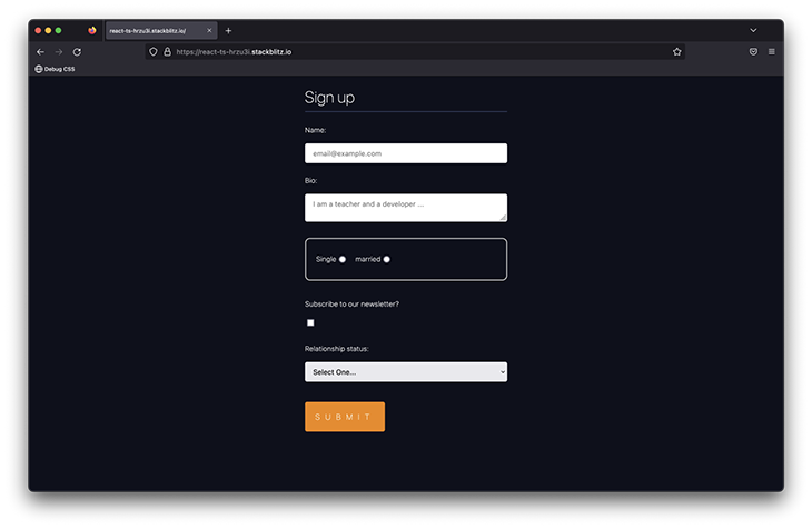
The form above leverages a text area, radio group, checkbox, and select inputs. With Informed, using these is as simple as importing the components (capitalize the names) and passing the same props you would the HTML element, with the addition of a label prop for accessibility.
Here’s how:
import * as React from 'react';
import {
  Form,
  Input,
  TextArea,
  Checkbox,
  Select,
  Option,
  Radio,
  RadioGroup,
} from 'informed';

export default function App() {
  return (
    <Form
      onSubmit={(formState) => {
        console.log(formState.values);
      }}
    >
      <h1>Sign up </h1>
      <Input
        required
        name="name"
        label="Name:"
        placeholder="email@example.com"
      />
      <TextArea {/**  look here **/}
        required
        name="bio"
        label="Bio:"
        placeholder="I am a teacher and a developer ..."
      />

      <RadioGroup name="relationship"> {/**  look here **/}
        <Radio value="single" label="Single" />
        <Radio value="married" label="married" />
      </RadioGroup>

      {/**  look here **/}
      <Checkbox name="newsletter" label="Subscribe to our newsletter?" />

      {/**  look here **/}
      <Select name="status" label="Relationship status:">
        <Option value="" disabled>
          Select One...
        </Option>
        <Option value="single">Single</Option>
        <Option value="relationship">Relationship</Option>
        <Option value="complicated">Complicated</Option>
      </Select>

      <button type="submit"> Submit </button>
    </Form>
  );
}
The Debug component
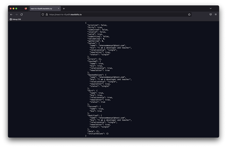
Debugging is a vital part of building real-world software. With Informed, instead of manually rendering the form values or battling console logs, you can use the Debug component to view the current form state.
Consider the use of Debug in the last example:
import {Debug} from 'informed'

...
<Debug />
...
All you have to do is render the Debug component, and you get a visual representation of the current synced state of the entire form.
To view the state of a single form field, use DebugField with the name of the field in question, as shown below:
import {DebugField} from 'informed'

...
<DebugField name="gender"/>
...
Controlling when validation occurs
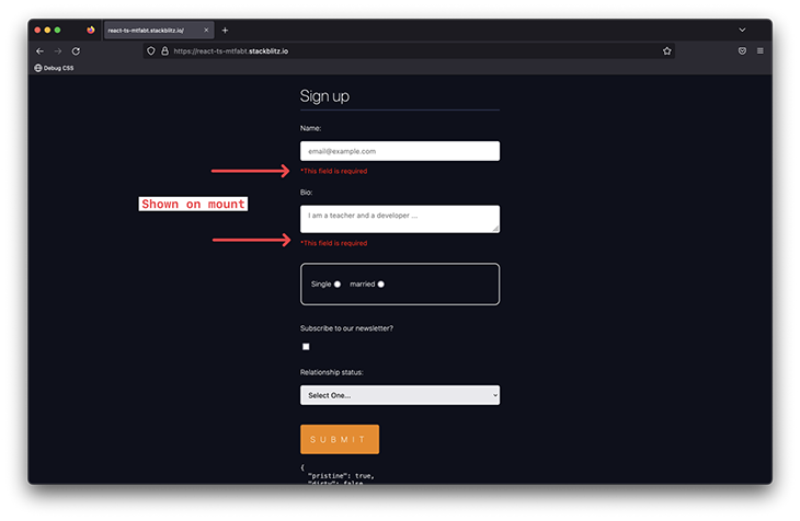
Having control over when you trigger form validation is powerful. For example, you may want to show errors as soon as the form is mounted in order to validate the initial values received from a server, or the defaults passed when initializing an SDK.
To validate as soon as the form mounts, pass the validateOnMount prop to the Form component:
<Form validateOnMount />If you went ahead to do this, validation will occur on mount, but the errors will not show to the user.
You can control when to show the validation error to the user with the showErrorIfError, showErrorIfTouched or showErrorIfDirty prop. (showErrorIfTouched is the default value here.)
To validate the form and show errors immediately on mount, do this:
<Form validateOnMount showErrorIfError/>And now, errors will be displayed as soon as the form is mounted (after validation):
By default, validation will occur when a field is blurred, but you can change this behavior. To further control when your field validation occurs, use the validateOn prop with any of these values:
changeblurchange-blurchange-submitblur-submitsubmit
You can also use the change value for some real-time field validation, like so:
{/** ... **/}

export default function App() {
  return (
    <Form
      showErrorIfError
      onSubmit={(formState) => {
        console.log(formState.values);
      }}
    >
      {/* ... */ }

      <TextArea
        name="bio"
        label="Bio:"
        validateOn="change" {/**  look here **/}
        placeholder="I am a teacher and a developer ..."
      />

      {/* ... */ }
    </Form>
  );
}
Note that showErrorIfError is used to display the error immediately after validation — not after the input field is blurred. The validateOn prop is also passed to the TextArea component and a validate function is provided.
This will simulate real-time validation, with the error shown to the user as it is encountered.
Conditionally render form fields by accessing the form state
At first glance, conditionally rendering a form field isn’t a difficult task. You just have to follow the same principles of JSX you’re already familiar with, e.g.:
true && <ConditionallyRenderThis />However, when the conditional render depends on the internal state of your form, you need access to the form state.
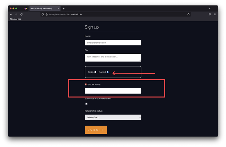
There are several ways to do this with Informed. Perhaps the most flexible option is to grab the state of the entire form using the useFormState Hook, and then conditionally render as you normally would:
const SpouseName = () => {
  const formState = useFormState();
  return (
    formState.values?.relationship === 'married' && (
      <Input name="spouse" label=" Spouse Name:" />
    )
  );
};

export default function App() {
  return (
    <Form
      onSubmit={(formState) => {
        console.log(formState.values);
      }}
    >
     {/* ... */ }
      <SpouseName />
      {/* ... */ }
    </Form>
  );
}
And now, when a user selects the Married option, we will go ahead and request their spouse’s name.
Conditionally display an input field
It’s important to note that the useFormState Hook is used in a separate child component rendered within the Form. If you went ahead to use the useFormState Hook in the parent component rendering the Form, this will not work.
formState.values will always be undefined here. You must use the Hook within the Form component to internally gain access to the form context:
export default function App() {
  const formState = useFormState()

  return (
    <Form
      onSubmit={(formState) => {
        console.log(formState.values);
      }}
    >
     {/* ... */ }
      {formState.values?.relationship === 'married' && (
         <Input name="spouse" label=" Spouse Name:" />
      )
      {/* ... */ }
    </Form>
  );
}
Easy, conditionally-rendered form fields
Informed also exports a Relevant component to simplify conditional renders. For example, we could rework our previous example to use the Relevant component, as shown below:
<Form
    onSubmit={(formState) => {
      console.log(formState.values);
    }}
   >
   {/** ... */}

   <Relevant
        when={({ formState }) => formState.values?.gender === 'non_binary'}
      >
      <Input name="spouse" label=" Spouse Name:" />
   </Relevant>

   {/** ... */}

   <button type="submit"> Submit </button>
 </Form>
The condition for rendering the child component is passed to the when function prop, which receives the form state as an argument and returns a boolean.
If this evaluates to true, the children components are rendered. In this case: <Input name="spouse" label=". Spouse Name:" />
Alternatively, you can also apply conditional rendering at the field level by passing a relevant prop to the required field. Consider the example below:
{/** ... **/}
 <Select
    name="date"
    label=" Shall we help you set up a date?"
    relevant={({ formState }) =>
      formState.values?.relationship === 'single'
    }
  >
    <Option value="" disabled>
      Select a date option
    </Option>
    <Option value="yes">Yes</Option>
    <Option value="no">No</Option>
 </Select>
{/** ... **/}
Now, whenever the user selects their relationship status as single, we’ll go ahead and render a select input asking whether to set them up on a date or not.
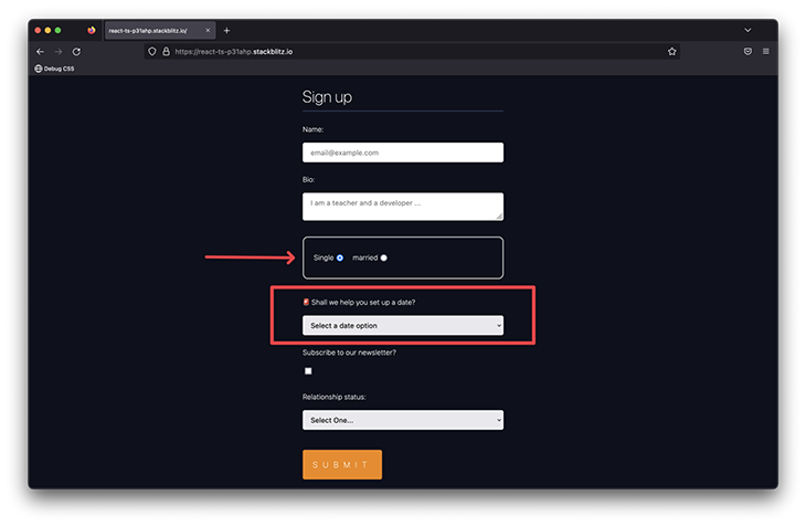
Conditionally rendering a field with the relevant prop
Instead of using the Relevant component, we’re leveraging the relevant prop here. It’s got a similar API to the when prop passed to Relevant. The value of the prop is a function that receives the form state, and the expected return value is a boolean.
Easier data organization with scopes
So far, we’ve only worked with a flat-form state structure. For example, our form, when filled out, will have a state similar to:
{
    "name": "Amadeus Mozart",
    "bio": "Senior software engineer",
    "relationship": "single",
    "date": "no",
    "newsletter": true,
    "status": "single"
}
However, with complex forms, you might want to nest related values within the form state.
For example, we could instead have the following state representation:
{
    "name": "Amadeus Mozart",
    "bio": "Senior software engineer",
    "bond": {
      "relationship": "single",
      "status": "single",
      "date": "no"
    },
    "marketing": {
      "newsletter": true
    }
}
Note the nested bond and marketing fields. To achieve this, Informed exposes a Scope component for grouping related form fields. All we need to do is wrap the child fields in a Scope component, with a scope prop pointing to the name of the eventual nested parent.
Here’s an example:
export default function App() {
  return (
    <Form
      onSubmit={(formState) => {
        console.log(formState.values);
      }}
    >
      {/** ... **/}

     {/** Look here  **/}
      <Scope scope="bond">
        <RadioGroup name="relationship">
          <Radio value="single" label="Single" />
          <Radio value="married" label="married" />
        </RadioGroup>

        <Relevant
          when={({ formState }) =>
            formState.values?.bond?.relationship === 'married'
          }
        >
          <Input name="spouse" label=" Spouse Name:" />
        </Relevant>

        <Select
          name="date"
          label=" Shall we help you set up a date?"
          relevant={({ formState }) =>
            formState.values?.bond?.relationship === 'single'
          }
        >
          <Option value="" disabled>
            Select a date option
          </Option>
          <Option value="yes">Yes</Option>
          <Option value="no">No</Option>
        </Select>

        <Select name="status" label="Relationship status:">
          <Option value="" disabled>
            Select One...
          </Option>
          <Option value="single">Single</Option>
          <Option value="relationship">Relationship</Option>
          <Option value="complicated">Complicated</Option>
        </Select>
      </Scope>

      {/** Look here  **/}
      <Scope scope="marketing">
        <Checkbox name="newsletter" label="Subscribe to our newsletter?" />
      </Scope>

      <button type="submit"> Submit </button>
    </Form>
  );
}
It’s important to note that when you use the Scope component, you must remember to use the new nested hierarchy wherever you access the form state.
For example, consider the relevant prop logic:
// before
formState.values?.relationship === 'single'

// now: use the nested "bond" scope
formState.values?.bond?.relationship === 'single'
Adding input formatters and masks to Informed
If you’ve tried shipping production input formatters or masks without the help of a library, then you know they can get unwieldy quickly. With Informed, you can handle this using either character strings or good old regex.
Consider the following new requirement for our form application: if the user is single and wishes to be set up for a date, go ahead and request their phone number to make it happen.
Assuming the application is only available in the US, let’s go ahead and provide some input formatting for the user’s phone number:
...

<Input
  type="tel"
  name="tel"
  label="Phone number"
  relevant={({ formState }) =>
    formState.values?.bond?.relationship === 'single' &&
    formState.values?.bond?.date === 'yes'
  }
/>;
Using the relevant prop, the phone number input will be displayed when the user’s relationship status is set to single, and they’d like a date.
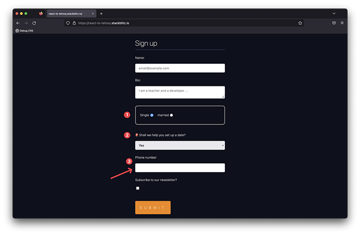
Conditionally displaying a telephone input
Now, we may go ahead and provide a formatter prop to this phone number input, as shown below:
<Input
  {/** ... **/}
  formatter="+1 ###-###-####"
  {/** ... **/}
/>;
This will format the user input to +1 ###-###-####, where # represents valid digits. If you inspect the form state, you’ll see the phone number is stored in the same format.
If you’d rather store the raw user input in the form state, go ahead and provide a parser function prop to strip away the formatting, as shown below:
<Input
  {/** ... **/}
  formatter="+1 ###-###-####"
  parser={(v) => v.replace('+1 ', '').replace(/-/g, '')}
  {/** ... **/}
/>;
The provided parser function takes a value and replaces the telephone code (+1) and the dashes (-).
There are obviously a lot of other use cases for input formatting and masking. I recommend giving the official docs a read.
Why use Informed?
Now that you’ve got an overview of how Informed works, let’s discuss why you should consider using Informed for your next project.
Informed vs. Formik
Formik is arguably the most popular open source form library for React and React Native. So, how does Informed stack up against the juggernaut?
Most of the beloved features of Formik work identically in Informed. They both have declarative APIs, so you can focus on your application business logic. They also both follow the same React mental model you’re used to — i.e., no fancy observers or subscriptions under the hood, just good ol’ React state and props. They also don’t tie you to any particular state management library out-of-the-box. As such, they are both adaptable to use with any state management library, like Redux.
Where Informed begins to shine is the additional utilities it provides over Formik. Informed provides:
- Explicit provisions for formatting and masking input fields
- The special
Debugcomponent - More options for dynamic forms using the
Relevantcomponent and additional utilities, such as KeepState, which lets you keep the state of a field even when it gets unmounted (no longer rendered on screen)
Informed goes beyond the basic needs and provides utilities to solve commonly used problems you’re likely to encounter in the real world.
In my opinion, Informed stacks up well against Formik.
Informed vs. React Hook Form
React Hook Form is an excellent alternative to building forms in React. It’s arguably the second most popular React form library. As with Formik, the provision of form utilities is what sets Informed apart here.
However, it is worth mentioning that React Hook Form’s standout feature is that it does not rely on controlled form inputs, which arguably gives it performance gains over a lot of other form libraries (Informed inclusive).
Conclusion
Informed, while still a young library, is full of potential. If you find yourself starting a new project or wanting to tinker with a new form library, give Informed a shot.
A caveat I’ve encountered working with Informed is there are obvious updates to be made to the documentation and exported types, but that’s the beauty of a new project with potential. You can contribute to its development.
Cheers, and happy form building!
Source: https://blog.logrocket.com
#react #reactjs