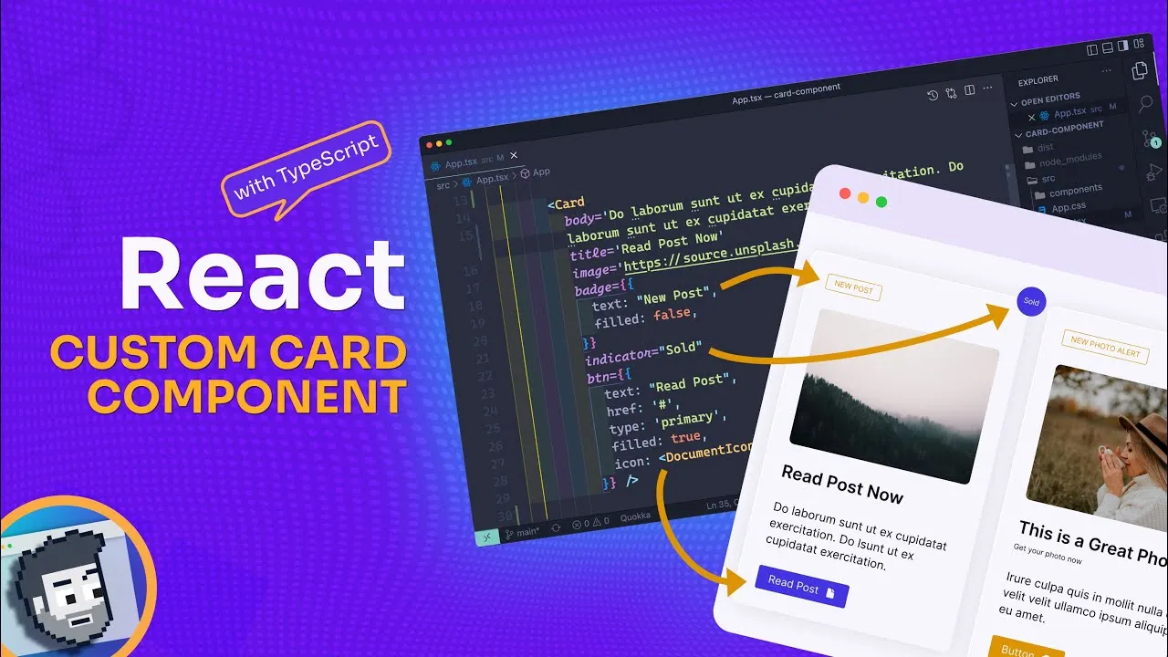
In this video, we'll learn how to build a React card component with TypeScript. We'll start by creating the basic HTML structure for the card component. Then, we'll use TypeScript to define the props and types for the card component. Finally, we'll use React to render the card component.
By the end of this video, you'll know how to build a React card component with TypeScript. This will allow you to create reusable and type-safe components in your React applications.
Here are the steps involved in building a React card component with TypeScript:
- Create the basic HTML structure for the card component.
- Use TypeScript to define the props and types for the card component.
- Use React to render the card component.
Here is the code for the card component:
import React from "react";

interface CardProps {
  title: string;
  description: string;
}

const Card = ({ title, description }: CardProps) => {
  return (
    <div>
      <h2>{title}</h2>
      <p>{description}</p>
    </div>
  );
};

export default Card;
This code will create a React card component that can be used to display a title and description. The card component is type-safe, so you can be sure that the props that are passed to it are of the correct type.
If you are interested in learning more about React, TypeScript, or building reusable components, then I encourage you to watch this video.
In this video, we’ll take a Figma card component from design to code with React and Typescript!
🔗 Key Links 🔗
- Github: https://github.com/coding-in-public/card-component-react-ts
- Demo: https://codinginpublic.dev/projects/card-component-react-ts/
---------------------------------------
⏲️ Timestamps ⏲️
0:00 Introduction
1:07 Figma Walkthrough
2:31 Code Setup
5:28 Badge Component
10:26 Style CSS
16:17 Badge CSS
18:24 Button Component
24:41 Button CSS
32:29 Card Component
44:04 Card CSS
48:04 Customizing Cards
#react
