I’ve been pretty busy working with some data from an experiment. I’m trying to fit a subset of the data to a model distribution/distributions where one of the functions follows a normal distribution (in linear space). Sounds pretty simple right?
Based on the domain knowledge of this problem, I _also _know that the data can probably be fitted by a mixture model and more specifically a Gaussian mixture model. Brilliant you say! Why not try something like,
from sklearn.mixture import GaussianMixture

model = GaussianMixture(*my arguments/params*)
model.fit(*my arguments/params*)
But try as I might I couldn’t find parameters that _should _model the underlying processes that generated the data. I had all sorts of issues from overfitting the data to nonsensical standard deviation values. Finally, after a lot of munging, reading and advice from my supervisor I figured out how to make this problem work for me and move onto the next step. In this post I want to focus on why the log domain can be useful in understanding the underlying structure of the data and can aid in data exploration when used in conjunction with kernel density estimation (KDE) and KDE plots.
Let’s look at this dataset in a bit more detail. Importing some useful libraries for later,
import numpy as np

import pandas as pd
import matplotlib.pyplot as plt
import seaborn as sns
#plot settings
plt.rcParams["figure.figsize"] = [16,9]
sns.set_style('darkgrid')
I’ve made the plots a little bigger and I’m using seaborn which enables me to manage the plots a little better and simultaneously make them look good! Reading the CSV with the data and getting to the subset that’s relevant to this project,
df = pd.read_csv("my_path/my_csv.csv")

df_sig = df[df['astrometric_excess_noise_sig']>1e-4]
df_sig = df_sig['astrometric_excess_noise_sig']
#describing the data
df_sig.describe()
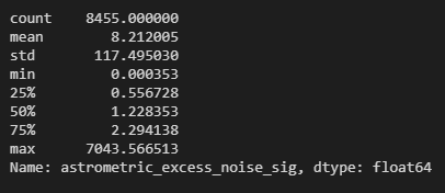
The stats relating to the data I’m looking at
As you can see, the maximum is close to 7000 while the minimum is of the order 1e-4. This is a fairly large range as the difference between the smallest and the largest value in this data frame is of the order 1e+7. This is where I had a bit of a moment/brain fart. Let’s walk through my moment!
I tried a fairly naive plot of this data and realised that it looks like this
plt.hist(df_sig, bins=150)

plt.xlabel('Astrometric Excess Noise Sigma', fontsize=12)
plt.ylabel('Frequency',fontsize=12)
plt.legend()
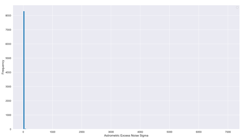
So this is with something like 150 bins. This should have been my first clue! The maximum value and values that extend beyond a few hundred have relatively fewer number of samples compared to the values that are a lot closer to zero or even in the tens.
After a LOT of blind alleys, I switched to the log domain.
Yes everyone, the log domain!
(If you want to know all the blind alleys I went down drop me a DM on Twitter and I’ll explain. I’m going to focus on the solution here instead!)
Why the log domain? (specifically log of base _e _or the natural logarithm). If you look at the (hideous) histogram above you’ll notice that the count is not “sensitive” enough to pick up the low frequency and high-value samples that extend beyond a few tens on the x-axis. Furthermore, the domain knowledge indicated that this data _might _be due to three underlying processes and potentially can be explained by a mixture model of three components that map onto these processes. Sadly, this structure is not visible in the linear domain due to the massive spread in the data and the low frequency of some of the samples (which is to be expected in this kind of experiment).
#data-visualization #python #kernel-density-estimation #logarithm #data-science #data analysis