How to Plot Cryptocurrency Price Charts with Python in 10 minutes
Starting from complete scratch, you will plot your first cryptocurrency candlestick data chart by the end of this article - In less than 10 minutes.
Building tools which take advantage of exchange data is a nightmare in the cryptocurrency space. The limited number of available tools means you need to develop features from nothing.
Since every exchange provides different endpoints for collecting data, this quickly turns into a black hole which will consume your time.
Each exchange requires custom code and infrastructure to handle the intricacies of what they offer.
Thankfully, the Universal Crypto Exchange APIs normalize this data for us. An API which you can freely use to access historical and live data.
This article will describe how to set up your first script to access live market data from any exchange, normalize it into a cohesive format, and plot it. There is no complex configuration or development.
Let’s get started!
Install Libraries
Before we get started writing the script, we need to install a few libraries. If you use pip, this can be done simply by running the following commands.
pip install shrimpy-python
pip install pandas
pip install plotly==4.1.0
Generate API Keys
After installing the necessary libraries, sign up for a Shrimpy Developer API account. These are the APIs which provide the exchange data. It’s free and takes only a few seconds to sign up.
After signing up, generate your master key. These keys are used to sign requests to Shrimpy and access crypto market data.
Make sure to securely store your public and secret keys. They will be needed for later steps.
Writing Our First Script
We’re now ready to begin writing our first script. The script for this article will collect candlestick market data from the exchange we specify, organize it in a way that’s understandable for the plotting library, and display it.
Import Libraries
In this script, we will be using the Plotly Library. This will provide a convenient way for us to get up and running without much effort.
Import these libraries into your script so we can collect our data and graph it.
import shrimpy
import plotly.graph_objects as go
Assign Keys
Before we can access any data from Shrimpy, we need to make sure we correctly sign our requests. This requires us to pass in our public and private keys. For now, let’s just assign them for later use.
public_key = '8x71n32d8cfbnnn1xzimjustkeyboardmashing8xn1t8jyv5098'
secret_key = '771dc5nxct4709672v4n09xn0morekeyboardmashing9475c029374n0xx4n50'
Create Client
To create the client, pass in the public and secret keys which were assigned in the previous step. The client will then conveniently handle the signing of each request, so you can focus on accessing the data and building tools with the data.
client = shrimpy.ShrimpyApiClient(public_key, secret_key)
Get Candles
It’s time to get our candlestick data from Shrimpy. Use the client to call the endpoint for retrieving the candlesticks.
Just make sure to pass in the exchange, trading pair, and interval you wish to access.
Example 1:
candles = client.get_candles(
    'binance',  # exchange
    'XLM',      # base_trading_symbol
    'BTC',      # quote_trading_symbol
    '15m'       # interval
)
Example 2:
candles = client.get_candles(
    'bittrex',  # exchange
    'LTC',      # base_trading_symbol
    'BTC',      # quote_trading_symbol
    '1h'        # interval
)
Example 3:
candles = client.get_candles(
    'kucoin',   # exchange
    'ETH',      # base_trading_symbol
    'USDT',     # quote_trading_symbol
    '1d'        # interval
)
Observe how we are able to change each of these parameters to configure the data we want to access.
The supported time intervals for each candle include the following:
1m, 5m, 15m, 1h, 6h, or 1d
Convert Data
Once the data has been collected from Shrimpy, we want to convert the data to the format which is accepted by the plotting library Plotly. To do this, we will go through the candlesticks we collected from Shrimpy and assign each of the candlestick components to an element of the candle.
dates = []
open_data = []
high_data = []
low_data = []
close_data = []

for candle in candles:
    dates.append(candle['time'])
    open_data.append(candle['open'])
    high_data.append(candle['high'])
    low_data.append(candle['low'])
    close_data.append(candle['close'])
The result of this step is each individual candlestick will be broken out into a list which holds the individual component of every candlestick.
Generate Figure
Finally, it’s time to generate the figure. Use the Plotly library to create the chart that we will display, then display the chart.
fig = go.Figure(data=[go.Candlestick(x=dates,
                       open=open_data, high=high_data,
                       low=low_data, close=close_data)])

fig.show()
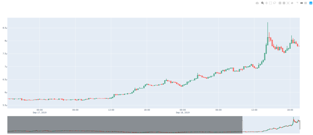
Calling fig.show() displays the graph. This will look something like the following chart.

The end result of the script is a graph which displays the candlesticks for an individual asset on an individual exchange over time.
Putting It All Together
Now that we’ve walked through each element of the script step-by-step, it’s time to put everything together.
# import the libraries we need
import shrimpy
import plotly.graph_objects as go

# insert your public and secret keys here
public_key = '8x71n32d8cfbnnn1xzimjustkeyboardmashing8xn1t8jyv5098'
secret_key = '771dc5nxct4709672v4n09xn0morekeyboardmashing9475c029374n0xx4n50'

# create the client
client = shrimpy.ShrimpyApiClient(public_key, secret_key)

# get the candles
candles = client.get_candles(
    'binance',  # exchange
    'XLM',      # base_trading_symbol
    'BTC',      # quote_trading_symbol
    '15m'       # interval
)

# create lists to hold our different data elements
dates = []
open_data = []
high_data = []
low_data = []
close_data = []

# convert from the Shrimpy candlesticks to the plotly graph objects format
for candle in candles:
    dates.append(candle['time'])
    open_data.append(candle['open'])
    high_data.append(candle['high'])
    low_data.append(candle['low'])
    close_data.append(candle['close'])

# construct the figure
fig = go.Figure(data=[go.Candlestick(x=dates,
                       open=open_data, high=high_data,
                       low=low_data, close=close_data)])

# display our graph
fig.show()
The final script can be run, altered, and leveraged to generate graphs similar to the one depicted above. Just make sure to insert your own public and secret keys so your client can properly sign requests.
More Scripts
If you want more ideas for developing your own scripts, explore everything that’s offered by the Universal Crypto Exchange APIs. You can find the Node and Python libraries for these APIs here:
Thank for reading! Please share if you liked it!
#Python #cryptocurrency #bitcoin #blockchain #node.js
