Javascript library for toggling element's CSS class by clicking another element
Class Toggler
Simple javascript library for toggling element’s CSS class by clicking another element(s). Toggling is controlled via data-attributes. Suitable for creating simply show/hide, more/less, tabs, accordion, dropdown or modal components without writing (repetitive) javascript code, all is done within your HTML template. Component visual behaviour is controlled by your stylesheets.
📋 Basic Usage
When toggling there are two types of HTML elements:
Toggle Button
- Show/hides related content(s) when clicked.
- Related content(s) is defined by
data-toggle-targetHTML attribut value. - Active state is identified by customizable CSS class (default
-active-toggle).
Toggle Content
- Element to be shown/hidden when related button(s) is clicked.
- Related button(s) is defined by
data-toggle-nameHTML attribut value. - Hidden state is identified by customizable CSS class (default
-hidden-toggle).
Basic Example
Reveals text and make the button green when you click on it:
<!-- Linking Class Toggler -->
<script src="class-toggler.min.js"></script>

<!-- Initialization of Class Toggler -->
<script>
  document.addEventListener('DOMContentLoaded', () => classToggler.init());
</script>

<!-- Styles for hidden content and active button -->
<style>
  .-active-toggle {
    color: green;
  }
  .-hidden-toggle {
    display: none;
  }
</style>

<!-- Toggle content -->
<div class="-hidden-toggle" data-toggle-name="toggle-name">
  <p>Text to be toggled.</p>
</div>

<!-- Toggle button -->
<button data-toggle-target="toggle-name">
  Toggle text!
</button>
(See live demos)
🚀 Initialization
- Link Class Toggler library in your HTML:
<script src="path-to-library/dist/class-toggler.min.js"></script>
- Initialize Class Toggler in your JS:
document.addEventListener('DOMContentLoaded', () => {
  classToggler.init();
});
or if using ES6 modules:
import classToggler from 'path-to-library/dist/class-toggler.esm.min.js';

document.addEventListener('DOMContentLoaded', () => {
  classToggler.init();
});
⚙ Options / Data Attributtes
Behaviour of each individual toggle can be set via these data attributes:
Toggle Button Options
data-toggle-target="name
Targets related content(s) that has data-toggle-name="name".
(See More/Less demo)
data-toggle-class=“class-name”
CSS class-name that will be assigned to active toggle button (default -active-toggle).
For example, when using BEM naming convention, your code should look like this:
<div class="Module">

  <button
    class="Module__button"
    data-toggle-target="module-text"
    data-toggle-class="Module__button--active"
  >Show text!</button>

  <p
    class="Module__text Module__text--hidden"
    data-toggle-name="module-text"
    data-toggle-class="Module__text--hidden"
  >Text lorem ipsum dolor.</p>

</div>
(See More/Less demo)
data-toggle-group="group-name"
Each group (togglers with the same group-name) can have maximum of one active toggler. Turning one toggler on will turn off the rest of togglers in group.
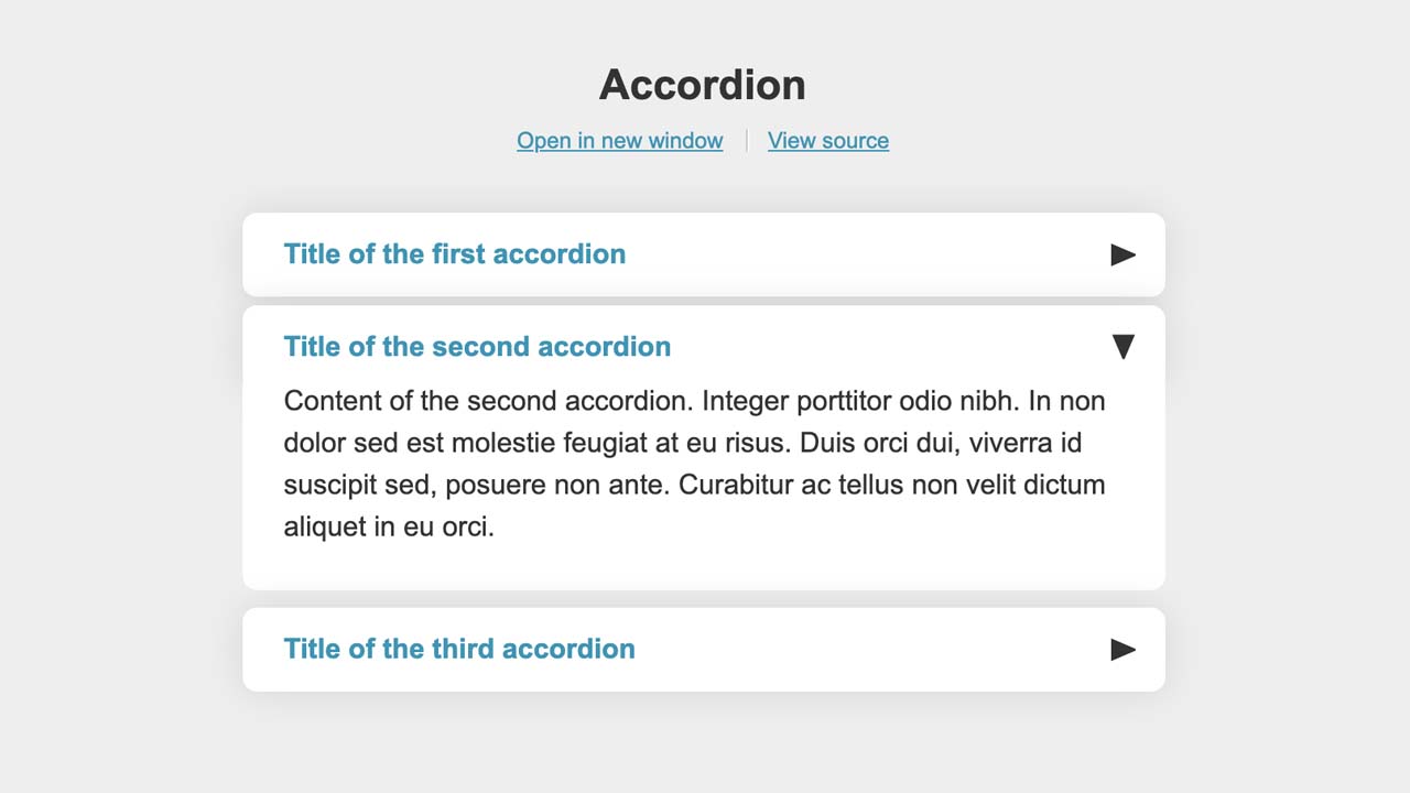
(See Accordion demo)
data-toggle-tabs="tabs-name"
Each tabs group (togglers with the same tabs-name) has always just one active toggler. Turning one toggler on will turn off the rest of togglers in tabs. Active toggler can’t be turned off by clicking it.
(See Tabs demo)
data-toggle-abort="event-1 event-2"
Automatically hides toggle for these possible events:
- escape - Hide when escape key is pressed.
- clickout - Hide when clicking outside the toggle content.
(See Modal demo)
data-toggle-match="media-query"
Binds toggle function on toggler only for matching media-query (e.g. (min-width: 30em)), otherwise default action will be fired (opening the <a>'s link, submitting <button>'s form…).
(See Media query demo)
Toggle Content Options
data-toggle-name="name"
Targets related button(s) that has data-toggle-target="name".
(See More/Less demo)
data-toggle-class="class-name"
CSS class-name that will be assigned to hidden toggle content (default -hidden-toggle). See toggle button option example.
(See More/Less demo)
data-toggle-focus="css-selector"
Element targeted by css-selector (e.g. #form-field) will be focused when content is shown.
(See Focused content demo)
👂 Events
ct.button.on
Fired at toggle button after it is turned on.
document.querySelector('#button').addEventListener('ct.button.on', () => {
  console.log('Button turned on!');
});
ct.button.off
Fired at toggle button after it is turned off.
document.querySelector('#button').addEventListener('ct.button.off', () => {
  console.log('Button turned off!');
});
ct.content.shown
Fired at toggle content after it is shown.
document.querySelector('#content').addEventListener('ct.content.shown', () => {
  console.log('Content shown!');
});
ct.content.hidden
Fired at toggle content after it is hidden.
document.querySelector('#content').addEventListener('ct.content.hidden', () => {
  console.log('Content hidden!');
});
ct.toggled
Fired at document when any toggle button is clicked.
document.addEventListener('ct.toggled', () => {
  console.log('Toggle button click!');
});
🛠 Configuration
Class Toggler can be initialized with these options:
classActive- CSS class for active toggle button (default-active-toggle)classHidden- CSS class for hidden toggle content (default-hidden-toggle)attrTarget- HTML data attribute used for toggle targeting (defaultdata-toggle-target),attrName- HTML attribute used for toggle naming (defaultdata-toggle-name),attrClass- HTML attribute defining toggled CSS class (defaultdata-toggle-class),attrFocus- HTML attribute used for focusing toggle content (defaultdata-toggle-focus),attrAbort- HTML attribute used for toggle aborting (defaultdata-toggle-abort),attrMatch- HTML attribute used for toggle media query (defaultdata-toggle-match),attrGroup- HTML attribute used for toggle grouping (defaultdata-toggle-group),attrTabs- HTML attribute used for toggle grouping in tabs (defaultdata-toggle-tabs),eventNamespace- Namespace for Class Toggler events (defaultct),
Example of initialization with custom configuration:
document.addEventListener('DOMContentLoaded', () => {
  classToggler.init({
    classActive: 'your-active-class',
    classHidden: 'your-hidden-class',
  });
});
Download Details:
Author: vyvrhel
Demo: https://vyvrhel.github.io/class-toggler/
Source Code: https://github.com/vyvrhel/class-toggler
#javascript