A spider chart is also called radar chart, it can be used to describe data with 3 or more dimensions with quantitative measures. Basically, whenever you want to analyze data using a pie chart, you can consider if you want to try a more advanced radar chart.
Tableau is one of the most popular data visualization tools now, but it doesn’t have a built-in spider chart to work with. I read many articles written about how to build a radar chart on Tableau and I worked out this very easy and simple method after trying many other complicated methods.
In this article, I will use the data set of Canada University Ranking 2015 posted on Kaggle as an example trying to compare universities in Canada by 6 dimensions: employment, faculty, publication, influence, broad and patents.
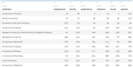
Data Set Preview
Let’s have a look at the radar chart I created on Tableau firstly. You can also find the radar chart I created on Tableau from here**.**👈

>>> Step 1: Pivot Data
Holding [Ctrl] select all the 6 qualities > right-click > click [Pivot]

Make sure dimension [Quality] names in a column and value [Score] of dimensions in another column.
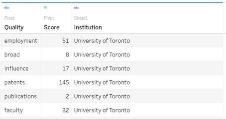
Data Table after Pivoting
>>> Step 2: Create Calculated Fields
№1. [Path]
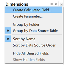
Create a calculated field
[Path] field tells Tableau the sequencing by which the ‘web’ should walk.
CASE [Quality]
WHEN 'employment' THEN 1
WHEN 'broad' THEN 2
WHEN 'influence' THEN 3
WHEN 'patents' THEN 4
WHEN 'publications' THEN 5
WHEN 'faculty' THEN 6
END
№2. [X-axis]
We’ll use Trigonometry to indicate the direction of each corner of our “spider web”, X-axis is cos value of an angel and Y-axis is sin value of the coordinating angel.
#tableau #data-visualization #data-science #data analysis
