Data visualization is an essential, routine task in any field regardless of how small or large the data is, then be it plotting a simple sinusoidal curve or creating sophisticated, interactive dashboards for stakeholders. Python being one of the most sought after programming languages today (in the active top 3 on Stack Overflow), offers tremendous possibilities of data visualization.
Matplotlib is one such powerful plotting library for python that offers a varied spectrum of 1D, 2D, and 3D visualizations. Being a gold badge holder of matplotlib on Stack Overflow, I thought of creating a series of tutorials aimed at teaching the basic know-hows of using python & matplotlib for plotting eye-catchy figures, providing ready-to-use, Jupyter Notebooks.
This first post of mine will teach you the **_essential basics _**of matplotlib, taking the use case of one-dimensional plots, together with basic bar and pie charts. The whole Notebook can be downloaded/forked from my GitHub repository. Following system settings are used: Python version: 3.7.7, Matplotlib version: 3.1.3. The tutorial is expected to work on older versions, too.
1) Let’s get started with 1D plots
To enable the inline plotting in Jupyter Notebooks, you need to use the following at the beginning of the Notebook
%matplotlib inline
If your screen supports retina display, you can enhance the resolution of the figure by using
%config InlineBackend.figure_format = ‘retina’
Matplotlib offers several cool style sheets to enhance the figure aesthetics. I will use 'fivethirtyeight'
plt.style.use('fivethirtyeight')
1.1) The simplest plot
The _simplest _example would be to plot a list of values. Let’s create a list of incremental values and plot it.
values = [5, 6, 7, 8, 9]
plt.plot(values)
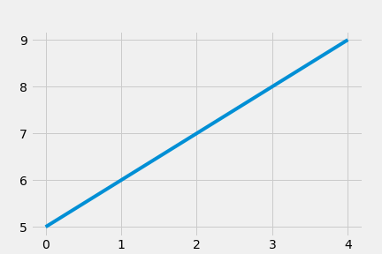
A simple line plot
You can see that the values are plotted on the y-axis. For plotting on the x-y space, you typically need two lists: one for the x-values and the other for the y-values. Please note that, by default, solid lines are used for plotting.
Now you might be wondering how the figure was created without passing the x-values.
By default, when we pass a single list to plt.plot(), the x-axis assume integer values starting from zero until one less than the length of the y-values. In the above figure, values had five elements. So the x-values became 0, 1, 2, 3, 4 (because indexing starts from 0 in python). In other words, the x-values are range(len(values)), where len(values) returns the length of the list i.e. 5. Therefore, the following line will also plot the same figure:
plt.plot(range(len(values)), values)
⇒ NOTE: If you are using some other python IDE, for instance spyder, you will need to use plt.show() after the plt.plot() command for the figure window to appear. You don’t need it in the Jupyter Notebook though.
#python #matplotlib #plotting #data-visualization #charts #programming