Responsive application layout, its UI as per the size and shape of the screen or window. This is particularly essential when the equivalent application can run on an assortment of devices, from a watch, phone, tablet, to a PC or desktop computer. At the point when the client resizes the window on a PC or desktop or changes the direction of the phone or tablet, the application ought to react by adjusting the UI appropriately.
The idea of Responsive Design is tied in with utilizing one lot of code that reacts to different changes to the layout. Stages, for example, the iOS and local Android SDKs, handled this issue with “all-inclusive layouts.” The widespread layouts react to layout changes by utilizing imperatives and naturally resizing components.
In this blog, We will be going to explore the **Responsive Flutter Layout With FittedBox Widget **and show a demo of how to use a fitted box widget in your flutter applications.
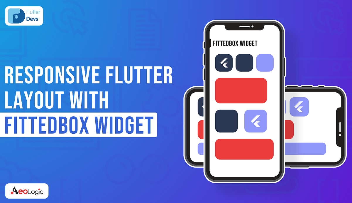
FittedBox
The [**FittedBox**](https://api.flutter.dev/flutter/widgets/FittedBox-class.html) widget is a single child layout widget, which implies it can have just a single child assigned to it. In this model, the Row widget is added as a child to FittedBox widgets. The Row widget has two Conatiner as its children. Typically, the second child of **Row **widgets will overflow to the one side when it renders its children on a screen size, which isn’t adequate to oblige the entirety of its children. However, with FittedBox, this issue of a widget overflowing is solved. It scales and positions its child inside the parent widget.
It makes a widget that scales and positions its child inside itself as indicated by Fit. FittedBox Widget is a basic Widget to help in making a snappy and neater approach to contain a child inside a parent. The fundamental purpose behind utilizing the FittedBox is to make the App UI look neater for dynamic children with shifting lengths.
#dart #responsive-layout #fittedbox-widget #flutter #mobile-app-development