So, you just finished retrieving, processing, and analyzing your data. You grab your data and you decide to graph it so you can show others your findings. You click ‘graph’ and……
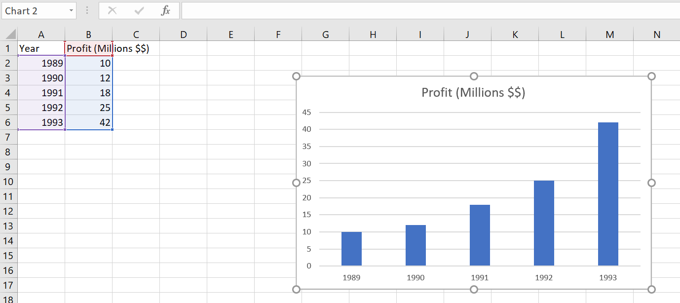
Photo Taken by Bruce Ironhardt
SYa looks kinda boring. What we want is something a little more fun and dynamic. Something like… this:
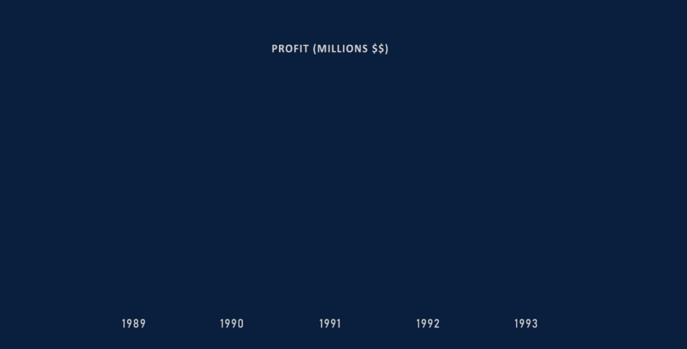

Yes! Now that looks awesome! So let’s see how we can do quickly get this animation going.
Prerequisites
Okay here’s what you’ll need to get started:
- Data for a bar graph (duh!)
- Adobe Illustrator (Don’t worry we don’t need it for anything complicated)
- Adobe After Effects
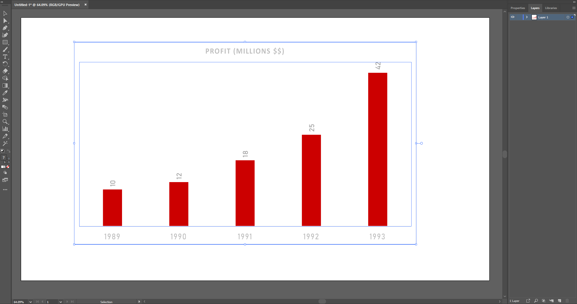
Step 1: Make Your Excel Graph Look Better
So, let’s just do a few things to make our graph look better. We can start by making the text a bit larger and let’s change the graph style while we’re at it.
Now for the style, I don’t want the y-axis and instead, I just want the total numeric value at the top of each bar in our graph. We can do it in excel pretty easily,
- Select the graph
- Click on the ‘brush icon’
- Under ‘Style’ we can find the graph style we’re looking for. For me, it was the second one but it may be different for you.
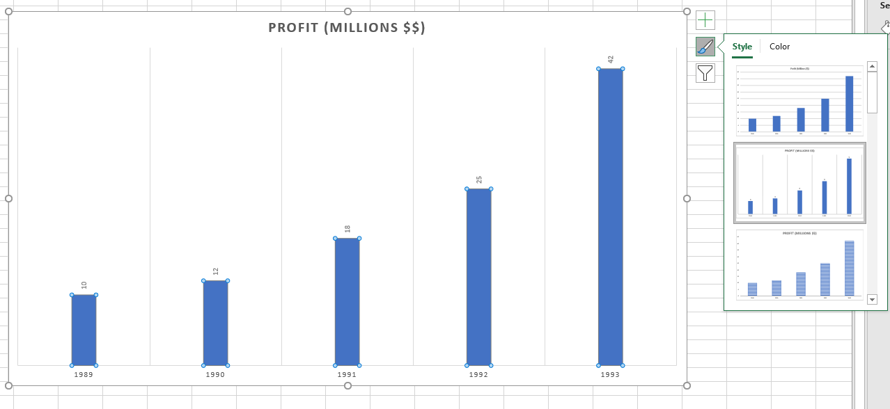
Photo Taken by Bruce Ironhardt
Next just make the font size larger and change the font to whatever tickles your fancy. Remove any background lines (you can just select and delete them). And maybe make the bar wider. After I was done editing my graph looked like this.
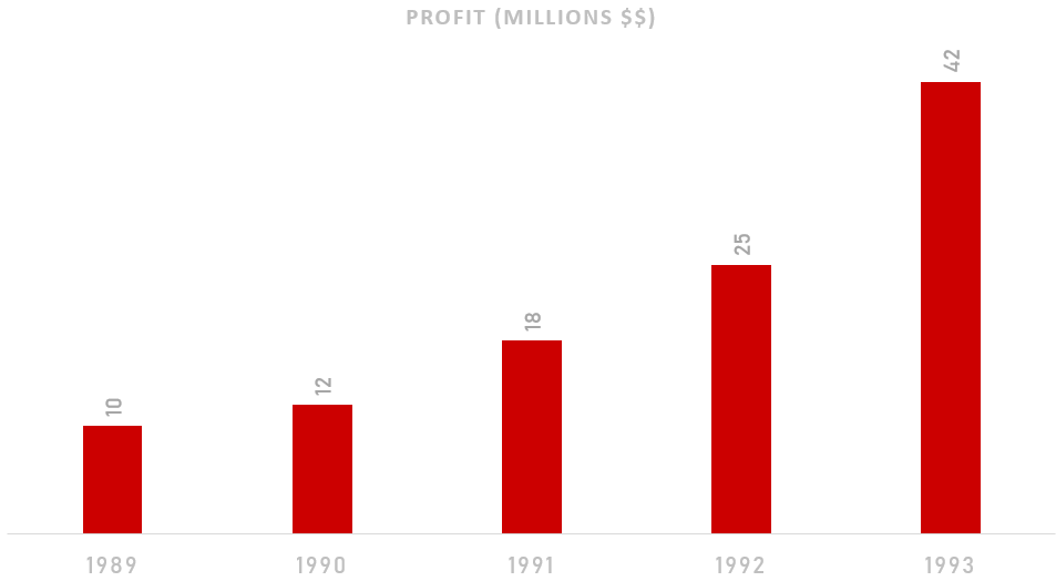
Don’t worry about the text being too light right now, later on, I’ll be adding a darker background color to make things pop more.
Experiment, and play with the kind of design you want to have, feel free to be as creative as you want.
Step 2: Break the Excel Chart Into Components in Adobe Illustrator
Create a new project in Adobe Illustrator and set the size to 1920 by 1080. Then simply copy-paste the graph you just made from Excel into Illustrator.
The image will copy in as a vector image meaning you can resize it without having to worry about quality loss. Resize your image until it fits the way you want it to on your canvas. See below for reference on how it’s been sized.
Split Each Bar Into Their Own Layer
If you open the ‘Layers’ panel (you can click f7 or Window -> Layers to open it up) you should see ‘Layer 1’. If we open it up, we should see a Layer called ‘’ with all the bars that we need.
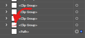
Right now they’re all stuck together.
1. Select that ‘’ -> Right-click on the bar -> Select ‘Release Clipping Mask’. That will create a ‘Compound Path’ Layer.
2. Select this layer and again right-click on the bar and select ‘Release Compound Path’. Now we have all the bars separated.
#guides-and-tutorials #visualization #data #after-effects #animation #data analysis