Animated Login From Using Only HTML & CSS

download sourch code : https://docodee.blogspot.com/
download font awesome : https://fontawesome.com/

Learn how to create a responsive login form with CSS.

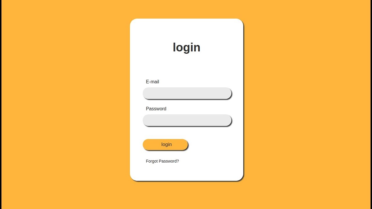
How To Create a Login Form

Step 1) Add HTML:

Add an image inside a container and add inputs (with a matching label) for each field. Wrap a

element around them to process the input. You can learn more about how to process input in our PHP tutorial.

Example

 <form action="action_page.php" method="post">
  <div class="imgcontainer">
    <img src="img_avatar2.png" alt="Avatar" class="avatar">
  </div>

  <div class="container">
    <label for="uname"><b>Username</b></label>
    <input type="text" placeholder="Enter Username" name="uname" required>

    <label for="psw"><b>Password</b></label>
    <input type="password" placeholder="Enter Password" name="psw" required>

    <button type="submit">Login</button>
    <label>
      <input type="checkbox" checked="checked" name="remember"> Remember me
    </label>
  </div>

  <div class="container" style="background-color:#f1f1f1">
    <button type="button" class="cancelbtn">Cancel</button>
    <span class="psw">Forgot <a href="#">password?</a></span>
  </div>
</form> 
  

Step 2) Add CSS:

Example

 /* Bordered form */
form {
  border: 3px solid #f1f1f1;
}

/* Full-width inputs */
input[type=text], input[type=password] {
  width: 100%;
  padding: 12px 20px;
  margin: 8px 0;
  display: inline-block;
  border: 1px solid #ccc;
  box-sizing: border-box;
}

/* Set a style for all buttons */
button {
  background-color: #4CAF50;
  color: white;
  padding: 14px 20px;
  margin: 8px 0;
  border: none;
  cursor: pointer;
  width: 100%;
}

/* Add a hover effect for buttons */
button:hover {
  opacity: 0.8;
}

/* Extra style for the cancel button (red) */
.cancelbtn {
  width: auto;
  padding: 10px 18px;
  background-color: #f44336;
}

/* Center the avatar image inside this container */
.imgcontainer {
  text-align: center;
  margin: 24px 0 12px 0;
}

/* Avatar image */
img.avatar {
  width: 40%;
  border-radius: 50%;
}

/* Add padding to containers */
.container {
  padding: 16px;
}

/* The "Forgot password" text */
span.psw {
  float: right;
  padding-top: 16px;
}

/* Change styles for span and cancel button on extra small screens */
@media screen and (max-width: 300px) {
  span.psw {
    display: block;
    float: none;
  }
  .cancelbtn {
    width: 100%;
  }
} 

How To Create a Modal Login Form

Step 1) Add HTML:

Example

 <!-- Button to open the modal login form -->
<button onclick="document.getElementById('id01').style.display='block'">Login</button>

<!-- The Modal -->
<div id="id01" class="modal">
  <span onclick="document.getElementById('id01').style.display='none'"
class="close" title="Close Modal">&times;</span>

  <!-- Modal Content -->
  <form class="modal-content animate" action="/action_page.php">
    <div class="imgcontainer">
      <img src="img_avatar2.png" alt="Avatar" class="avatar">
    </div>

    <div class="container">
      <label for="uname"><b>Username</b></label>
      <input type="text" placeholder="Enter Username" name="uname" required>

      <label for="psw"><b>Password</b></label>
      <input type="password" placeholder="Enter Password" name="psw" required>

      <button type="submit">Login</button>
      <label>
        <input type="checkbox" checked="checked" name="remember"> Remember me
      </label>
    </div>

    <div class="container" style="background-color:#f1f1f1">
      <button type="button" onclick="document.getElementById('id01').style.display='none'" class="cancelbtn">Cancel</button>
      <span class="psw">Forgot <a href="#">password?</a></span>
    </div>
  </form>
</div> 

Step 2) Add CSS:

Example

 /* The Modal (background) */
.modal {
  display: none; /* Hidden by default */
  position: fixed; /* Stay in place */
  z-index: 1; /* Sit on top */
  left: 0;
  top: 0;
  width: 100%; /* Full width */
  height: 100%; /* Full height */
  overflow: auto; /* Enable scroll if needed */
  background-color: rgb(0,0,0); /* Fallback color */
  background-color: rgba(0,0,0,0.4); /* Black w/ opacity */
  padding-top: 60px;
}

/* Modal Content/Box */
.modal-content {
  background-color: #fefefe;
  margin: 5px auto; /* 15% from the top and centered */
  border: 1px solid #888;
  width: 80%; /* Could be more or less, depending on screen size */
}

/* The Close Button */
.close {
  /* Position it in the top right corner outside of the modal */
  position: absolute;
  right: 25px;
  top: 0;
  color: #000;
  font-size: 35px;
  font-weight: bold;
}

/* Close button on hover */
.close:hover,
.close:focus {
  color: red;
  cursor: pointer;
}

/* Add Zoom Animation */
.animate {
  -webkit-animation: animatezoom 0.6s;
  animation: animatezoom 0.6s
}

@-webkit-keyframes animatezoom {
  from {-webkit-transform: scale(0)}
  to {-webkit-transform: scale(1)}
}

@keyframes animatezoom {
  from {transform: scale(0)}
  to {transform: scale(1)}
} 

Tip: You can also use the following javascript to close the modal by clicking outside of the modal content (and not just by using the “x” or “cancel” button to close it):

Example

 <script>
// Get the modal
var modal = document.getElementById('id01');

// When the user clicks anywhere outside of the modal, close it
window.onclick = function(event) {
  if (event.target == modal) {
    modal.style.display = "none";
  }
}
</script> 

#html #css #web-development

Animated Login From Using Only HTML & CSS
7.05 GEEK