A Simple and Lightweight Vue Modal Component
@burhanahmeed/vue-modal-2
A simple and lightweight Vue modal component. For short we call it VM2.
Install
yarn add @burhanahmeed/vue-modal-2
or
npm install @burhanahmeed/vue-modal-2
Usage
Vue-modal-2 usage for Vue 2.x
import Vue from "vue";
import App from "./App.vue";

import Modal from "@burhanahmeed/vue-modal-2";

Vue.use(Modal);

Vue.config.productionTip = false;

new Vue({
  render: (h) => h(App)
}).$mount("#app");
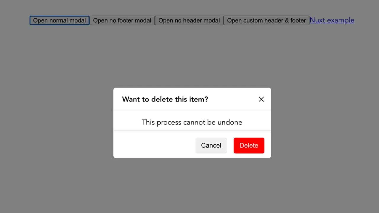
Usage in vue. If you didn’t specify options.componentName, by default it will be <vue-modal-2></vue-modal-2>
<template>
  <vue-modal-2 name="modal-1" @on-close="close">
    Hello From Inside Modal Component
  </vue-modal-2>
</template>
API usage
methods: {
  open () {
    this.$vm2.open('modal-1')
  },
  close () {
    this.$vm2.close('modal-1')
  }
}
vue-modal-2 also accept options in .use() function as second argument.
options
options.componentName
- type:
String - default:
vue-modal-2
Vue.use(Modal. {
  componentName: 'MyModal'
});
<template>
  <my-modal name="modal-1" @on-close="close">
    Hello From Inside Modal Component
  </my-modal>
</template>
Props
vue-modal-2 accept some props
name
unique name of the modal (required).
- type:
String - required:
true - default:
modal-1
@on-close or v-bind:on-close
props function using to close the modal (required).
- type:
function - required:
true
see example above.
headerOptions
options props for vue-modal-2 header
- type:
Object - default:
{}
headerOptions key:
| key | type | default | desc |
|---|---|---|---|
headerOptions.title |
String |
Modal title | Modal title on the left side |
headerOptions.closeIcon |
String |
✕ |
Close button icon on the right side |
footerOptions
options props for vue-modal-2 footer
- type:
Object - default:
{}
footerOptions key:
| key | type | default | desc |
|---|---|---|---|
footerOptions.justify |
String |
flex-end |
determine button position on the left or right |
footerOptions.btn1 |
String |
Button 1 |
button one text. Button 1 is the one on the left side. |
footerOptions.btn2 |
String |
Button 2 |
button two text. Button 2 is the one on the right side. |
footerOptions.btn2 |
String |
Button 2 |
button two text. Button 2 is the one on the right side. |
footerOptions.disableBtn2 |
Boolean |
false |
button 2 (right side) can be disabled. |
footerOptions.btn1OnClick |
Function |
() => {} |
action when button 1 is clicked. |
footerOptions.btn2OnClick |
Function |
() => {} |
action when button 2 is clicked. |
footerOptions.btn1Style |
Object |
{} |
style or css of button 1. eg. {fontSize: '14px'} |
footerOptions.btn2Style |
Object |
{} |
style or css of button 2. eg. {fontSize: '14px'} |
noFooter
used to remove footer
- type:
Boolean - default:
false
noHeader
Used to remove header
- type:
Boolean - default:
false
wrapperBg
Background color of modal wrapper (default is dark)
- type:
String - default:
rgba(0, 0, 0, 0.5)
darkMode
Used to switch color mode
- type:
Boolean - default:
false
lightBg
background color of modal container when mode is light
- type:
String - default:
white
darkBg
background color of modal container when mode is dark
- type:
String - default:
#06090f
fontDark
text color of modal when mode is dark
- type:
String - default:
white
fontLight
text color of modal when mode is light
- type:
String - default:
black
API
open(args)
accept modal name as args
close(args)
accept modal name as args
Contribution
Feel free to open an issue or pull request. Open an issue if you want discussing something.
Download Details:
Author: burhanahmeed
Demo: https://tautan.link/demoVueModal
Source Code: https://github.com/burhanahmeed/vue-modal-2
#vue #vuejs #javascript