Introduction
The “Daily UI Challenge” (https://www.dailyui.co/) is a challenge for UI/UX designers. They provide a different type of UI elements every week (like sign-in, user profile, search etc) and designer on the challenge attempt to create their own version. Many of the designs are very inspiring and creative.
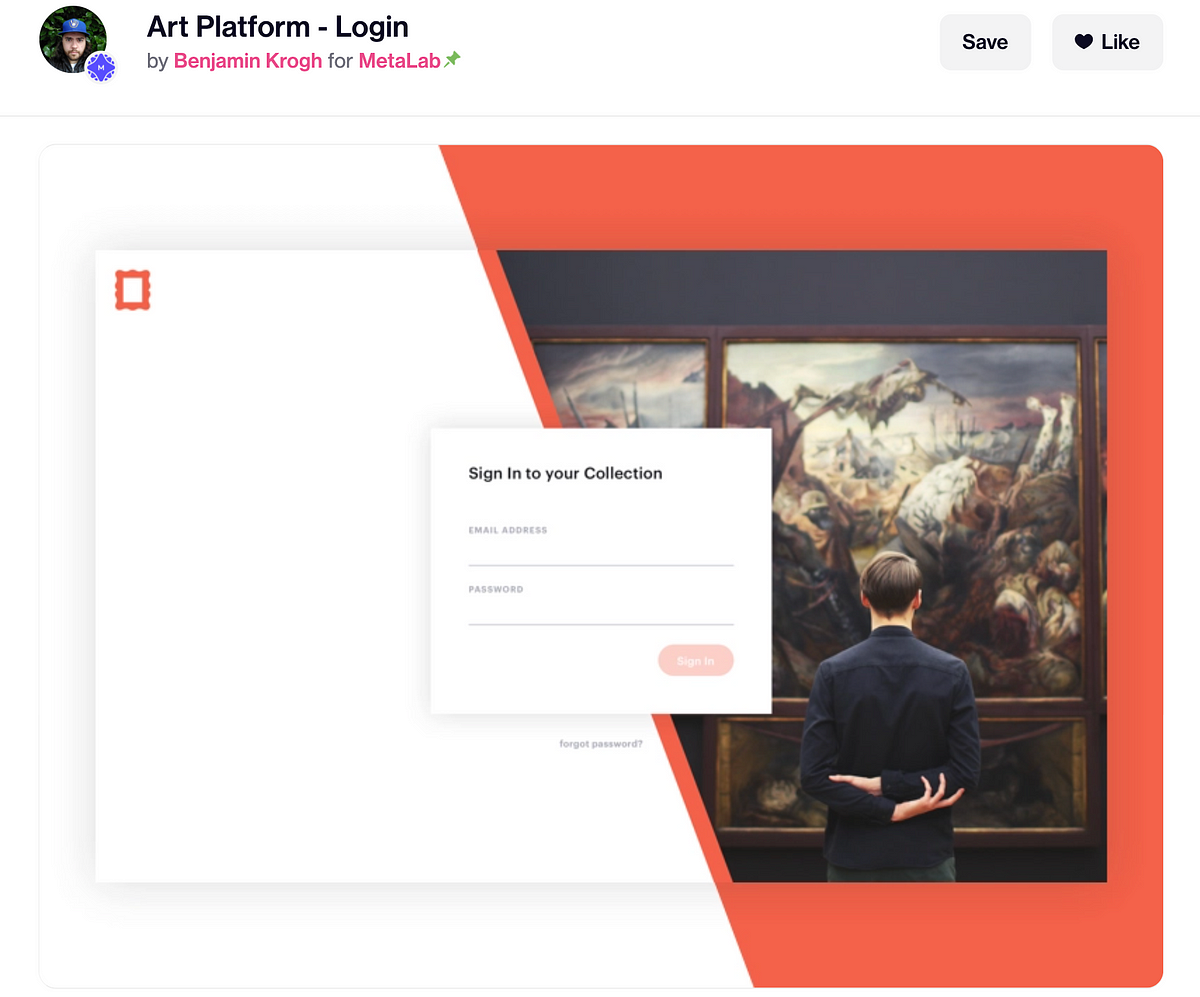
In this article, I will pick one interesting example for “Sign in” form and try to actually implement it in code. The example I picked is “Art Platform — login” by Benjamin Krogh (https://dribbble.com/shots/3270775-Art-Platform-Login)

This is the design we will try to implement in code
Note like this is usually further explanation
Result demo
This is the final result I created in codepen:
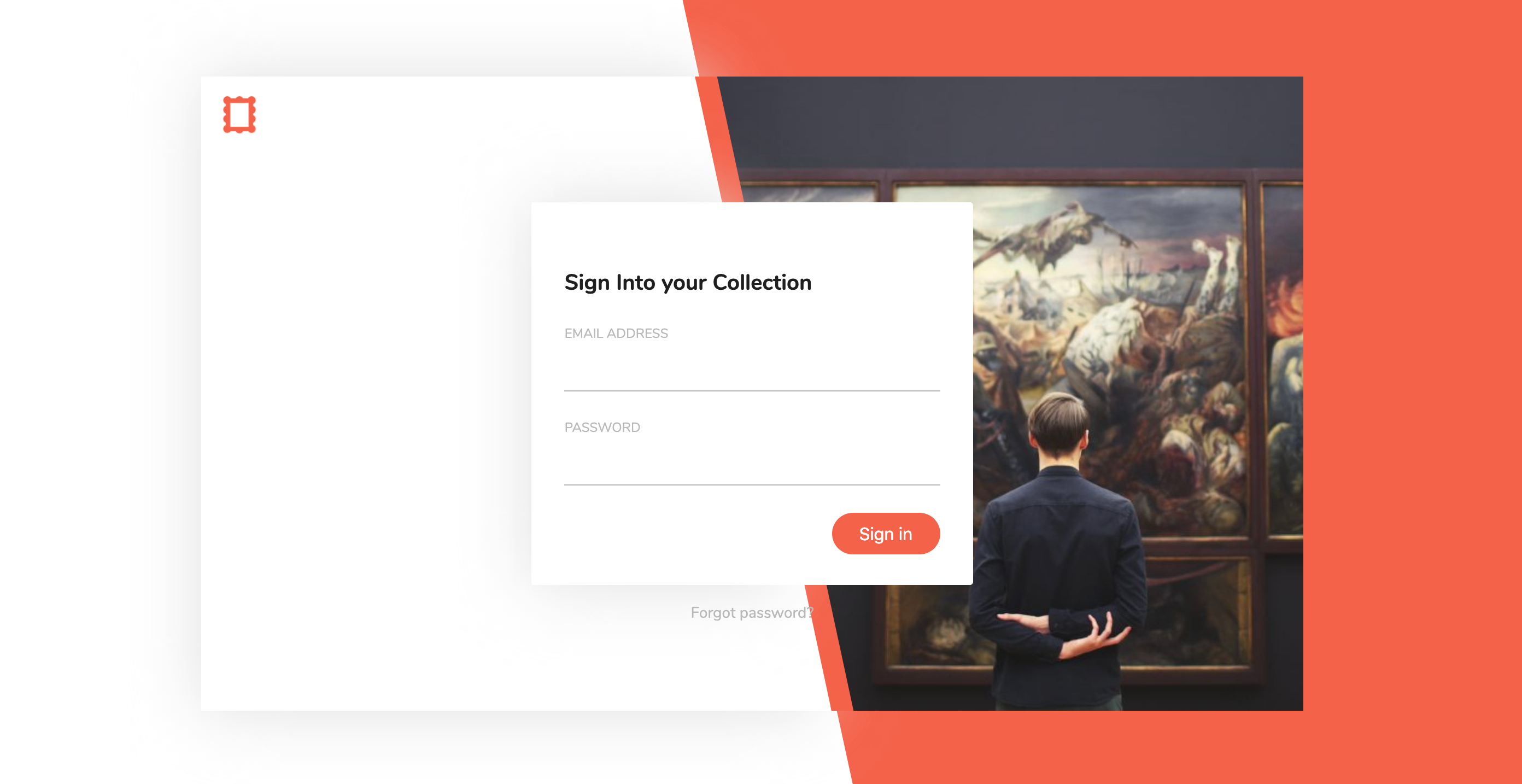
Can you spot the difference between this and the original design? (Spoiler: there’s a lot)
Codepen: https://codepen.io/josephwong2004/full/NWGBRJQ
Prerequisite
Basic HTML, CSS and SCSS/SASS
Step by step guide
Step 1: Create a quick draft
The first thing I do is to quickly draft the design myself, and break it down to different elements in coding.

Please bear with my terrible drawing
The first thing I notice is the different hierarchy level of the design. From bottom to top:
- Background with white and orange split color
- Container for the “card” like shape, holding the image. Also, it has an orange edge
- Pop up sign in form
I have some personal interpretation here as well. I assume the orange in the background and the orange on the card is separated. Although it is not that obvious in the original design, I believe since the card is “lifted”, the orange edge part should be lifted as well. Making it extend a bit from the background.
Step 2: Make the background
We will create the design of the three different hierarchy one by one. Starting with the background. We will need to make it split between white and orange. My solution is to use a div with white background, and a “before” element with clip-path for the orange part.
On second thought after completing the whole thing, I should have just use background
_linear-gradient__ for the same effect. It is a more elegant way and we don’t need to have a “before” element just for background color._
_If you are interested: _https://stackoverflow.com/questions/25958315/use-linear-gradient-in-css-to-split-div-in-2-colors-but-not-in-equal-halves
So let jump into the html and css.
HTML (it is just one line for the background):
<div class='background'></div>
SCSS:
// Font
	@import url('https://fonts.googleapis.com/css2?family=Nunito:wght@400;700&display=swap');

	// Color
	$orange: #F4624A;
	$grey: #dfdfdf;
	$black: #1f1f1f;

	*, *:before, *:after {
	  box-sizing: border-box;
	}

	body {
	  margin: 0;
	  font-family: 'Nunito', sans-serif;
	  color: $black;
	}

	// Helper mixin
	@mixin center {
	  display: flex;
	  align-items: center;
	  justify-content: center;
	}

	@mixin clipQuad ($start: 45%, $end: 57%, $right: true) {
	  $path: temp;
	  @if $right {
	    $path: polygon($start -5%, 105% -5%, 105% 105%, $end 105%);
	  } @else {
	    $path: polygon(0 0, $start 0, $end 100%, 0 100%);
	  }
	  -webkit-clip-path: $path;
	  clip-path: $path;
	}

	.background {
	  width: 100vw;
	  height: 100vh;
	  @include center;
	  &:before {
	    content: "";
	    width: 100%;
	    height: 100%;
	    background-color: $orange;
	    position: absolute;
	    @include clipQuad;
	  }
	}
There’s a lot of things in the SCSS, but most of them are just setting up for future use. Like the color, font, and helper mixin.
One thing I discover about clip path (not sure if it is browser specific issue) is that sometimes it show a tiny white border around the clipped area when two div are overlapping. Therefore you can see my $path actually exceed 100% and 0% as a workaround.
So pretty simple, we have our background with two-color split. The next step is to create the card container.
#sign-in #tutorial #front-end-development #ui-design #daily-ui-challenge