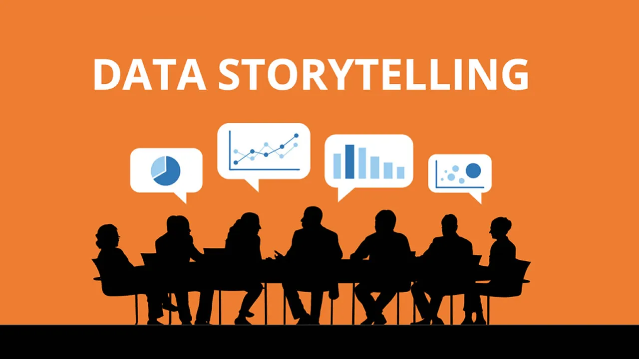
What is Data Storytelling?
Discover the essence of data storytelling Data storytelling is the concept of building a compelling narrative based on complex data and analytics that help tell your story and influence and inform a particular audience.
The benefits of data storytelling
Data storytelling is very similar to human storytelling but provides the added benefits of deeper insights and supporting evidence through graphs and charts. Through data storytelling, complicated information is simplified so that your audience can engage with your content and make critical decisions quicker and more confidently.
Constructing a data story that moves a person to take action can be a very powerful tool. Effective data storytelling can have a positive impact on people and your organization. Some benefits of successful data storytelling include:
- Adding value to your data and insights.
- Interpreting complex information and highlighting essential key points for the audience.
- Providing a human touch to your data.
- Offering value to your audience and industry.
- Building credibility as an industry and topic thought leader.
Making sure your data story is valuable
Good data storytelling means analyzing all the raw data you’ve gathered to confirm a hypothesis and, hopefully, the determined change you’d like see come from introducing your data story.
After reviewing all the data, begin your story. Sometimes it can be tempting to cherry-pick data sets that only support your theory, but look at the whole picture. Look at what the data is telling you and communicate a clear data story to your team with the right tools. It can be overwhelming when you have a lot of data sets available, but it helps to structure how you’d like to tell your story.
- Think about your theory. What do you want to prove or disprove? What do you think the data will tell you?
- Collect data. Collate the data you’ll need to develop your story.
- Define the purpose of your story. Using the data you gathered, you should be able to write what the goal of your story is in a single sentence.
- Think about what you want to say. Outline everything from the intro to the conclusion.
- Ask questions. Were you right or wrong in your hypothesis? How do these answers shape the narrative of your data story?
- Create a goal for your audience. What actions would you like them to take after reading your story?
You want to make sure that you’re not only looking at data that supports your theory, but also the data that doesn’t. You don’t have to add every single piece of data available. Use data sets that help guide your narrative unbiased. Your data story should always point to how it can help support an action or change that will help your business.
Using data visualization to enhance your data storytelling
Data visualization plays a significant role in determining how receptive your audience is to receiving complex information. Data visualization helps transform boundless amounts of data into something simpler and digestible. Here, you can supply the visuals needed to support your story. Effective data visualizations can help:
- Reveal patterns, trends, and findings from an unbiased viewpoint.
- Provide context, interpret results, and articulate insights.
- Streamline data so your audience can process information.
- Improve audience engagement.
Most of these findings and insights are more easily understood through a data dashboard built with data visualization tools.
Presenting visuals through a data dashboard
A data dashboard is a tool used for information management and business intelligence (BI). By organizing and displaying important information in an easy-to-understand format in a single location, data dashboards can interpret complicated metrics to help the audience understand the connection between the data story and the story’s hypothesis.
The benefits of utilizing a dashboard for your data are:
- Providing better visibility into past and current trends.
- Forecasting future trends with more accuracy.
- Identifying key performance indicators from multiple sources.
- Enabling real-time customer analytics.
The three key elements of data storytelling
Through a structured approach, data storytelling and data visualization work together to communicate your insights through three essential elements: narrative, visuals, and data. As you create your data story, it is important to combine the following three elements to write a well-rounded anecdote of your theory and the resulting actions you’d like to see from users.
- Build your narrative
As you tell your story, you need to use your data as supporting pillars to your insights. Help your audience understand your point of view by distilling complex information into informative insights. Your narrative and context are what will drive the linear nature of your data storytelling. - Use visuals to enlighten
Visuals can help educate the audience on your theory. When you connect the visual assets (charts, graphs, etc.) to your narrative, you engage the audience with otherwise hidden insights that provide the fundamental data to support your theory. Instead of presenting a single data insight to support your theory, it helps to show multiple pieces of data, both granular and high level, so that the audience can truly appreciate your viewpoint. - Show data to support
Humans are not naturally attracted to analytics, especially analytics that lack contextualization using augmented analytics. Your narrative offers enlightenment, supported by tangible data. Context and critique are integral to the full interpretation of your narrative. Using business analytic tools to provide key insights and understanding to your narrative can help provide the much-needed context throughout your data story.
By combining the three elements above, your data story is sure to create an emotional response in your audience. Emotion plays a significant role in decision-making. And by linking the emotional context and hard data in your data storytelling, you’re able to influence others. When these three key elements are successfully integrated, you have created a data story that can influence people and drive change.
Data storytelling examples
Data storytelling is the art of presenting data with a contextual narrative. There are a few different ways to present your data story. A data dashboard presents all available data so you’re able to create your narrative. Below are a few examples of eye-catching data storytelling.

Source: Microsoft Power BI Blog
A dashboard presents all your information front and center. While your dashboard might provide some context, you will need to build your narrative and connect the dots. Simplicity works best. Just providing an intro sentence with a data-driven graphic is often the quickest way to tell a short data story.

Source: Microsoft Power BI
Another data storytelling example of connecting two or more data visualizations—a call center analysis that shows customer satisfaction based on subject, percentage of satisfied and unsatisfied customers, total number of satisfied and unsatisfied customers, and other smaller stories that together tell a larger story.

Source: Microsoft Power BI
Infographics are a form of data storytelling, as well as a quick way to tell a visually appealing data story. An infographic can consist of individual data visualizations that help tell your story but might not provide much narrative (like the example above).
Data storytelling is changing how we consume information
There’s a possibility that data storytelling has the potential to make a huge shift in changing the face of how we consume data and analytics. Data storytelling adds a human touch to the sometimes-indecipherable numbers and figures raw data presents to us. Building a narrative is a major component of the process, but creating a strong story is dependent on your being able to understand and translate that information from an unbiased point of view. Microsoft Power BI can help you tell that story.
Source: https://powerbi.microsoft.com
#data #datastorytelling #dataanalytics #datascience