R vs Python is a constant tussle when it comes to what is the best language, according to data scientists. Though each language has it’s strengths, R, in my opinion has one cutting-edge trick that is hard to beat — R has fantastic tools to communicate results through visualization.
This particular point stood out to me this week, when I was trying to find an appealing way to visualize the correlation between features in my data. I stumbled upon CHORD Diagrams!(Which we will get to, in a minute) I had seen a few R examples to generate Chord Diagrams using _Circlize _where you could just pass the properly shaped data to the chordDiagram() function and ta-da!
You should have seen the look on my face when I found the Python Plotly implementation of the Chord Diagram. Even to get a basic figure, one had to put in a lot of effort. The end result simply did not seem worth the effort. I was almost dropping the idea of using a Chord Diagram, when I stumbled upon chord on pypi.
Okay, What is a Chord Diagram?
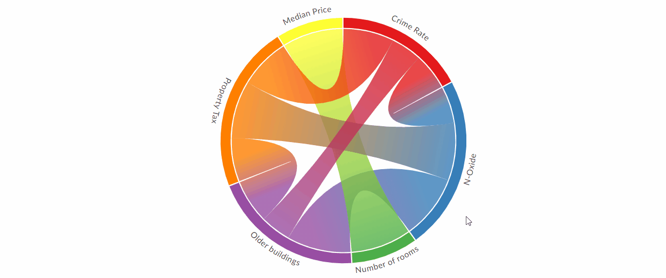
A Chord Diagram represents the flows between a set of distinct items. These items known as nodes are displayed all around a circle and the flows are shown as connections between the nodes, shown as arcs.
If that did not explain it clearly, let’s take a look at an example:
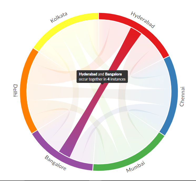
The above Chord Diagram, visualizes the number of times two entities(Cities in this case) occur together in the itinerary of a traveler, it allows us to study the flow between them.
How to create a beautiful Chord Diagram with minimum effort?
Let me take you through the process of data preparation and then the creation of the Chord Diagram.
Installation:
Assuming Pandas is already installed, You need to install the chord package from pypi, using —
pip install chord
#python #chord-diagram #data-visualization #machine-learning #data-science #data analysis