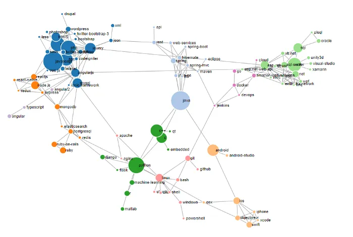
So recently countries around the world are feverishly contact-tracing to control the Covid-19 infection rates. As a fellow data analyst I have been exposed to my fair share of network diagrams lately. It was intriguing to see a graph made up primarily of nodes and links to be not only aesthetically appealing but alsorepresent connectivity between different entities effectively.
Majority of network graph visualisations are mostly deployed on web applications. The harsh truth is web development time far exceeds that of dashboarding. Moreover teams I have worked with are often only interested in snapshots of the network diagram so the ability to plot network diagrams on dashboarding tools such as Tableau would offer greater convenience in highlighting significant findings where interactivity with the graph is less crucial. Hence, I proceeded to explore and implement ways to plot the exact same graph on Tableau with minimal effort. This led me to create a pet project comprising of 2 parts —
**Part I: **A web application to output data directly for Tableau (functionalities include flexibility to manually adjust the graph’s layout + export of the final Tableau-ready data output)
**Part II: **Using the data generator created in Part I, include a network diagram in my next Tableau dashboard accordingly.
#network-analysis #data-visualization #d3js #tableau #data-science