How to create fancy scrolling techniques in Flutter?
Hello, fearless Flutter fans! Today we’re going to delve into a highly specialized topic — something most app developers can blissfully ignore and create great looking apps without needing to know or understand. Usually if you need to scroll through something, ListView and GridView will do the job. Done and done. But, if you seek deeper knowledge and want to spice up your scrolling abilities:

Read on…
Or wait… if you hate reading, check out these two videos that quickly summarizes the ideas in this article:
What? You’re still here? Well in that case:
What’s a Sliver and Why do I want it?
Around the web I see a lot of FOS. That’s Fear Of Slivers for those not In The Know. But a sliver is just a portion of a scrollable area. That’s it! Under the covers, all of the scrollable views you use, like ListView and GridView, are actually implemented using Slivers. You can kind of think of Slivers as a lower-level interface, providing finer-grained control on implementing scrollable area. Because slivers can lazily build each item just as it scrolls into view, slivers are particularly useful for efficiently scrolling through large numbers of children.
You might want this additional control in scrolling behavior if you:
- Want an app bar with nonstandard behavior (disappearing as you scroll, changing size or color as you scroll, etc).
- Need to scroll a list of items and a grid of items all together as one unit. (Yes, you can do this with a table in a ListView but that is much less efficient, particularly if you have a large table.)
- Do something weird like a collapsing list with headers (see gif on the right at the top of this page).

How do I use it?
All of these sliver components go inside a CustomScrollView. The rest is up to you for how to combine your list of slivers to make your custom scrollable area. You can reinvent a ListView by putting a SliverList inside a CustomScrollView and set nothing else.
SliverList
SliverList takes a delegate parameter which provides the items in the list as they scroll into view. You can specify the actual list of children with a SliverChildListDelegate Or build them lazily with a SliverChildBuilderDelegate.
// Explicit list of children. No efficiency savings here since the
// children are already constructed.SliverList(
    delegate: SliverChildListDelegate(
      [
        Container(color: Colors.red, height: 150.0),
        Container(color: Colors.purple, height: 150.0),
        Container(color: Colors.green, height: 150.0),
      ],
    ),
);// This builds an infinite scrollable list of differently colored
// Containers.SliverList(
    delegate: SliverChildBuilderDelegate((BuildContext context, int index) {
      // To convert this infinite list to a list with three items,
      // uncomment the following line:
      // if (index > 3) return null;
      return Container(color: getRandomColor(), height: 150.0);
    },
    // Or, uncomment the following line:
    // childCount: 3,
  ),
);
SliverGrid
SliverGrids also can specify children with a delegate, or an explicit list, just like SliverList. But there’s some additional formatting for the cross-axis dimension on a grid. There are three ways to specify how you want your grid layout:
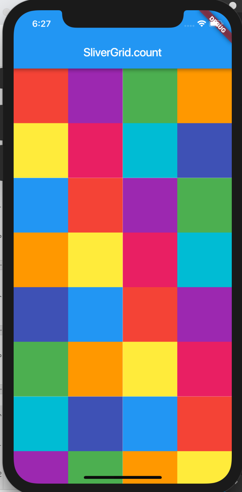
- Count constructor to count how many items are, in this case, in the horizontal axis:
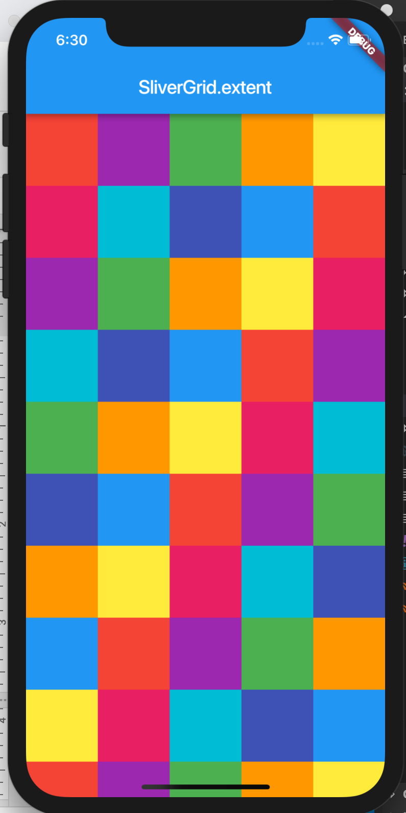
SliverGrid.count(children: scrollItems, crossAxisCount: 4) - Extent constructor to specify the maximum width of items to determine how many should fit across a grid. This is most useful if the items in your grid vary in size, you can limit how large a space they should take up (in this case, horizontally).
SliverGrid.extent(children: scrollItems, maxCrossAxisExtent: 90.0) // 90 logical pixels - Default constructor, passing in an explicit gridDelegate parameter:
// Re-implementing the above SliverGrid.count example:
SliverGrid(
  gridDelegate: SliverGridDelegateWithFixedCrossAxisCount(
    crossAxisCount: 4,
  ),
  delegate: SliverChildBuilderDelegate(
    (BuildContext context, int index) {
      return new Container(
        color: randomColor(),
        height: 150.0);
    }
);
SliverAppBar
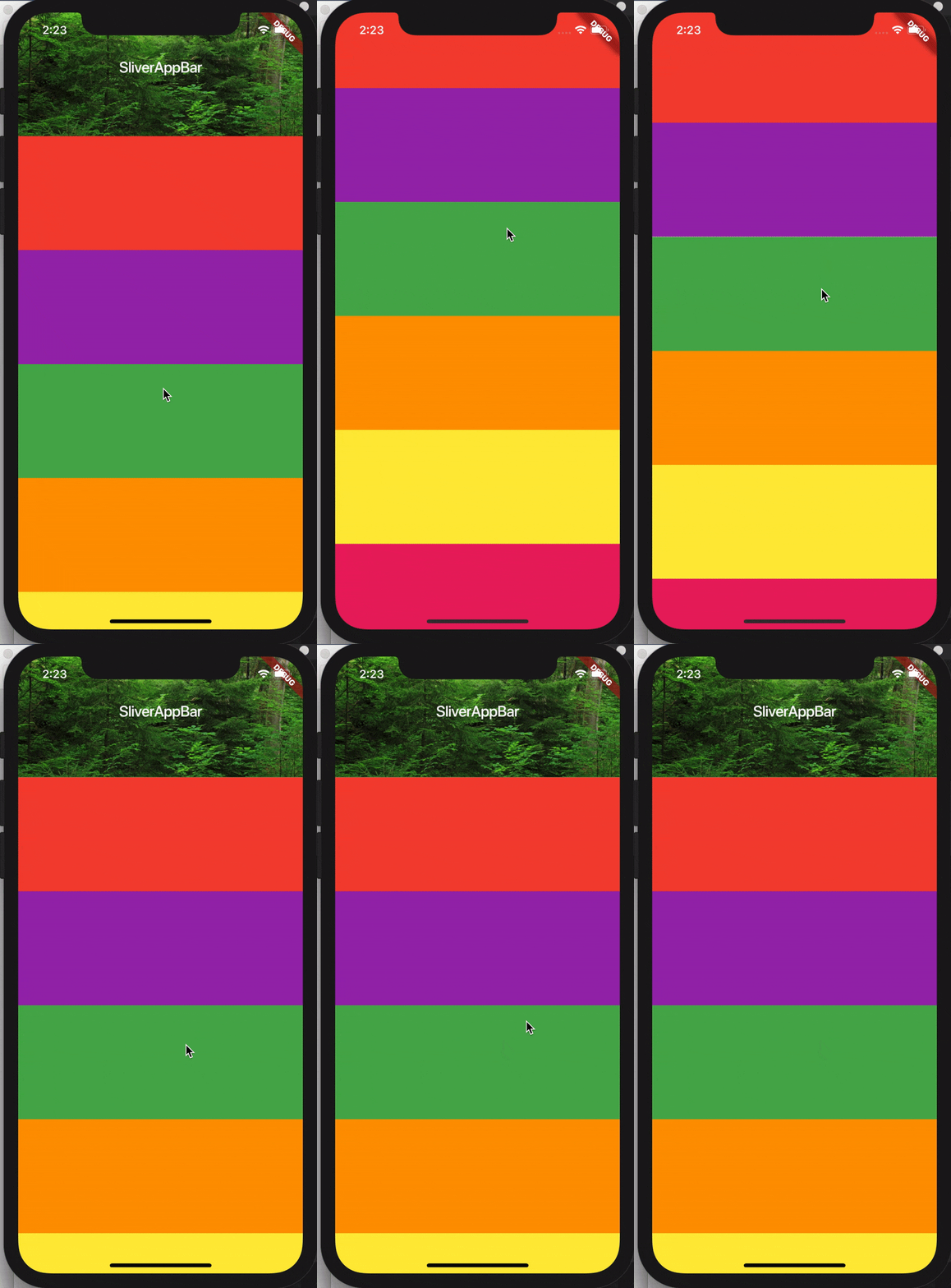
Okay, okay, enough exposition. Here’s what I know you all have been waiting for. How do I make those gorgeous expanding and contracting app-bars? The secret is to set both the flexibleSpace parameter and the expandedHeight parameter. You can set both for a different height and appearance for your app bar when it is expanded to its full size vs the “compressed” version.
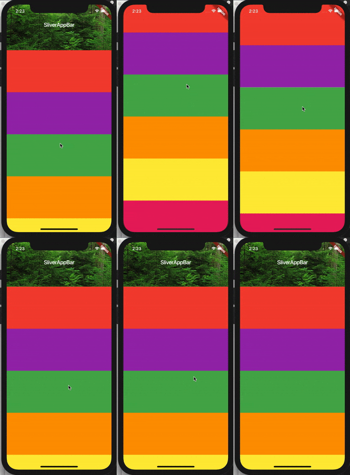
Here’s the code for the above example:
CustomScrollView(
    slivers: <Widget>[
      SliverAppBar(
        title: Text('SliverAppBar'),
        backgroundColor: Colors.green,
        expandedHeight: 200.0,
        flexibleSpace: FlexibleSpaceBar(
          background: Image.asset('assets/forest.jpg', fit: BoxFit.cover),
        ),
      ),
      SliverFixedExtentList(
        itemExtent: 150.0,
        delegate: SliverChildListDelegate(
          [
            Container(color: Colors.red),
            Container(color: Colors.purple),
            Container(color: Colors.green),
            Container(color: Colors.orange),
            Container(color: Colors.yellow),
            Container(color: Colors.pink),
          ],
        ),
      ),
    ],
);
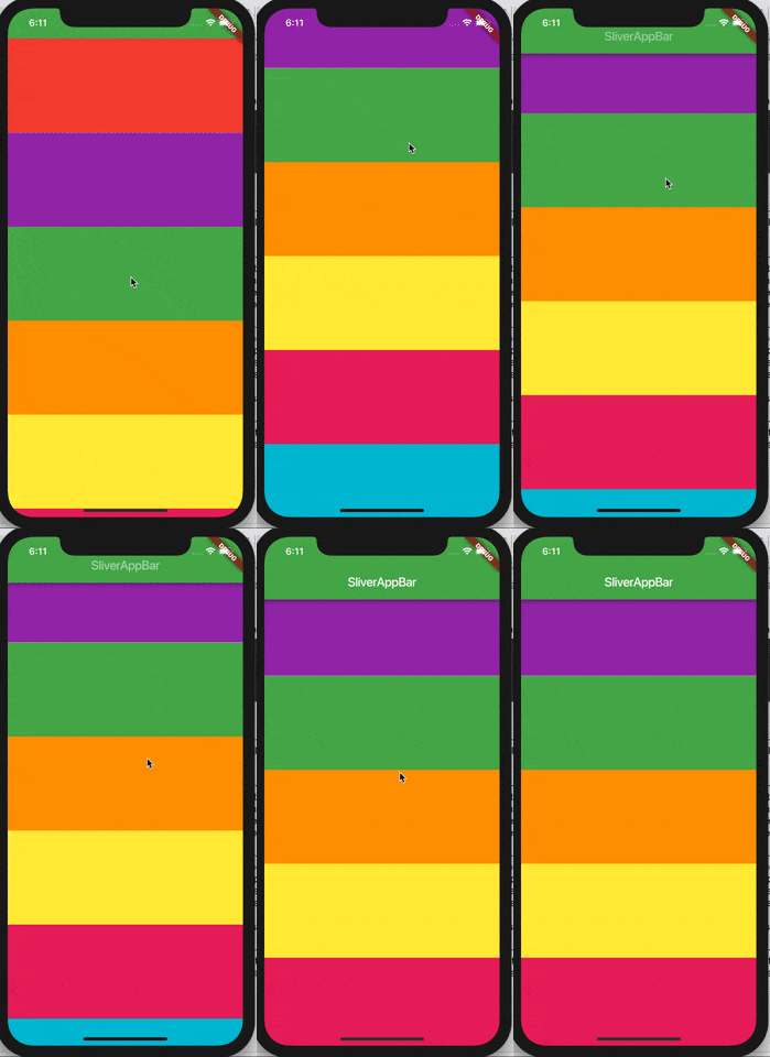
There’s some additional customization you can add on SliverAppBar. You can set the floating parameter to true to make the app bar reappear when you scroll down, even if you haven’t reached the top of the list.
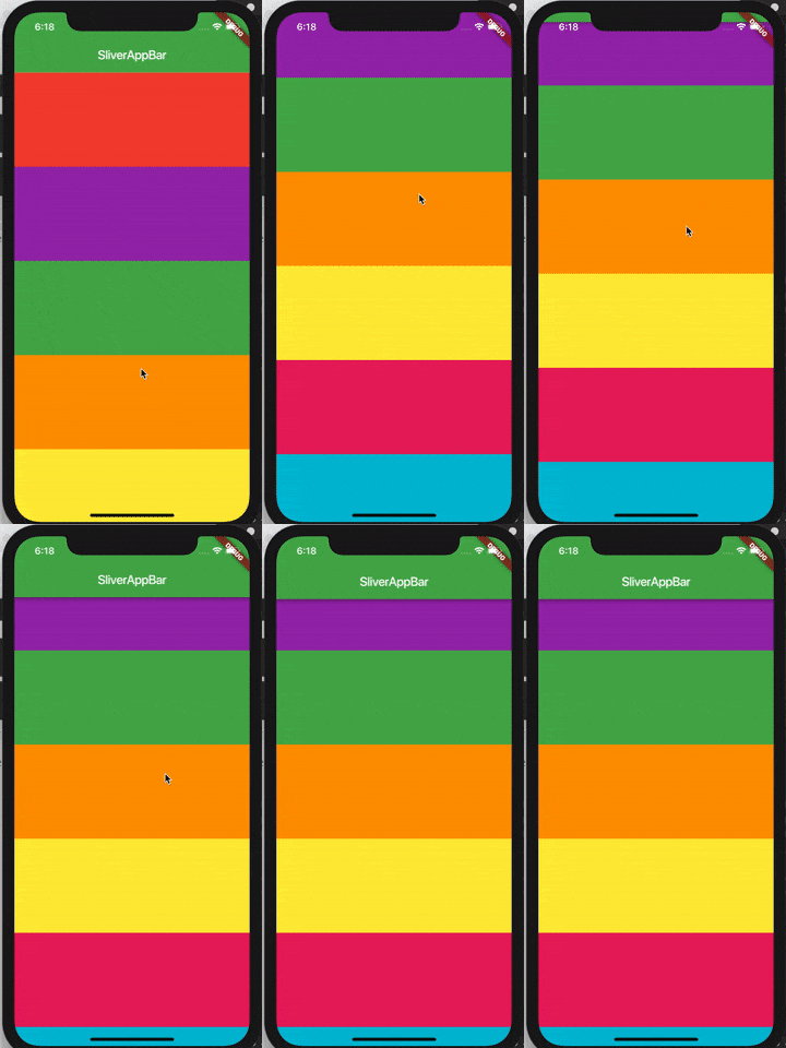
If you add both the snap parameter with the floating parameter, you can make the app bar fully snap back into view when you scroll down.
Putting it all together: a collapsible scrolling list with SliverPersistentHeader
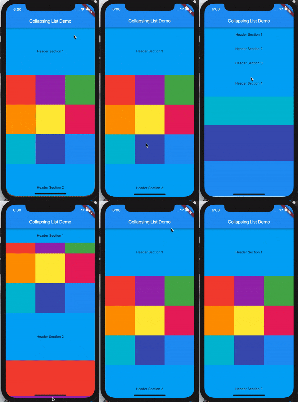
I tried to imagine the most unusual scrolling behavior I could think of that still might be useful. I came up with this scrolling collapsible list:
import 'package:flutter/material.dart';import 'dart:math' as math;void main() => runApp(MyApp());class MyApp extends StatelessWidget {
  @override
  Widget build(BuildContext context) {
    return MaterialApp(
      home: Scaffold(
        appBar: AppBar(title: Text('Collapsing List Demo')),
        body: CollapsingList(),
      ),
    );
  }
}class _SliverAppBarDelegate extends SliverPersistentHeaderDelegate {
  _SliverAppBarDelegate({
    @required this.minHeight,
    @required this.maxHeight,
    @required this.child,
  });  final double minHeight;
  final double maxHeight;
  final Widget child;  @override
  double get minExtent => minHeight;  @override
  double get maxExtent => math.max(maxHeight, minHeight);  @override
  Widget build(
      BuildContext context,
      double shrinkOffset,
      bool overlapsContent)
  {
    return new SizedBox.expand(child: child);
  }  @override
  bool shouldRebuild(_SliverAppBarDelegate oldDelegate) {
    return maxHeight != oldDelegate.maxHeight ||
        minHeight != oldDelegate.minHeight ||
        child != oldDelegate.child;
  }
}class CollapsingList extends StatelessWidget {
  SliverPersistentHeader makeHeader(String headerText) {
    return SliverPersistentHeader(
      pinned: true,
      delegate: _SliverAppBarDelegate(
        minHeight: 60.0,
        maxHeight: 200.0,
        child: Container(
            color: Colors.lightBlue, child: Center(child:
                Text(headerText))),
      ),
    );
  }  @override
  Widget build(BuildContext context) {
    return CustomScrollView(
      slivers: <Widget>[
        makeHeader('Header Section 1'),
        SliverGrid.count(
          crossAxisCount: 3,
          children: [
            Container(color: Colors.red, height: 150.0),
            Container(color: Colors.purple, height: 150.0),
            Container(color: Colors.green, height: 150.0),
            Container(color: Colors.orange, height: 150.0),
            Container(color: Colors.yellow, height: 150.0),
            Container(color: Colors.pink, height: 150.0),
            Container(color: Colors.cyan, height: 150.0),
            Container(color: Colors.indigo, height: 150.0),
            Container(color: Colors.blue, height: 150.0),
          ],
        ),
        makeHeader('Header Section 2'),
        SliverFixedExtentList(
          itemExtent: 150.0,
          delegate: SliverChildListDelegate(
            [
              Container(color: Colors.red),
              Container(color: Colors.purple),
              Container(color: Colors.green),
              Container(color: Colors.orange),
              Container(color: Colors.yellow),
            ],
          ),
        ),
        makeHeader('Header Section 3'),
        SliverGrid(
          gridDelegate:
              new SliverGridDelegateWithMaxCrossAxisExtent(
            maxCrossAxisExtent: 200.0,
            mainAxisSpacing: 10.0,
            crossAxisSpacing: 10.0,
            childAspectRatio: 4.0,
          ),
          delegate: new SliverChildBuilderDelegate(
            (BuildContext context, int index) {
              return new Container(
                alignment: Alignment.center,
                color: Colors.teal[100 * (index % 9)],
                child: new Text('grid item $index'),
              );
            },
            childCount: 20,
          ),
        ),
        makeHeader('Header Section 4'),
        // Yes, this could also be a SliverFixedExtentList. Writing
        // this way just for an example of SliverList construction.
        SliverList(
          delegate: SliverChildListDelegate(
            [
              Container(color: Colors.pink, height: 150.0),
              Container(color: Colors.cyan, height: 150.0),
              Container(color: Colors.indigo, height: 150.0),
              Container(color: Colors.blue, height: 150.0),
            ],
          ),
        ),
      ],
    );
  }
}
The last step (exercise left to the reader) would be to add a GestureDetector so that tapping on one of the headers allows you to jump to that section in the list. Take your newfound knowledge of Slivers and apply it to GestureDetection to make a cool collapsing list!
#Flutter #mobile-app #dart
