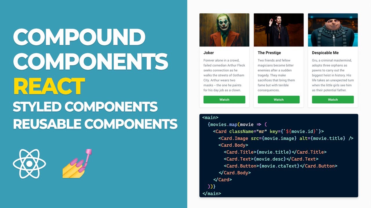
In this React tutorial, I’ll be demonstrating how we can build a re-usable UI by adopting compound components in React. I have found that by using Compound Components I avoid having to create unnecessary components that ultimately add architectural complexity to my application. Do let me know what you think about Compound Components, I’d love to hear your thoughts in the comments section below! ⌨️👇
⏳ Timeline
- 0:00:00 - Quick overview of what we will be building
- 0:00:35 - Escaping component hell
- 0:02:50 - Showing the postcards that we will be building
- 0:03:40 - How to get setup
- 0:04:51 - Remember to comment as to what videos you’d like to see
- 0:05:15 - A run-through of the initial code
- 0:05:40 - Creating a components folder
- 0:05:50 - Creating a styles folder
- 0:06:00 - Creating a Card.js component file
- 0:06:30 - Why I export from our parent index.js file
- 0:07:15 - Building the Card component
- 0:08:00 - Mapping over our movies in App.js
- 0:08:09 - Importing our data.json file
- 0:08:30 - Remember to create an App.scss file
- 0:08:56 - App.scss - just a reset (reference the repo to get)
- 0:09:50 - Building out our Card component
- 0:11:10 - Building our styled component (Card)
- 0:13:00 - Continuing work on our Card component
- 0:19:30 - Adding our Card component to App.js
- 0:21:00 - Adding our SCSS file to App.js
- 0:21:40 - Remembering to add a key to our Card map
- 0:22:00 - Displaying the final result!
🎯 Github repo: https://github.com/karlhadwen/compound-components
#reactjs #javascript #webdev
23.15 GEEK