A Versatile Color Selection Widget with Material, White, Black
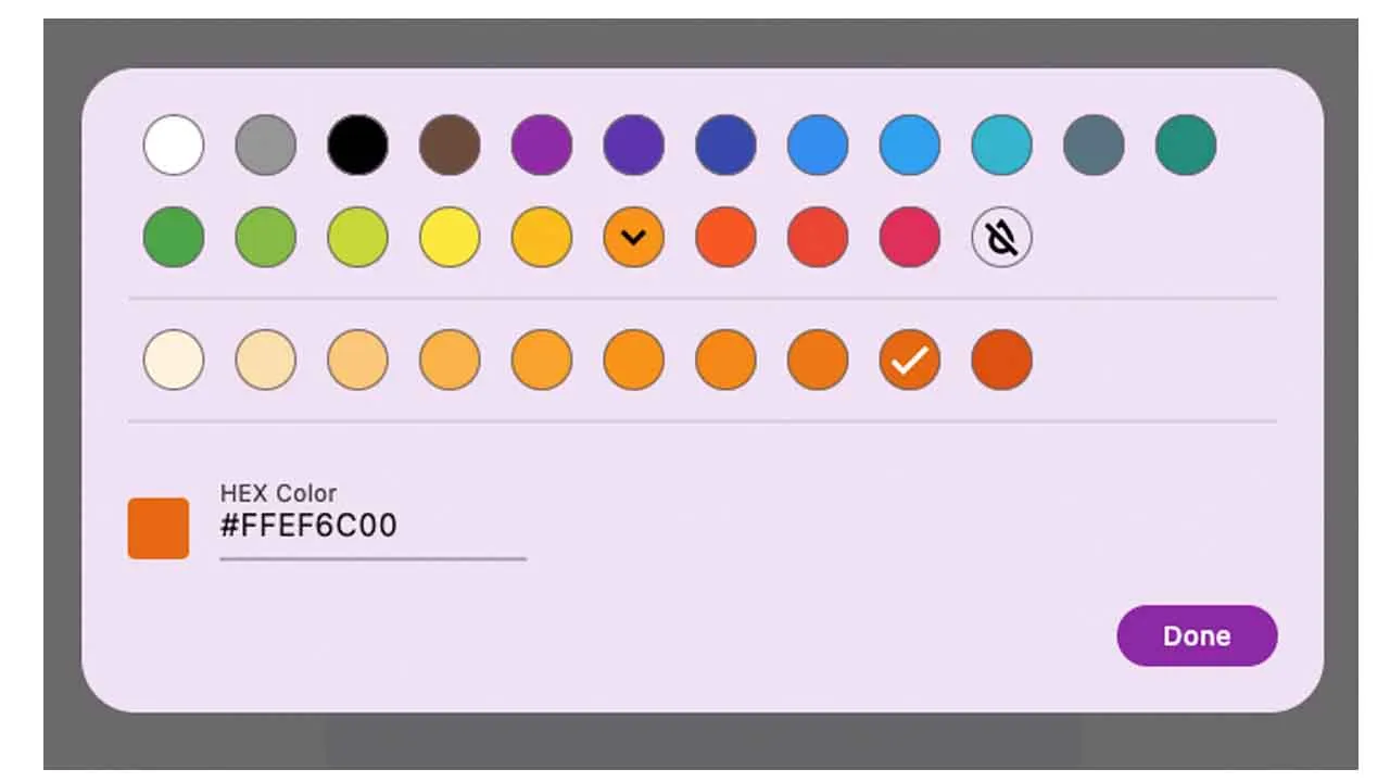
faabul_color_picker
faabul_color_picker is developed and used by Faabul Live Quizzes
Getting Started
Call showColorPickerDialog to show the color picker dialog and await the result.
final color = await showColorPickerDialog(context: context);
In most cases you want to specify the currently selected color. If you want to allow the user to unselect the color, set allowUnselectButton to true.
final color = await showColorPickerDialog(
  context: context,
  selected: selectedColor,
  allowUnselectButton: true,
);
Custom colors
If you want to use custom colors, pass them to the colors parameter.
final color = await showColorPickerDialog(
  context: context,
  selected: selectedColor,
  colors: [
    FaabulColorShades(color: Colors.red, shades: [
       Colors.red,
       Colors.redAccent,
    ]),
    FaabulColorShades(color: Colors.green, shades: [
       Colors.lightGreen,
       Colors.green,
       Colors.lightGreenAccent,
       Colors.greenAccent,
    ]),
    FaabulColorShades(color: Colors.blue, shades: [
        Colors.lightBlue,
        Colors.blue,
        Colors.lightBlueAccent,
        Colors.blueAccent,
    ]),
  ],
);
Other exposed classes
FaabulColorPicker is the widget that shows inside the showColorPickerDialog. It can be used directly if you want to select the color in a different way.
FaabulColorButton is the button used to represent an individual Color.
FaabulColorSample presents the Color in a circle.
Use this package as a library
Depend on it
Run this command:
With Dart:
$ dart pub add faabul_color_pickerWith Flutter:
$ flutter pub add faabul_color_pickerThis will add a line like this to your package's pubspec.yaml (and run an implicit dart pub get):
dependencies:
  faabul_color_picker: ^1.0.1
Alternatively, your editor might support dart pub get or flutter pub get. Check the docs for your editor to learn more.
Import it
Now in your Dart code, you can use:
import 'package:faabul_color_picker/faabul_color_picker.dart'; import 'package:faabul_color_picker/faabul_color_picker.dart';
import 'package:flutter/material.dart';
void main() {
runApp(const MyApp());
}
class MyApp extends StatelessWidget {
const MyApp({super.key});
// This widget is the root of your application.
@override
Widget build(BuildContext context) {
return MaterialApp(
title: 'Flutter Demo',
theme: ThemeData(colorSchemeSeed: Colors.purple, useMaterial3: true),
home: const MyHomePage(),
);
}
}
class MyHomePage extends StatefulWidget {
const MyHomePage({super.key});
@override
State<MyHomePage> createState() => _MyHomePageState();
}
class _MyHomePageState extends State<MyHomePage> {
Color? _selectedColor;
bool _allowUnselectButton = false;
bool _customColors = false;
static const _kCustomColors = [
FaabulColorShades(color: Colors.red, shades: [
Colors.red,
Colors.redAccent,
]),
FaabulColorShades(color: Colors.green, shades: [
Colors.lightGreen,
Colors.green,
Colors.lightGreenAccent,
Colors.greenAccent,
]),
FaabulColorShades(color: Colors.blue, shades: [
Colors.lightBlue,
Colors.blue,
Colors.lightBlueAccent,
Colors.blueAccent,
]),
];
@override
Widget build(BuildContext context) {
final theme = ThemeData.from(
colorScheme: ColorScheme.fromSeed(seedColor: _selectedColor ?? Colors.purple),
useMaterial3: true,
);
return Theme(
data: theme,
child: Scaffold(
backgroundColor: _selectedColor,
body: Center(
child: SizedBox(
width: 400,
height: 400,
child: Card(
child: Column(
children: [
Expanded(
child: Padding(
padding: const EdgeInsets.all(16.0),
child: Column(
mainAxisAlignment: MainAxisAlignment.spaceEvenly,
children: [
if (_selectedColor == null)
const Text('No color selected')
else
Wrap(
spacing: 4,
children: [
const Text('Selected color:'),
FaabulColorSample(color: _selectedColor!),
],
),
FilledButton(onPressed: _handlePickColor, child: const Text('Pick a color')),
],
),
),
),
SwitchListTile.adaptive(
title: const Text('Allow unselect button'),
value: _allowUnselectButton,
onChanged: (value) => setState(() => _allowUnselectButton = value),
),
SwitchListTile.adaptive(
title: const Text('Custom colors'),
value: _customColors,
onChanged: (value) => setState(() => _customColors = value),
),
],
),
),
),
),
),
);
}
Future<void> _handlePickColor() async {
final color = await showColorPickerDialog(
context: context,
selected: _selectedColor,
allowUnselectButton: _allowUnselectButton,
colors: _customColors ? _kCustomColors : null,
);
if (!mounted) return;
setState(() => _selectedColor = color);
}
} Download details:
Author: yomio