While it’s easier (and better practice) to design and style your app for various screen sizes from the beginning, it IS possible to add responsive design to your projects after you’ve begun. Want to retroactively add responsiveness to an existing app? Here are 6 tips to get you started.
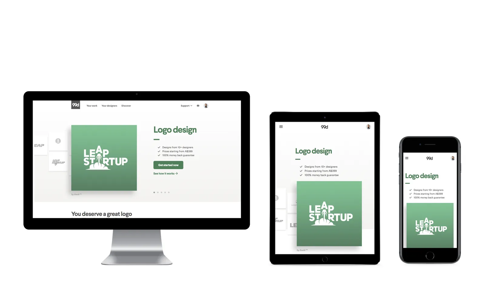
Learn how to scale your websites for various screen sizes
Background
Learning to code in a Bootcamp program has lots of advantages. A project-focused program was great for me to solidify what I was learning. I built databases, CRUD backends, Jamstack applications, and modern web frameworks in four-day-long project sprints, and presented these projects to my classmates at the end of the week.
As a former graphic designer, I always made time to plan out and implement basic wireframes, colors, and typography in my projects. But I never got the time to learn or implement responsive design in any of my projects during the Bootcamp, which meant that after graduating I was left with projects that I was proud of, but weren’t responsive. After I deployed the first project (actually my portfolio) and proudly sent the link to all my friends, I realized the glaring error in my ways. My site that looked perfect on a desktop was UTTERLY unreadable on mobile.
This blog post is meant to serve anyone who’s at the same daunting fork in the road. I know that the thought of re-opening that CSS file knowing your about to perform major surgery on it fills you with dread but I also know you don’t want your hard work misrepresented just because it was opened on the wrong screen size.
Without further-a-do, here are 6 things that helped me to focus my energy on, and that I hope will help you too. If you go step by step, you’ll have a website that looks great anywhere before you know it.
#coding #css #responsive-web-design #media-queries