This tutorial picks up from a previous tutorial. As a reminder, this is what the data structure looks like:
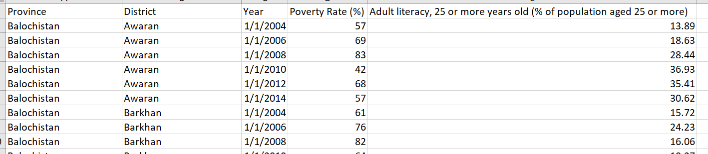
Poverty Rate is the y-axis value and the indicator in the last column is the x-axis value and changes with each dataset.
In the previous tutorial, we changed the Province value but in this tutorial, we will update the Year. (All code on Github and demo available here). This means we will need to invoke the update selection because we want to select data points that are already displayed on the page and **_change _**them somehow (as opposed to invoking exit which removes data points from the page or enter which adds data points to the page).
As in the previous tutorial, we have to first “capture” the user’s choice, in this case that is the Year value. This can be done in various ways but we will use the drop-down element again, placed next to the Province drop-down:
#d3js #international-development #data-visualization #pakistan #data visualization