CSS 3D transform Colorful Animated Carousel
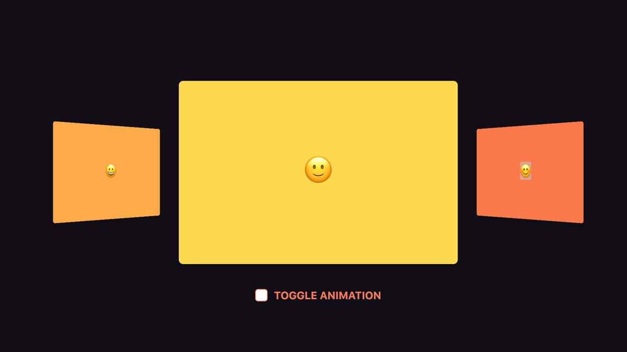
A pure CSS 3D perspective carousel that automatically rotate through a group of html content using CSS3 transforms.
How to use it:
Build the html structure for the carousel.
<figure class="icon-cards mt-3">
  <div class="icon-cards__content">
    <div class="icon-cards__item d-flex align-items-center justify-content-center"><span class="h1">🙂</span></div>
    <div class="icon-cards__item d-flex align-items-center justify-content-center"><span class="h1">😊</span></div>
    <div class="icon-cards__item d-flex align-items-center justify-content-center"><span class="h1">😀</span></div>
  </div>
</figure>

<div class="checkbox">
  <input class="d-none" id="toggle-animation" type="checkbox" checked />
  <label class="checkbox__checkbox" for="toggle-animation"></label>
  <label class="checkbox__label" for="toggle-animation">Toggle animation</label>
</div>
The primary CSS / CSS3 style rules for the carousel.
// Cards Carousel
// ----------------------------------------------

.icon-cards {
  position: relative;
	width: 60vw;
	height: 40vw;
  max-width: 380px;
  max-height: 250px;
  margin: 0;
  color: white;
	perspective: 1000px;
  transform-origin: center;

	// This is the element that rotates with the animation

	&__content {
		position: absolute;
		width: 100%;
		height: 100%;
    transform-origin: center;
		transform-style: preserve-3d;
		transform: translateZ(-30vw) rotateY(0);
		animation: carousel 10s infinite cubic-bezier(0.77, 0, 0.175, 1) forwards;

    &.step-animation {
      animation: carousel 8s infinite steps(1) forwards;
    }
	}

	// Individual cards

	&__item {
		position: absolute;
		top: 0;
		left: 0;
    right: 0;
    bottom: 0;
		width: 60vw;
		height: 40vw;
    max-width: 380px;
    max-height: 250px;
    box-shadow: 0 5px 20px rgba(0,0,0,.1);
		border-radius: 6px;
    transform-origin: center;

		&:nth-child(1) {
			background: #FDD94F;
			transform: rotateY(0) translateZ(35vw);
		}

		&:nth-child(2) {
			background: #F87949;
			transform: rotateY(120deg) translateZ(35vw);
		}

		&:nth-child(3) {
			background: #FBAB48;
			transform: rotateY(240deg) translateZ(35vw);
		}
	}
}

// Carousel animation

@keyframes carousel {
	0%,  17.5%  { transform: translateZ(-35vw) rotateY(0); }
	27.5%, 45%  { transform: translateZ(-35vw) rotateY(-120deg); }
	55%, 72.5%  { transform: translateZ(-35vw) rotateY(-240deg); }
	82.5%, 100% { transform: translateZ(-35vw) rotateY(-360deg); }
}


// Demo only
// ----------------------------------------------

html,
body {
  height: 100%;
}

body {
  display: flex;
  align-items: center;
  justify-content: center;
  flex-direction: column;
  background: #110F15;
}

// Checkbox

.checkbox {
  position: relative;
  margin-top: 2rem;
  font-size: .9rem;
  font-weight: bold;
  text-transform: uppercase;
  color: #F47956;
  transition: color .3s ease;
  user-select: none;

  &:hover {
    color: #F7A95A;
  }

  // Checkbox

  &__checkbox {
    position: relative;
    top: 0;
    width: 1.0625rem;
    height: 1.0625rem;
    background: white;
    border: 1px solid currentColor;
    border-radius: 4px;
    vertical-align: middle;
    transition: background 0.1s ease;
    cursor: pointer;

    &::after {
      content: '';
      position: absolute;
      top: 1px;
      left: 5px;
      width: 5px;
      height: 11px;
      opacity: 0;
      transform: rotate(45deg) scale(0);
      border-right: 2px solid #fff;
      border-bottom: 2px solid #fff;
      transition: all 0.3s ease;
      transition-delay: 0.15s;
    }
  }

  // Label

  &__label {
    margin-left: 5px;
    vertical-align: middle;
    cursor: pointer;
  }

  // Animate it if checkbo is checked

  > input:checked ~ .checkbox__checkbox {
    border-color: transparent;
    background: #F47956;
    animation: jelly 0.6s ease;

    &:after {
      opacity: 1;
      transform: rotate(45deg) scale(1);
    }
  }
}

// Jelly checkbox animation

@keyframes jelly {
  from { transform: scale(1, 1); }
  30% { transform: scale(1.25, 0.75); }
  40% { transform: scale(0.75, 1.25); }
  50% { transform: scale(1.15, 0.85); }
  65% { transform: scale(0.95, 1.05); }
  75% { transform: scale(1.05, 0.95); }
  to { transform: scale(1, 1); }
}
JS
function classToggle() {
  var el = document.querySelector('.icon-cards__content');
  el.classList.toggle('step-animation');
}

document.querySelector('#toggle-animation').addEventListener('click', classToggle);
Download Details:
Author: edmundojr
Live Demo: https://codepen.io/edmundojr/pen/qdLWWx
GitHub: https://codepen.io/edmundojr/pen/qdLWWx
#css #css3 #html
33.05 GEEK