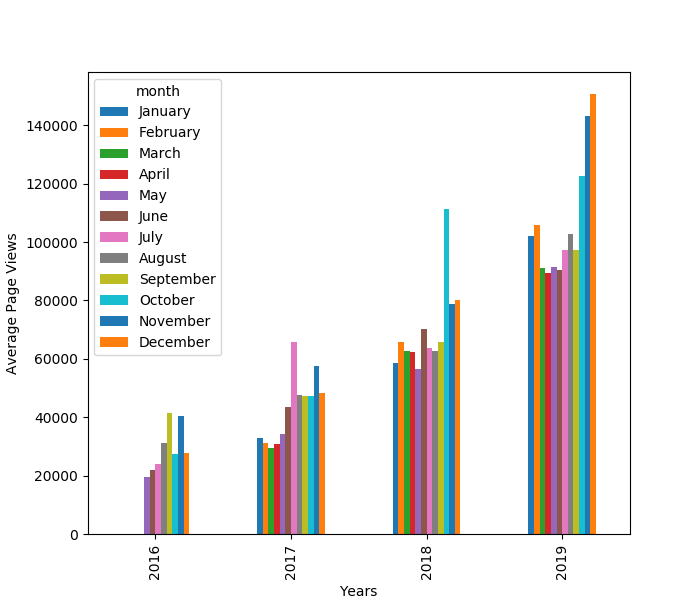
As I was working on freeCodeCamp’s Data Analysis with Python certification, I came across a tricky Matplotlib visualization: a grouped bar chart. I’ve been making my way through the projects, but the guidance is minimal. This is good because it makes you put in the work to arrive at the desired solution, but it is awful if you don’t have much experience with Matplotlib, pandas and Numpy, or even if you’re just having difficulties with the current exercise.
So, I’m writing this article to share my solution on how to create the grouped bar chart from the “Page View Time Series Visualizer” project. I had a hard time understanding how to create this visualization in Matplotlib so I hope this article is enlightening for your data analysis projects.
#data-analysis #python #data-science #data-visualization