Plotly Express is probably my new favorite data viz tool in python, especially after learning how to take control of it to make it look even nicer. Here, I’ll walk you through the basics to help you on your way to mastering making pretty charts with Plotly Express.
Before we start, we have to have some data to play with! For this, I used this video game sales data from Kaggle. I dropped all null values just for this article, but do keep in mind that you should generally avoid doing that in practice!
import pandas as pd
#Importing the initial dataframe
df1 = pd.read_csv("data/vgsales.csv").dropna()
df1.Year = df1.Year.astype("int")
#First Modified Dataframe
df2 = df1.groupby("Genre").sum().drop(columns = ["Year", "Rank"]).sort_values(by = "Global_Sales").reset_index()
#Second modified Dataframe
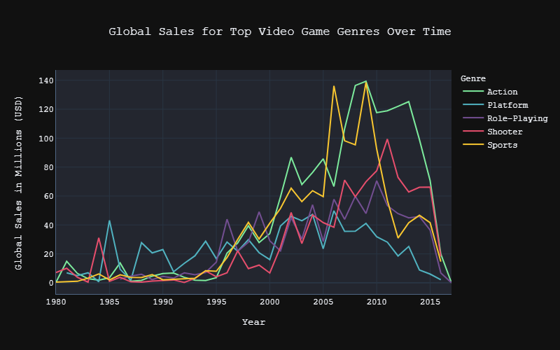
top_genres = ["Platform", "Role-Playing", "Shooter", "Sports", "Action"]
df3 = df1[df1.Genre.isin(top_genres)].groupby(["Genre", "Year"]).sum().drop(columns="Rank").reset_index()
Great! Now, on to the fun part. If you haven’t already installed the package, there are instructions on how to install the current version here. If you have it, great! All you need to run is import plotly.express as px and you can follow along!
We’ll be using a (dreaded) pie chart, a bar graph, and a line chart throughout this article. The code for each are as follows:
#Percentage of how many games are in each category
px.pie(df1, names = "Genre")

#Total lifetime global profit per genre
px.bar(df2, x = "Genre", y = "Global_Sales")
#Global profit over time for top 5 genres
px.line(df3, "Year", "Global_Sales"

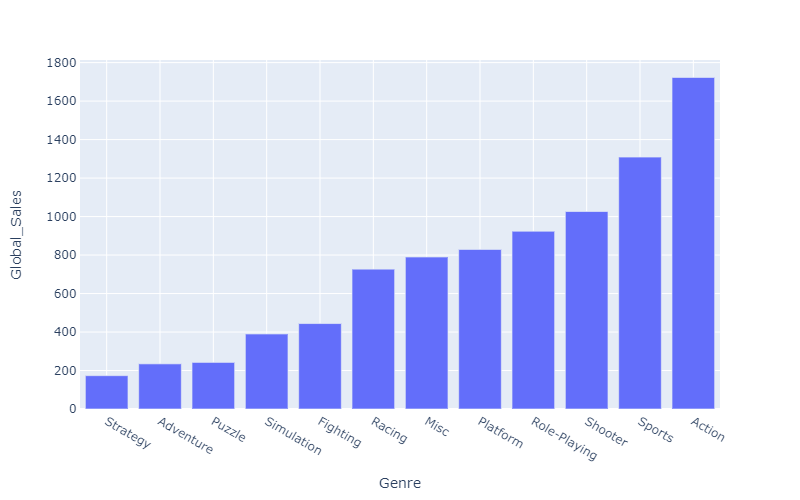
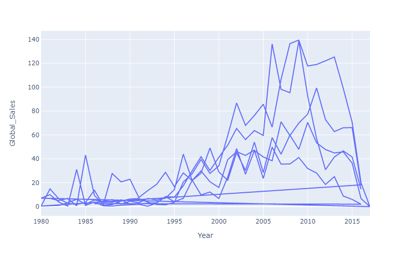
Now… as you can see here these are all quite bland or even impossible to read. Plus, there aren’t even any titles and the axis names are just the variables used! Fortunately, both issues are quite easy to fix!
#python #plotly-express #plotly #data-visualization #data-science