As a graduate student studying microbial community data, most of the projects I work on involve some sort of clustering analysis. For one of them, I wanted to color the ends of a dendrogram by a variable from my metadata, to visualize whether that variable followed the clustering as part of another figure. There exist excellent packages in R like ggdendro that allow you to either plot colored bars under dendrograms to represent how groups cluster or color the terminal segments by the cluster itself.
That said, I still haven’t found an easy way to change the color of the terminal ends of the dendrogram itself based on user-defined metadata, which I personally think can be more aesthetically pleasing in some situations. This tutorial describes how I did it and provides reproducible code if you are hoping to do the same thing!
Dendrogram Basics
Before I start, what is a dendrogram, anyway?
A dendrogram is a graphical representation of hierarchical clustering. Clusters can be constructed in different ways (i.e., top-down or bottom-up), most commonly in R through the application of hclust() on a distance matrix. Dendrograms are built by connecting nodes to branches or other nodes, resulting in a tree-like figure that shows how individual things are related to each other based on multiple variables.
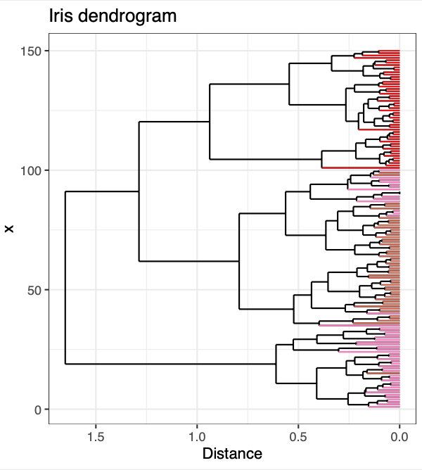
Let’s say we want to compare how individual irises cluster from the well-known R-core data set. This dataframe contains four numeric vectors (Sepal.Length, Sepal.Width, Petal.Length, and Petal.Width) as well as one character vector (Species). We could easily construct and plot a dendrogram incorporating all these numeric data with base R, but what if we want to color the terminal segments by the species of iris to visualize whether Species follows the clustering determined by hclust()?
#ggplot2 #r #dendrogram #data-visualization #data-science #data analytic