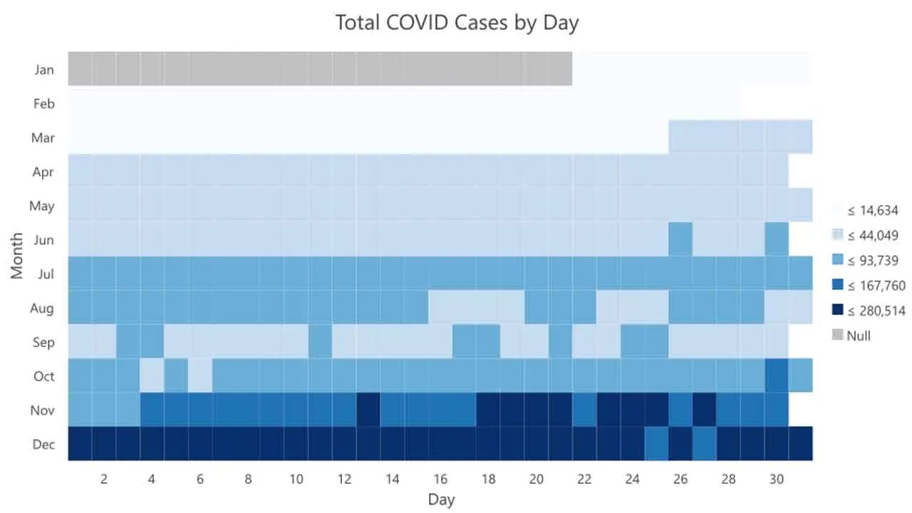
Charting provides a powerful way to visualize and explore your data by helping to uncover patterns, trends, relationships, and structures that might not be apparent when looking at a table or map. The COVID-19 pandemic has created voluminous streams of data for scientists, researchers, and decision-makers to visualize, analyze, and understand through a variety of data analysis packages and tools.
This blog walks through visualizing characteristics and trends of the COVID-19 pandemic in the United States during 2020 using the integration between Python and ArcGIS Platform.
Preparing the Data
To get started, I’ll load and prepare the data using pandas, but you can use whatever Python tools you prefer. I’m acquiring the data from the New York Times COVID-19 data repository (publicly accessible here), and I’m filtering the data to include only dates from the complete year of 2020.
import pandas as pd
from arcgis.features import GeoAccessor
import arcpy
arcpy.env.workspace = 'memory'

DATA_URL = 'https://raw.githubusercontent.com/nytimes/covid-19-data/master/us-states.csv'
# load data with pandas, create new fields, and filter

daily_df = (
    pd.read_csv(DATA_URL, parse_dates=['date'])
        .sort_values(['state', 'date'])
        .rename(columns={
            'cases': 'cases_total',
            'deaths': 'deaths_total'
        })
        .assign(
            cases_new = lambda df: df.groupby('state')['cases_total'].diff().clip(lower=0),
            deaths_new = lambda df: df.groupby('state')['deaths_total'].diff().clip(lower=0)
        )
        .query("'2020-01-01' <= date <= '2020-12-31'")
        .reset_index(drop=True)
)
Here’s a quick look at the prepared dataset. Notice that there is an individual row for each date and state combination. These rows will be summarized and aggregated when I visualize this data with charts.
#python #covid-19 #covid 19 #charting