Wouldn’t it be fascinating if you can know how much you are going to spend next week? Or if you can tell the number of hours of sleep you will get the next day?
I would be all over knowing how to do it because the human brain gets intrigued when it is challenged.
Introduction to Time Series
So, how to go about it?
There is a separate part in data science which lets us do the exact thing — forecasting based on historical data. The data for this forecast would ideally be data points collected over successive periods, arranged in chronological order. The special kind of data is called “Time series”.
This kind of data is exceptional from other tabular data in the following ways
- Data points need to be continuous in point time.
- Data points are not independent.
Since these features violate most of the basic statistical models, this kind of data can be manipulated only with a unique modeling technique — “Time Series Analysis”.
Basics First…
Even before we jump into the nitty-gritties of modeling, we need to make sure we have the ground-level understanding of what makes time series unique in forecasting. Any time-series data could have a couple or more of the following components.
- Trend
- Seasonality
- Cyclicity
- Randomness
The Trend, Seasonality, and Cyclicity are “Systematic” components, indicating that there is an underlying pattern. Whereas randomness cannot be attributed to one single reason.
So, how do we observe a trend?
Let see the below graph for example. It contains the stock price of Tata Motors over the past three months. At first glance, we can tell that this is a time-series data because,
· We know for a fact that the data points are gathered over regular time intervals.
· We also know that the data doesn’t have breaks.
· To further reassure, the data points are not independent. We know that yesterday’s stock price is a strong influencer to today’s stock price.
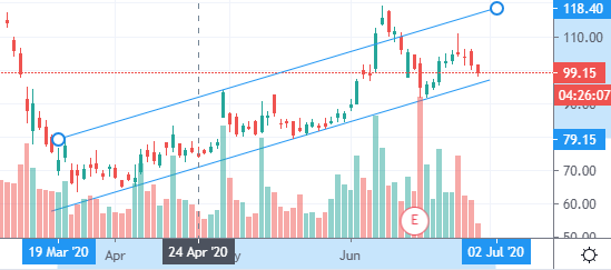
We can see here that over the three months, the data points follow a positive trend. Hence, the trend line shows an overall upward action.
This explains how to locate the trend.
How about seasonality? How do we spot seasonal data?
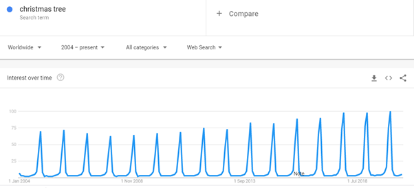
Search counts for “Christmas tree” on google. Taken from Google trends.
The above graph shows the count of searches for “Christmas tree” in Google. So, during the holiday season — around Nov-Dec — there is a peak in the number of searches that people do in google for Christmas trees. The above data can be confirmed to be seasonal data.
#forecasting #data-science #analytics #time-series-forecasting #trend-analysis #data analysis