Ionic is not just an amazing design system made for mobile devices but also work like a charm on desktop. We use it at DeckDeckGo particularly for that reason.
While we developed our editor for presentations, we implemented the following two tricks I am about to share with you and which I hope, may be one day useful to you too.
Fullscreen Modal
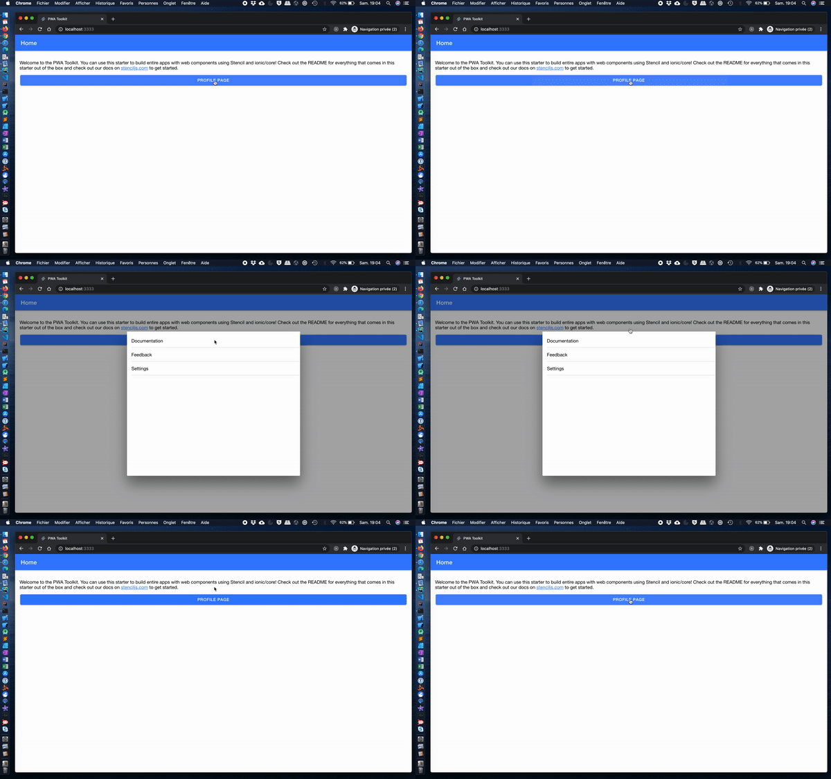
Out of the box, regardless which platform’s style is applied, as soon as your browser reaches the size of 768x600 pixels, an Ionic modal will not be displayed fullscreen anymore but rather as a centered popup.

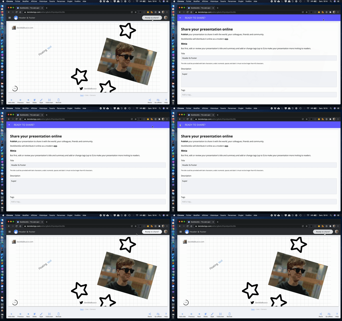
While that might fits almost all the use cases, there might be one which would request a full screen modal. Indeed, you might want to present multiple information to the user, therefore need space, but might not want to add a page in the history stack.
For example, users editing their slides with our editor are able to ship their decks as Progressive Web Apps. Upon request, we are packaging their presentations in PWAs and are deploying these online. As it is quite a process and something which the user has to explicitly trigger, we have decided to present all the information in a modal rather than using a navigation, avoiding possible back and forth errors 😇.

Assuming you are not looking to make all your modals fullscreen but only some, I suggest that we style the modals with the help of a CSS class selector which we can apply as displayed on the documentation.
Angular:
async presentModal() {
  const modal = await this.modalController.create({
    component: ModalPage,
    cssClass: 'fullscreen'
  });
  await modal.present();
}
#javascript #ionic #web-development #programming #front-end-development
